
The Most Common UI Design Mistakes (And How to Fix Them)
You finally finish a design you’re genuinely proud of. Then you look at work from top designers and suddenly… yours feels off, even if you can’t explain why. Usually, it comes down to a few common UI design mistakes. In this article we'll go through the ones beginners and even experienced designers make most often.
Table Of Contents
1. UI foundations
Color
Color is one of the most powerful elements in UI design. And one of the easiest to get wrong. Yet, most designers never get taught how to use color. They’re expected to just “figure it out” by copying trends, using color pickers, or downloading palettes they don’t fully understand.
And the result? Messy interfaces. Inaccessible text. Inconsistent tones. Zero confidence.
That's why we've created The Ultimate UI Colors Masterclass, a course that will help you unlock the power of color to create stunning and impactful designs.
Let this be the moment you stop second-guessing and start owning your color decisions. Learn UI color once and for all, and never look back.
Let’s dive into the most common UI design mistakes that designers make when using color.
Relying on color for meaning
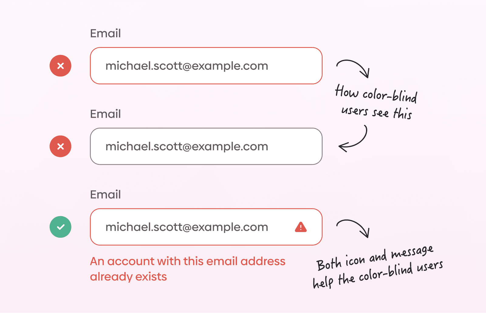
Many beginner UI designers rely too heavily on color to communicate meaning. When color is the only indicator, parts of the UI can become harder to understand or access. A more effective approach is to use color with purpose and alongside other visual cues so information remains understandable.
This is especially important when designing for colorblind users. If you’d like to explore this topic further, read our article How to Design for Colorblind People. We've covered practical tips and strategies for creating colorblind-friendly designs in it.
Chaotic color choices
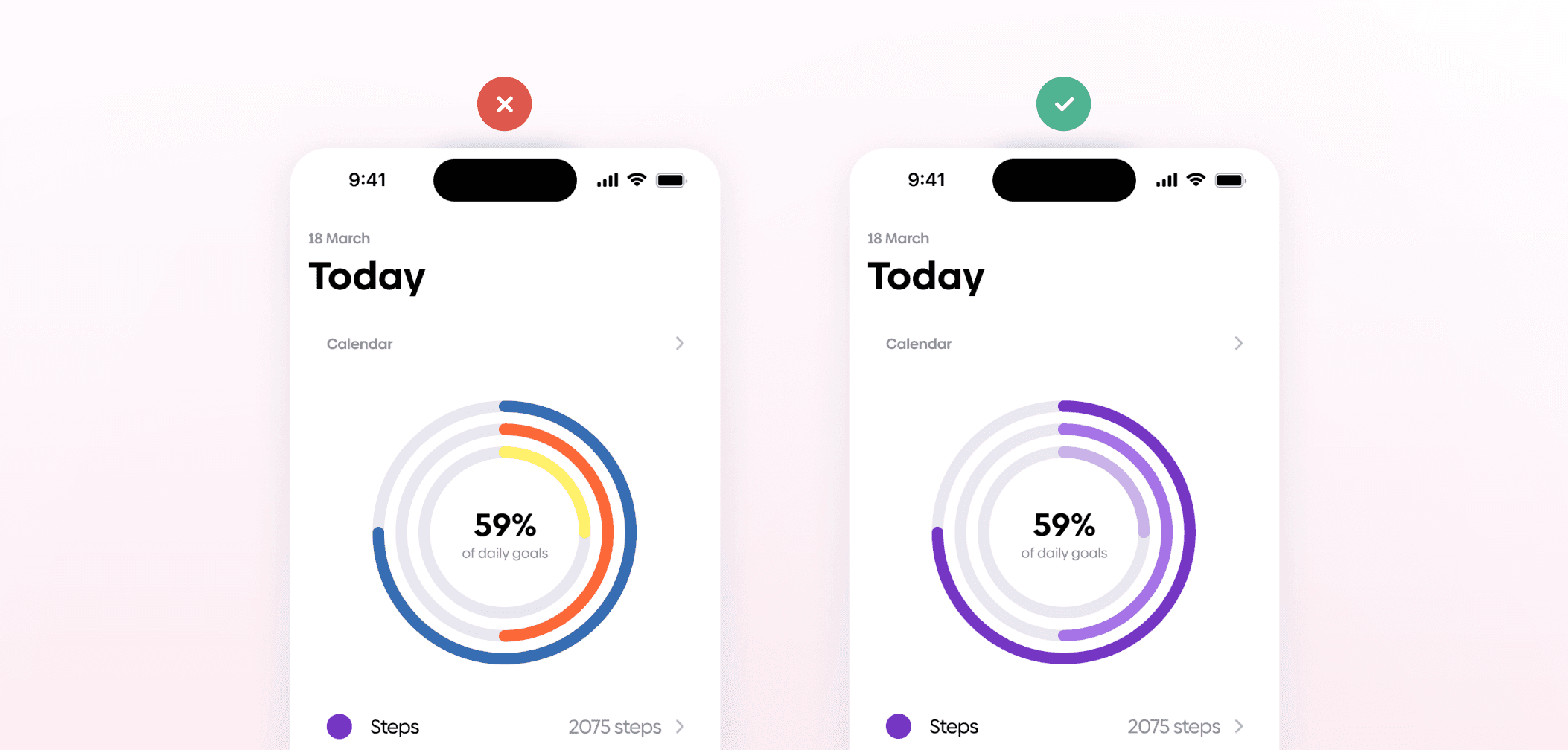
Another common issue is chaotic color usage. Random or inconsistent colors can make an interface feel disorganized, especially when there is no clear system behind them. Using a limited color palette and assigning consistent meanings to specific colors helps create a more structured visual language. This also makes interfaces easier to scan and understand.

Colorful color palettes
Designers sometimes make the mistake of using highly colorful palettes regardless of context. Context-aware color choices usually create a more balanced and readable result.
If you wish to learn how to effectively choose and use UI color palettes, read our article A Guide To UI Color Palettes. In it, we also discuss standard practices for naming color palettes and show you how to document them in Figma.
Tacky gradients
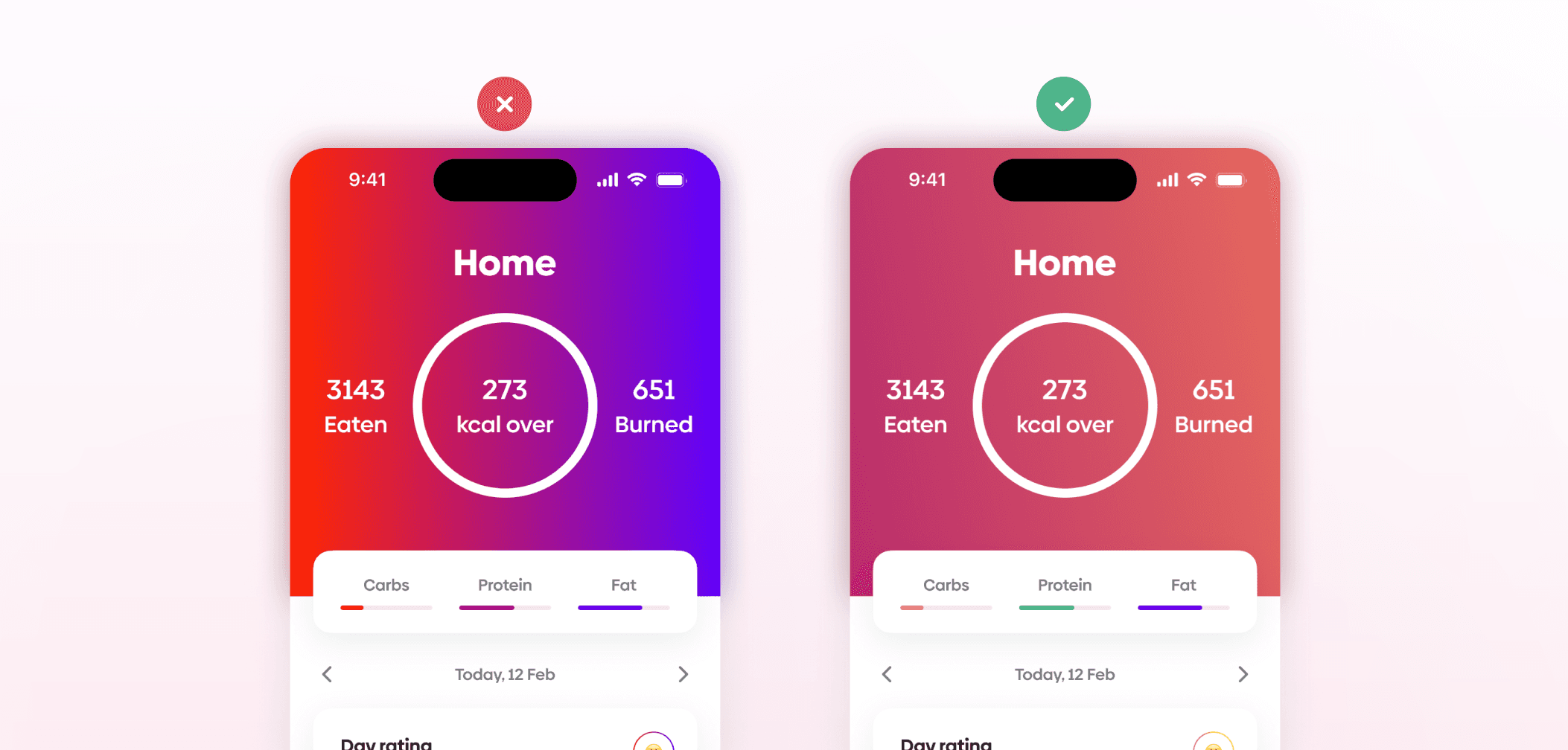
Gradients are another area where beginner work can feel visually overwhelming. Tacky gradients tend to draw unnecessary attention and can make interfaces feel less cohesive. More natural gradients usually integrate better into the overall design without dominating it.
Ignoring the power of greys
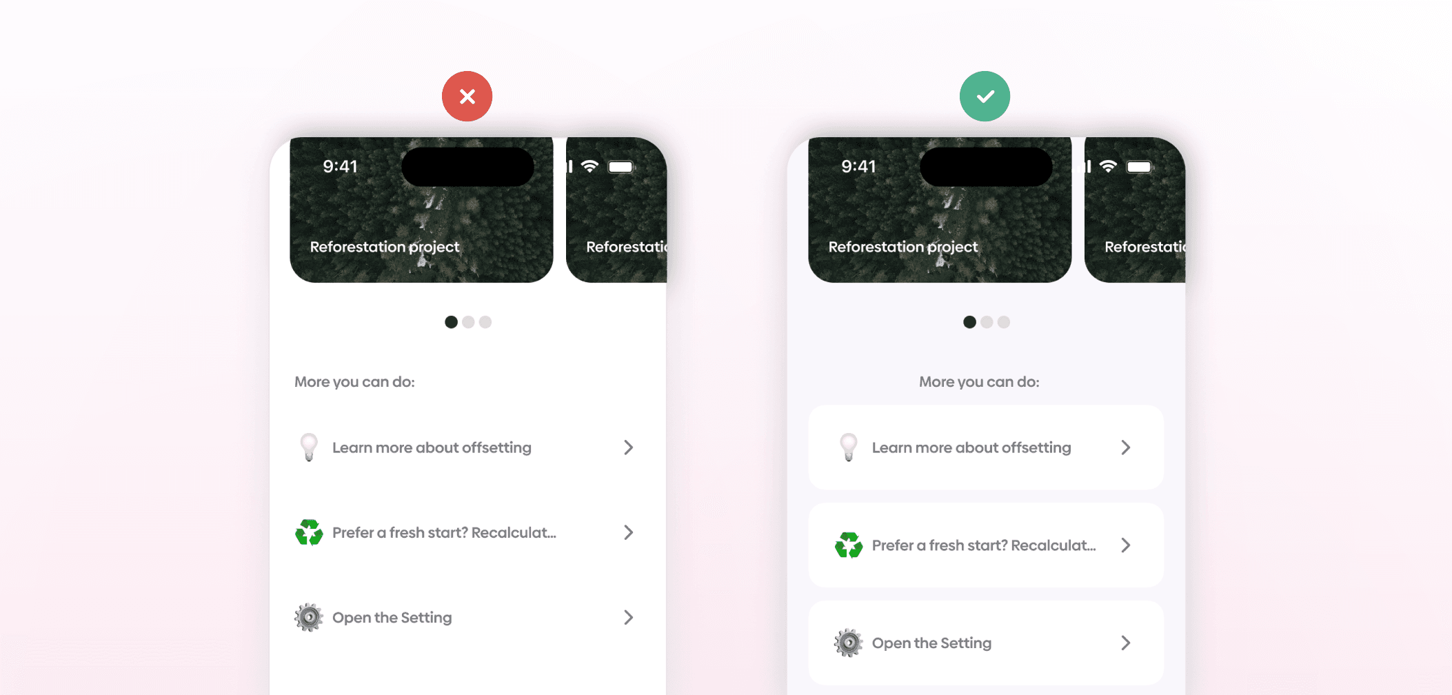
Greys are frequently underused in early UI work. Using different shades of grey allows designers to create separation and focus more carefully, while reserving stronger colors for elements that need attention.
Too much or too little contrast
Contrast is another area where balance matters. Too much contrast can feel harsh, while too little can reduce readability and clarity. Interfaces generally benefit from balanced contrast that supports readability without overwhelming the visual structure.
Not using color for hierarchy
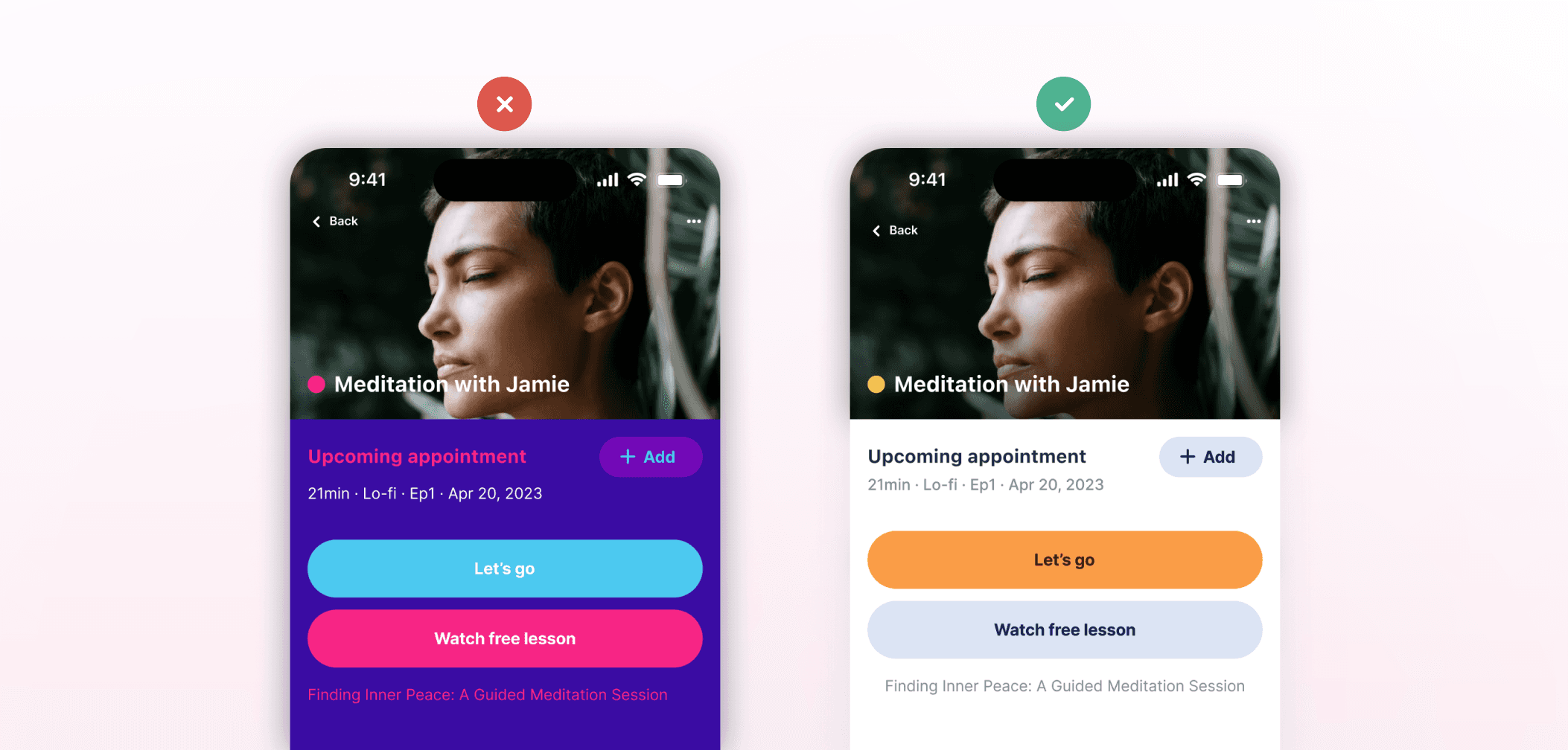
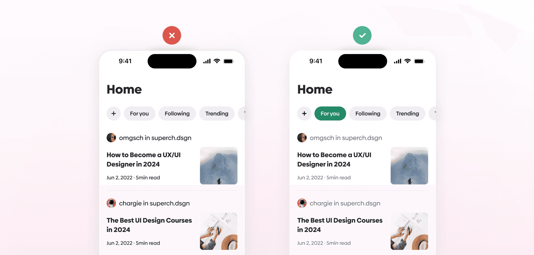
Color also plays an important role in hierarchy. When everything uses the same visual intensity, it becomes harder to distinguish primary elements from secondary ones. Thoughtful use of color can help guide attention and clarify the relationship between interface elements.
Not designing in black and white first
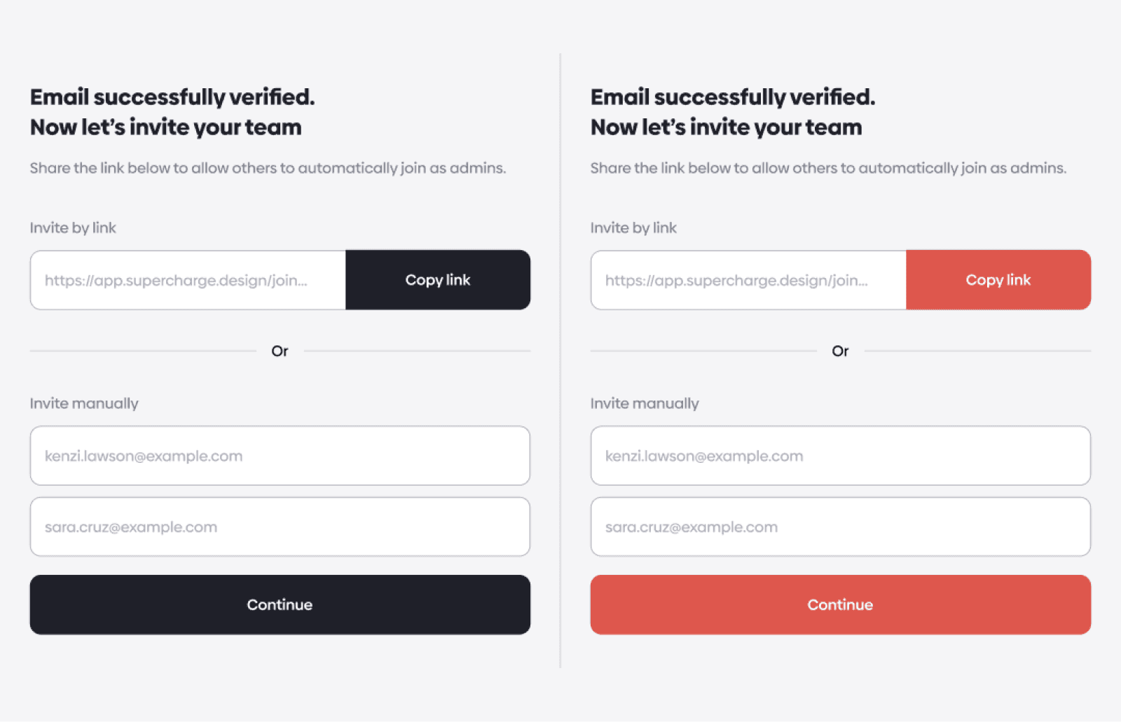
A useful starting point for many UI projects is designing in black and white first. Working in grayscale emphasizes the spacing and layout by simplifying other more complex aspects of visual design. Color can then be introduced later with a specific purpose, rather than being used to compensate for weak structure.
1. UI foundations
Color
Color is one of the most powerful elements in UI design. And one of the easiest to get wrong. Yet, most designers never get taught how to use color. They’re expected to just “figure it out” by copying trends, using color pickers, or downloading palettes they don’t fully understand.
And the result? Messy interfaces. Inaccessible text. Inconsistent tones. Zero confidence.
That's why we've created The Ultimate UI Colors Masterclass, a course that will help you unlock the power of color to create stunning and impactful designs.
Let this be the moment you stop second-guessing and start owning your color decisions. Learn UI color once and for all, and never look back.
Let’s dive into the most common UI design mistakes that designers make when using color.
Relying on color for meaning
Many beginner UI designers rely too heavily on color to communicate meaning. When color is the only indicator, parts of the UI can become harder to understand or access. A more effective approach is to use color with purpose and alongside other visual cues so information remains understandable.
This is especially important when designing for colorblind users. If you’d like to explore this topic further, read our article How to Design for Colorblind People. We've covered practical tips and strategies for creating colorblind-friendly designs in it.
Chaotic color choices
Another common issue is chaotic color usage. Random or inconsistent colors can make an interface feel disorganized, especially when there is no clear system behind them. Using a limited color palette and assigning consistent meanings to specific colors helps create a more structured visual language. This also makes interfaces easier to scan and understand.
Colorful color palettes
Designers sometimes make the mistake of using highly colorful palettes regardless of context. Context-aware color choices usually create a more balanced and readable result.
If you wish to learn how to effectively choose and use UI color palettes, read our article A Guide To UI Color Palettes. In it, we also discuss standard practices for naming color palettes and show you how to document them in Figma.
Tacky gradients
Gradients are another area where beginner work can feel visually overwhelming. Tacky gradients tend to draw unnecessary attention and can make interfaces feel less cohesive. More natural gradients usually integrate better into the overall design without dominating it.
Ignoring the power of greys
Greys are frequently underused in early UI work. Using different shades of grey allows designers to create separation and focus more carefully, while reserving stronger colors for elements that need attention.
Too much or too little contrast
Contrast is another area where balance matters. Too much contrast can feel harsh, while too little can reduce readability and clarity. Interfaces generally benefit from balanced contrast that supports readability without overwhelming the visual structure.
Not using color for hierarchy
Color also plays an important role in hierarchy. When everything uses the same visual intensity, it becomes harder to distinguish primary elements from secondary ones. Thoughtful use of color can help guide attention and clarify the relationship between interface elements.
Not designing in black and white first
A useful starting point for many UI projects is designing in black and white first. Working in grayscale emphasizes the spacing and layout by simplifying other more complex aspects of visual design. Color can then be introduced later with a specific purpose, rather than being used to compensate for weak structure.
Dark UI design
In digital design, dark UI is a powerful tool that designers use to create interfaces that are both visually appealing and highly functional. If you want a bit more information on how to design for dark mode, make sure to read our article The Designers’ Guide to Dark UI Design.
But for now, let’s dive into the most common UI design mistakes that designers make when designing dark UIs.
Pairing pure black with pure white
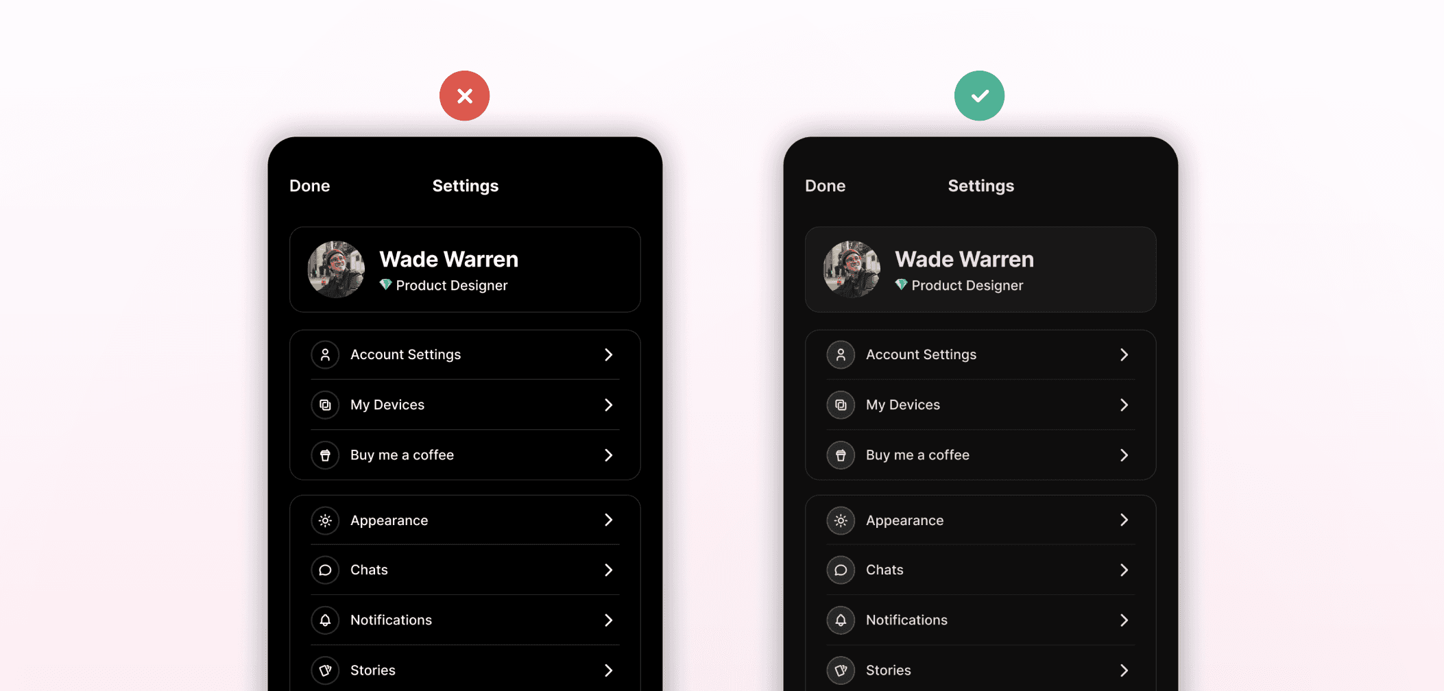
One of the biggest common mistakes in dark UI design is pairing pure black with pure white. This creates very strong contrast, which can become uncomfortable to look at over time. Using tinted greys instead helps soften the contrast and can reduce eye strain while still maintaining readability.
Using large bright surfaces
Large bright surfaces can also feel out of place in dark interfaces. Because the rest of the UI is dark, highly bright areas tend to stand out too aggressively and appear to glow against surrounding elements. Keeping large surfaces darker helps maintain visual balance across the interface.

Relying on shadows
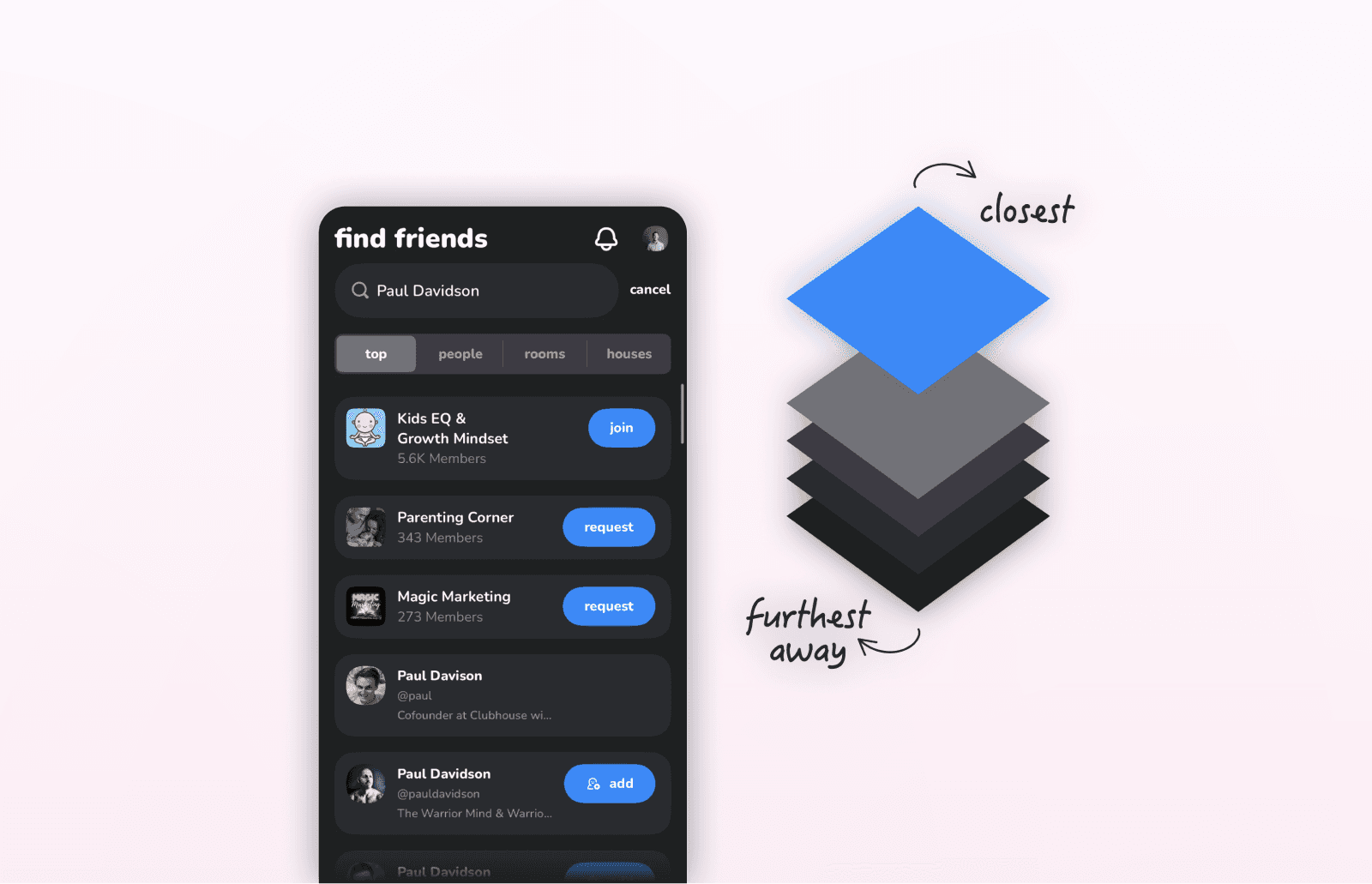
Many beginner designers rely heavily on shadows to create depth in dark mode. Shadows are generally more effective in light interfaces, while dark UIs benefit from different techniques. Overlapping elements, contrast differences, and opacity changes can communicate elevation and separation more naturally in dark mode.
Overly saturated colors
Overly saturated colors in dark UIs are another common issue. Strong saturation increases contrast and can create visual vibration, especially against dark backgrounds. Lowering saturation helps keep the interface visually calmer and reduces unnecessary tension between elements.

Assuming everyone prefers dark mode
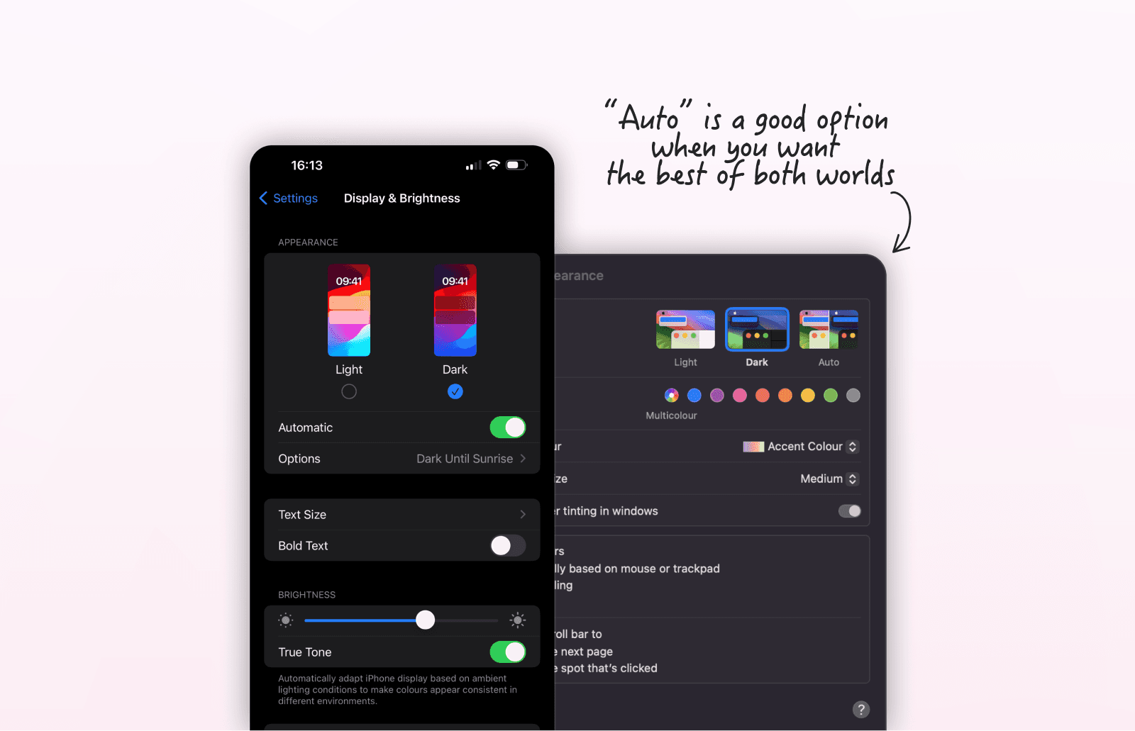
Some designers assume dark mode is universally preferred, but that is not always the case. Dark interfaces can be inconvenient in bright environments and do not suit everyone. Providing users with control over appearance settings allows them to choose what works best for their situation. An “Auto” option can also help by switching between light and dark modes based on the user's environment or system settings.
Abusing accent colors
Accent colors are often overused in dark interfaces. When too many surfaces compete for attention, the interface loses visual focus. Color accents work better when they are reserved for interactive or important elements, while most surfaces remain dark.


Typography
If you're like most UI/UX designers, you've poured hours into learning layout, colors, spacing, components... and somehow, your designs still look off. Too flat. Too noisy. Not quite right.
Here's the brutal truth most beginner and intermediate designers don't hear enough: Typography is the most under-taught, under-prioritized skill in UI design, and it shows.
It's also the skill that separates the amateur from the expert at first glance.
That's why we created the Ultimate UI Typography Masterclass. It's a comprehensive, practical, and eye-opening course designed to completely transform how you see, use, and master typography in your UI design work. Make sure to check it out if you're ready to finally master UI typography the right way.
Now, let’s dive into the most common UI design mistakes that designers make when working with typography.
Too many fonts
A common beginner mistake in UI design is using too many fonts at once. Interfaces often become inconsistent when every section introduces a different typeface or style.
Limiting a design to one or two typefaces creates a more cohesive system, while variation can still be achieved through different weights and sizes. A good rule of thumb is 4 text styles per screen.
If you are searching for a complete guide to typography classification, check out our article Typography Classification Explained.
Generic typography
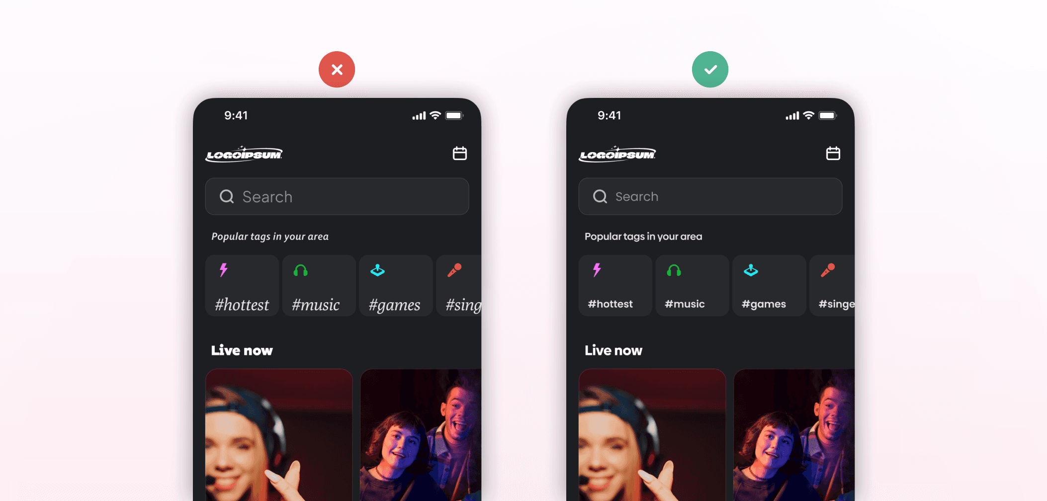
Using generic badly-set typography is a common typography mistake. Instead, use custom type choices and deliberate scaling to create a more controlled visual rhythm. These techniques are especially important for establishing hierarchy.

Arbitrary font choices and sacrificing readability
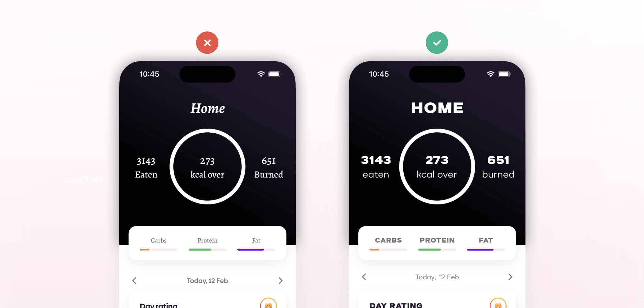
Another mistake I often see designers make is using arbitrary font choices or overusing decorative fonts, even though typography affects the overall tone of a product. Aligning type choices with the brand creates stronger consistency across the interface. And don't sacrifice readability for style; instead, use simple and legible typefaces.
Cramped or unreadable spacing
Spacing problems are another frequent issue. Cramped layouts or unreadable spacing can make text feel difficult to scan, even when the font itself is appropriate. To fix this, try using a line-height of 130-160%. That way, you can avoid spacing that's too tight or too loose.

Low contrast
Text contrast is another area that is often overlooked. Low contrast between text and background reduces readability. Using adequate contrast helps maintain clarity without forcing unnecessary visual strain.

Abusing styled text
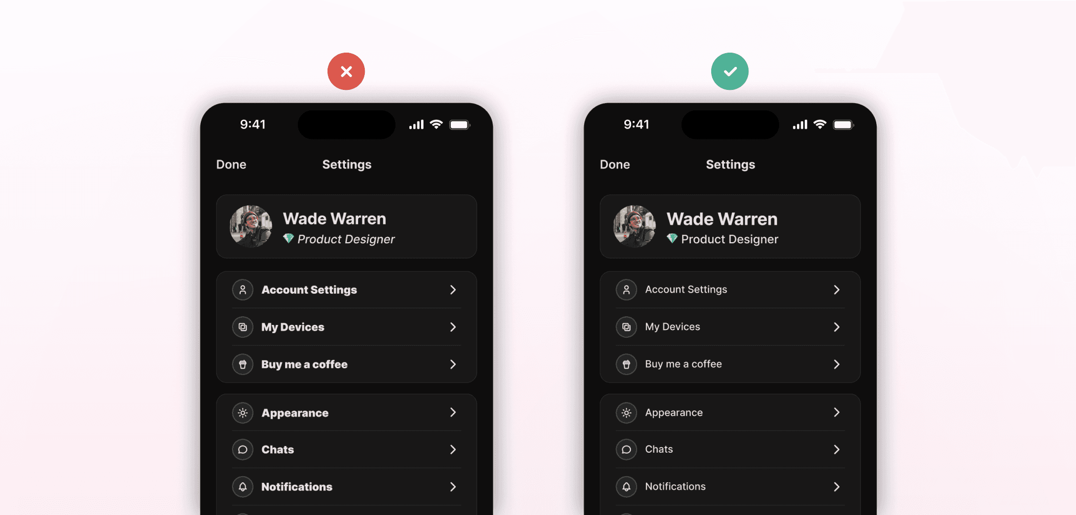
Styled text is also quite overused. When too many words compete for emphasis through bolding, styling, or similar, the hierarchy becomes less clear. Emphasis works better when it is applied with intent.
Inconsistent alignment and centering
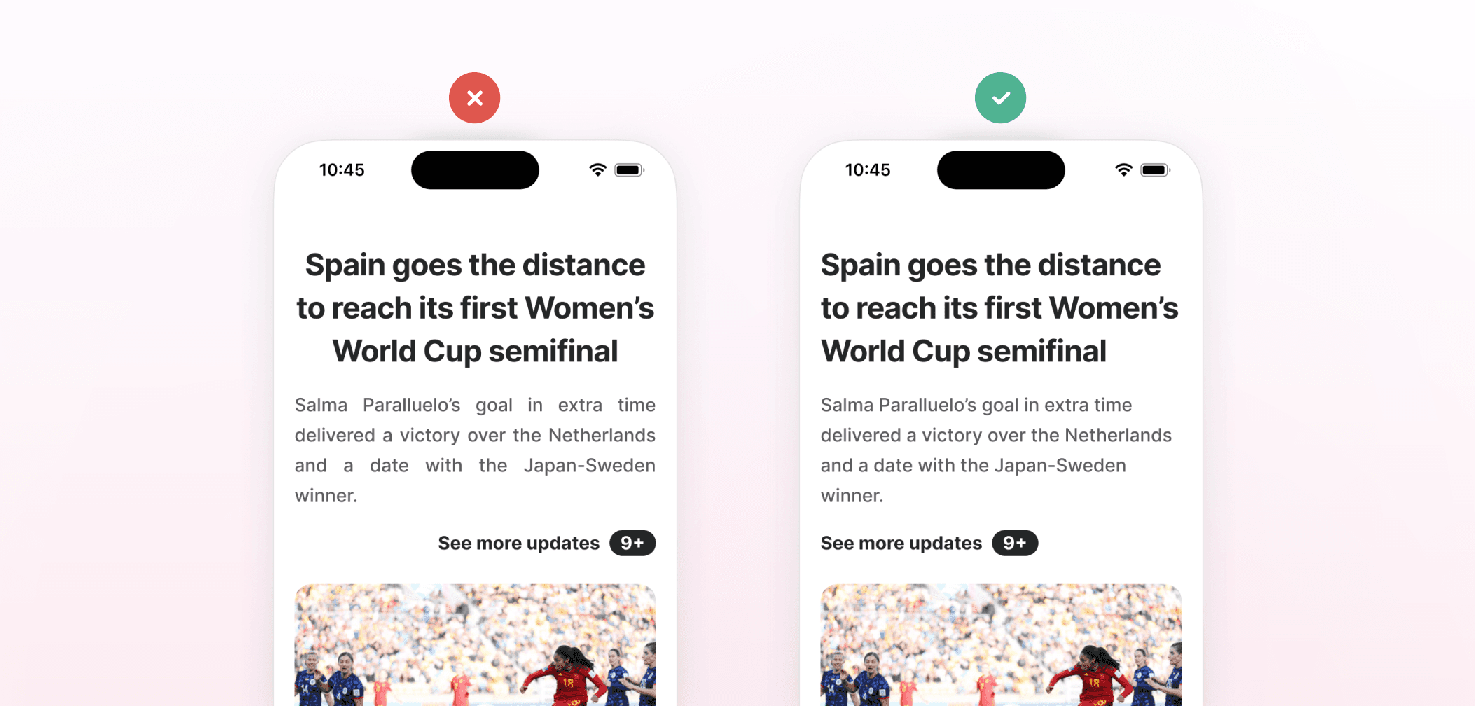
Alignment affects readability as well. Inconsistent text alignment can make interfaces feel visually unstable. Centering dense paragraphs is another common mistake, as it makes text difficult to read. Longer sections of text are easier to follow when they are left-aligned.
Using short or long text blocks
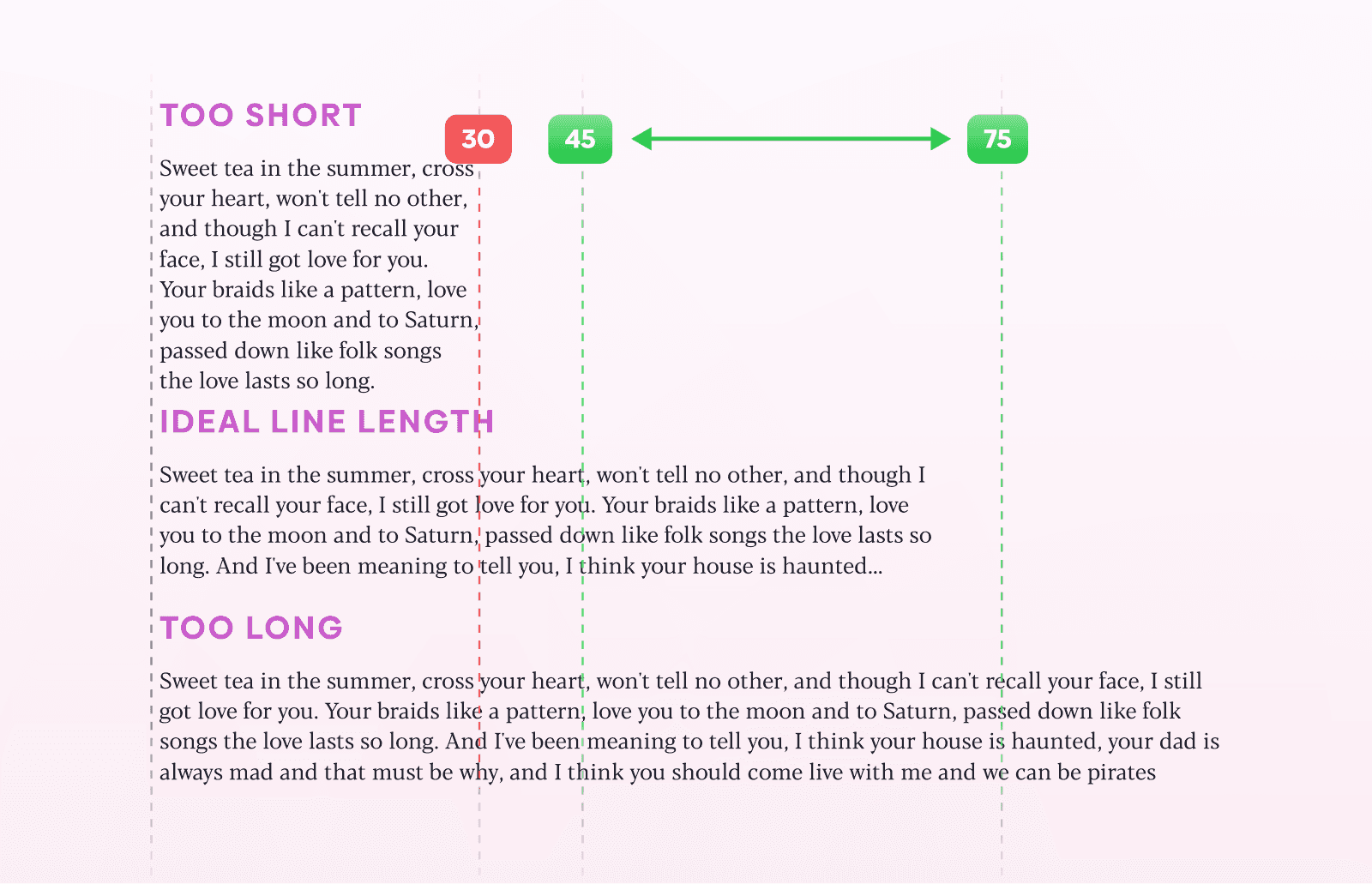
Line length also affects how comfortably text can be read. Extremely short or very long text blocks interrupt reading rhythm and make scanning more difficult. Instead, try to keep lines within 45-75 characters.
Type system
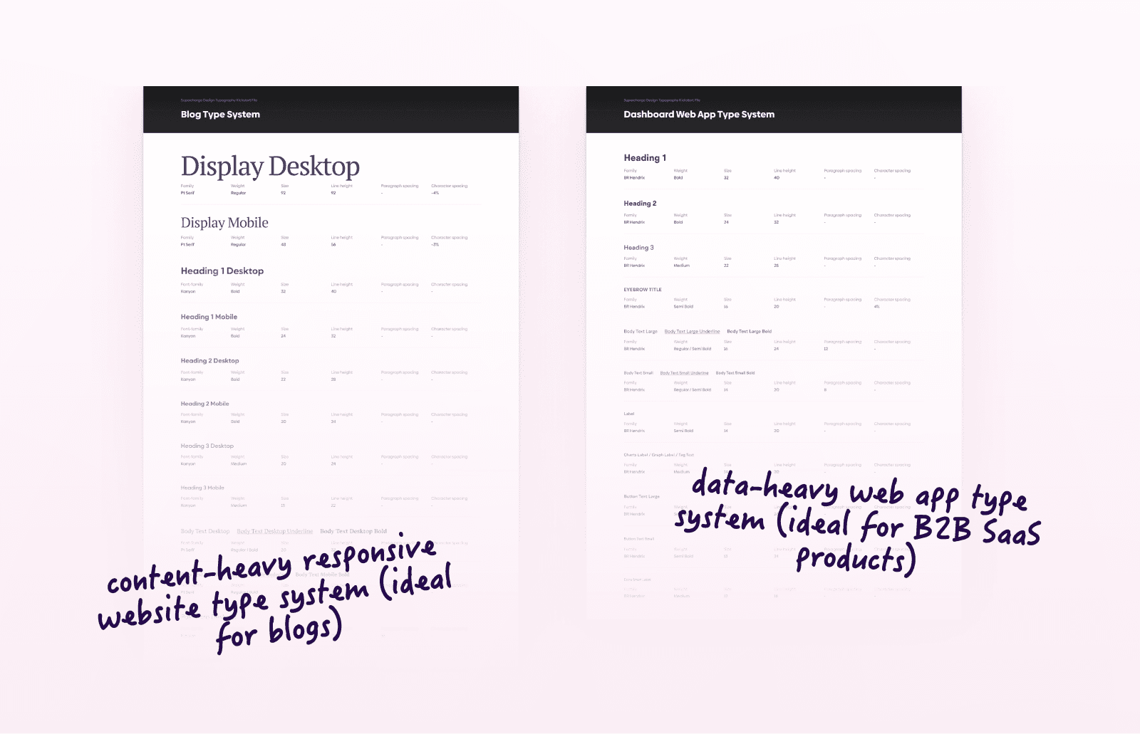
Blindly trusting type scale presets without adjusting them to the interface itself is yet another mistake I see often. Type scales usually work better when you customize them for your context.
If you wish to learn how to create a good type scale for your project, our article What Is a Type Scale will help you out.
2. Visual hierarchy and clarity
Inconsistent spacing, messy alignment, cluttered visual hierarchy… These issues silently kill the polish of your designs. And the worst part? Tutorials rarely explain why your UI feels unprofessional, let alone show you how to fix it.
That’s exactly why we've created UI Grids & Layouts Masterclass, to help designers like you learn the real foundations of layout design, so you can stop relying on intuition and finally understand how to build consistent, clean, and confident UI layouts across any screen size or platform.
Ready to go from “kinda works” to visually stunning? UI Grids & Layouts Masterclass is where your layout game levels up.
Now, let’s dive into the most common UI design mistakes that designers make when working with visual hierarchy and clarity.
Alignment and spacing
Letting things float
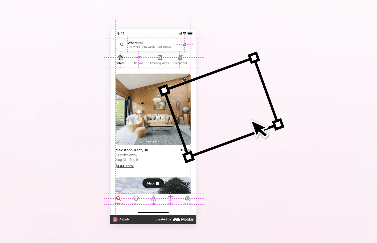
One of the most common beginner mistakes in UI design is letting elements feel disconnected or randomly placed on the screen. Aligning and anchoring elements creates clearer relationships between components.
Inconsistency and eyeballing every margin
Inconsistent alignment and spacing can also make interfaces feel chaotic. Using grids cleverly allows elements to relate to each other more clearly instead of placing them randomly.
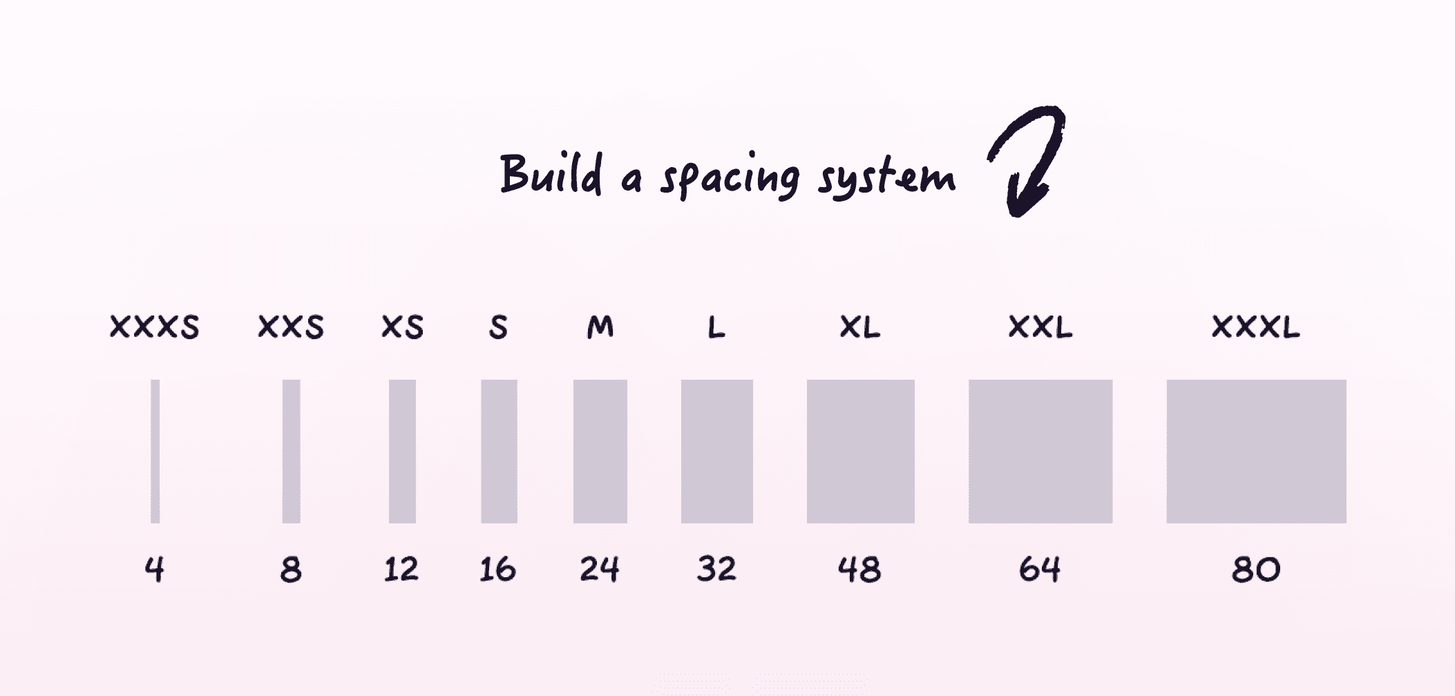
Another common issue is eyeballing every margin and cramping. You can fix this by using a consistent spacing system, such as a 4-point or 8-point grid. By doing so, you'll create more regular spacing patterns throughout the interface.
If you wish to learn about the importance of grids, the distinction between soft and hard grids, embracing the 8-point grid system, understanding how to achieve perfect responsiveness, and utilizing Figma's features for setting up reusable grids, check out our article UI Design Grids Explained.
Hierarchy
A common beginner mistake in UI design is trying to make every element stand out at the same time. This happens when the interface becomes too cluttered or visually overwhelming as well. When everything stands out, nothing stands out. Clear and clean visual hierarchy helps organize attention.

Inconsistency
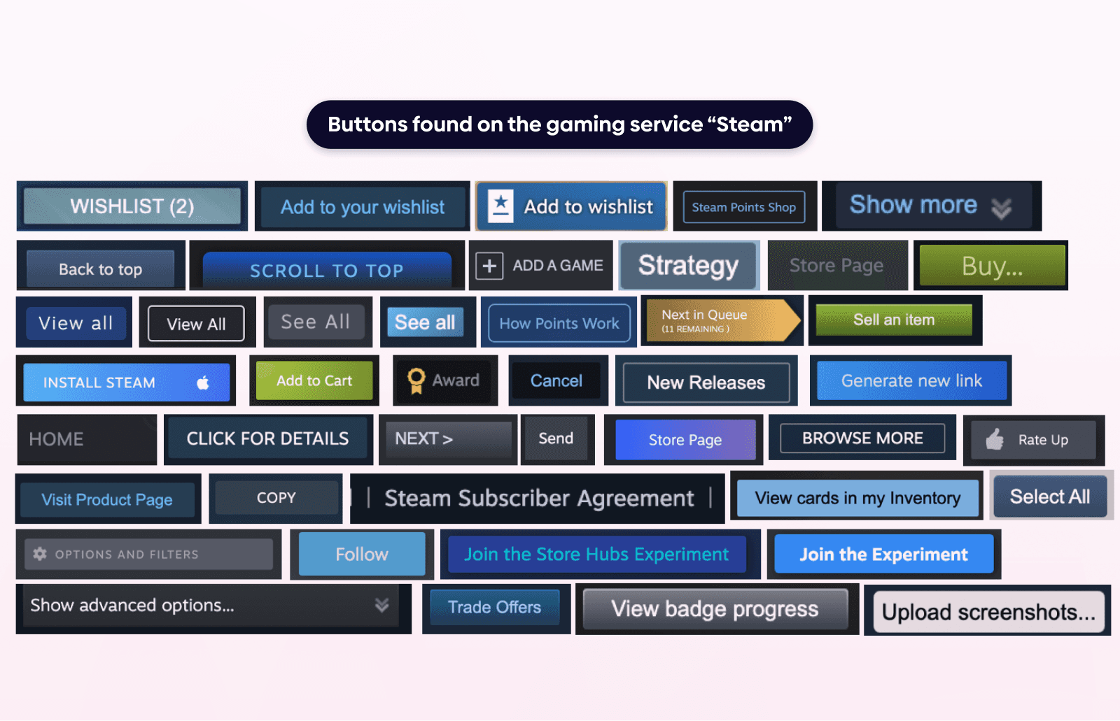
Inconsistent visual decisions are a common sign of design immaturity. Random border radii, changing styles, and unrelated color choices can make interfaces feel disconnected and unstructured. Consistency across these elements creates a more unified visual system and gives the design a more polished appearance. And remember, consistency signals professionalism.
Inconsistency also affects how people perceive the interface overall. Chaos kills trust while consistency builds it.
Overcomplication
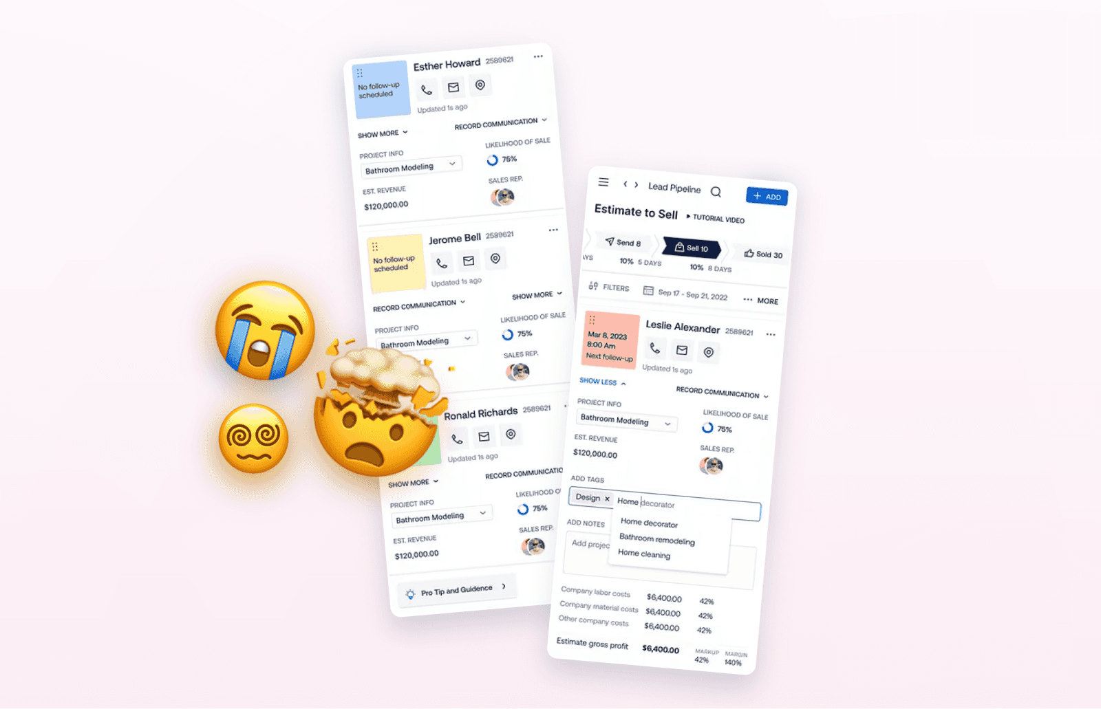
Another common beginner mistake is adding more elements, styles, or features simply because you can add them. More complexity does not automatically improve a design. In fact, it can make interfaces harder to follow and distract users.
3. UI design elements and components
Every user interface is a combination of various UI elements, each serving a specific purpose. Without a strong grasp of these foundational elements, designing user-centered experiences becomes a daunting challenge.
That’s why we decided to create a guide that bridges this knowledge gap, empowering designers with a comprehensive understanding of each element, thereby transforming their design approach.
Say goodbye to endless searches and embrace a structured guide that unveils the intricacies of each element, all in one place, with our Ultimate UI Elements Guide.
And now we can dive into the most common UI design mistakes that designers make when working with UI design elements and components.
Buttons
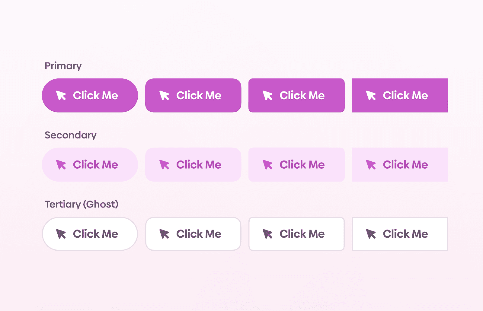
One common beginner mistake in UI design is making users guess which elements are clickable. When buttons do not clearly look tappable or clickable, interfaces become harder to navigate.
Shadows
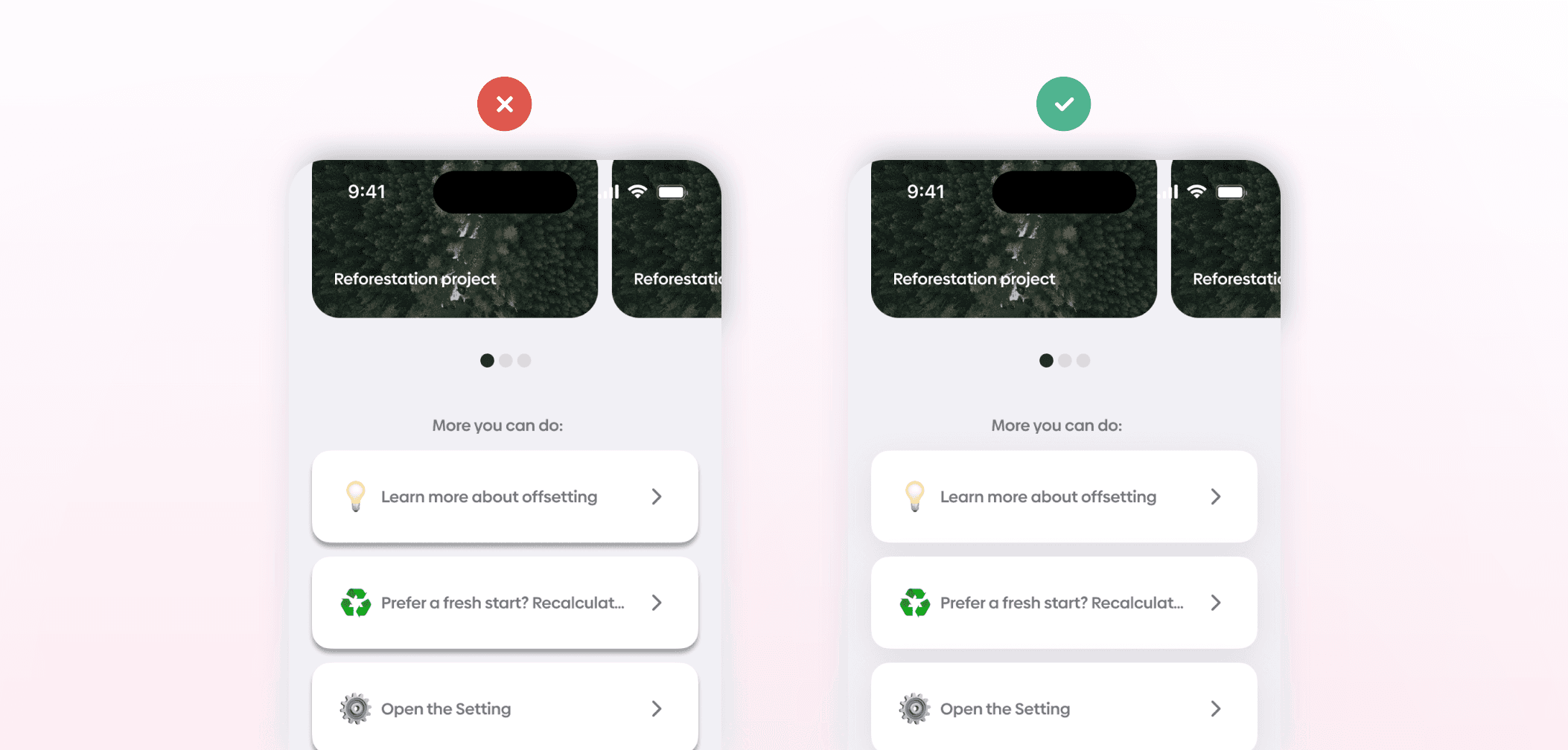
Many beginner interfaces use default shadows that appear too harsh. Softer, more customized shadows generally create a more balanced interface.
Another common issue is ignoring real-world lighting principles when designing shadows and elevation. The top part of the object naturally catches the most light, while the bottom part of the object is the furthest from the light source.
Imagery
Beginners often underestimate the impact of imagery. It has a strong effect on the overall appearance of an interface. Poor image choices can reduce the quality of the design, so you should aim for imagery that is high-quality, clean, and overall impactful. Ensuring a strong contrast between the background and text is also a must.
If you wish to explore the core pillars of visual communication for UI designers and why they are essential for a successful UI design career, check out our article Visual Communication for UI Designers.

4. Product thinking
Ignoring context
A common beginner mistake in UI design is focusing only on the screen itself instead of the people using it. Designing with the user’s context in mind creates interfaces that are more appropriate for real usage situations.

Chasing trends
A common beginner mistake in UI design is focusing more on creating visually impressive interfaces than on solving actual design problems.
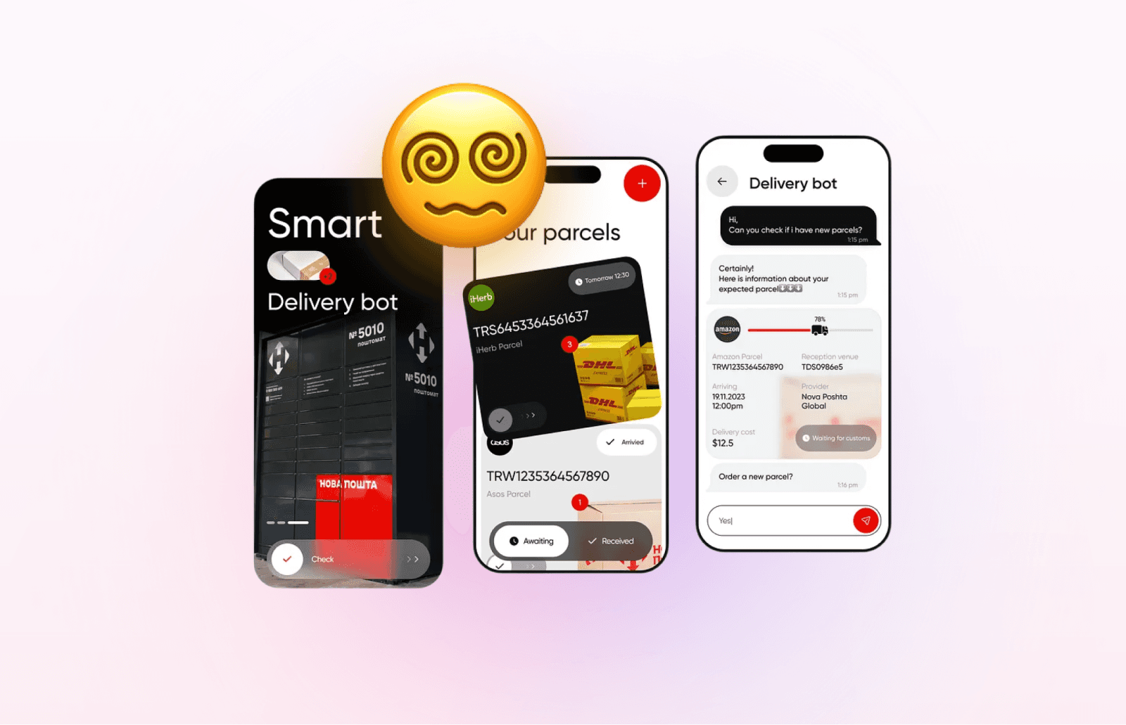
Another issue is ignoring the standards. Redesigning familiar interactions or interfaces increases cognitive load. That's why changing familiar patterns is only worth the effort if it genuinely enhances the design.
AI
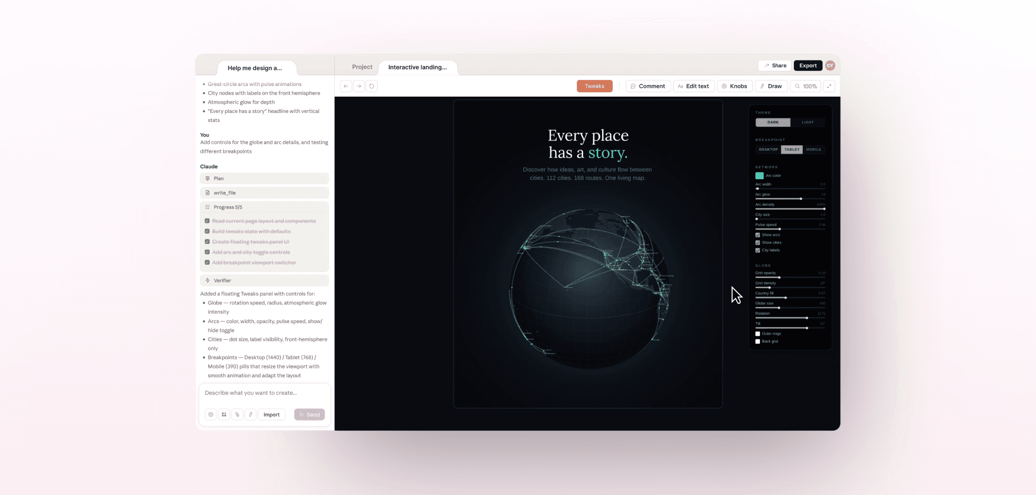
A common beginner mistake in UI design is using AI tools for every part of the process without considering where they are actually useful.
Another issue is blindly following AI outputs. They still need evaluation, editing, and judgment rather than being applied automatically without review.
If you wish to explore some of the most helpful and efficient AI tools for UI designers and their benefits, check out our article The Best AI Tools for UI Designers.
5. Content and communication
Microcopy is a significant part of UI design. It can help users navigate an interface more easily, understand the purpose of UI elements, and feel more confident while using an app or website.
If you are new in the UI design world, writing microcopy might seem challenging or unattainable. But the truth is that UI designers can write good microcopy. Many UI designers already write microcopy as part of their job, including button labels, error messages, tooltips, and other interface copy.
Copywriting
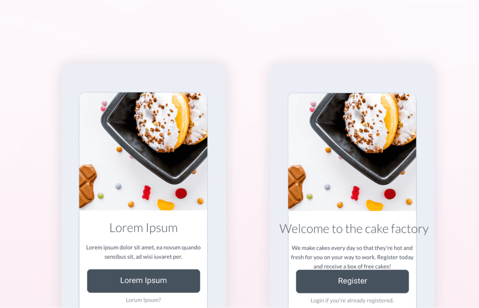
A common beginner mistake in UI design is relying on placeholder text for too long. Designing with lorem ipsum instead of real content can hide problems related to spacing, hierarchy, and readability. Using real content as early as possible in the process creates a more accurate representation of how the interface will actually function.
Another issue is treating copy as a secondary detail compared to visual design. A visually polished interface can still fail when the writing is unclear or weak.
6. Design process
Testing
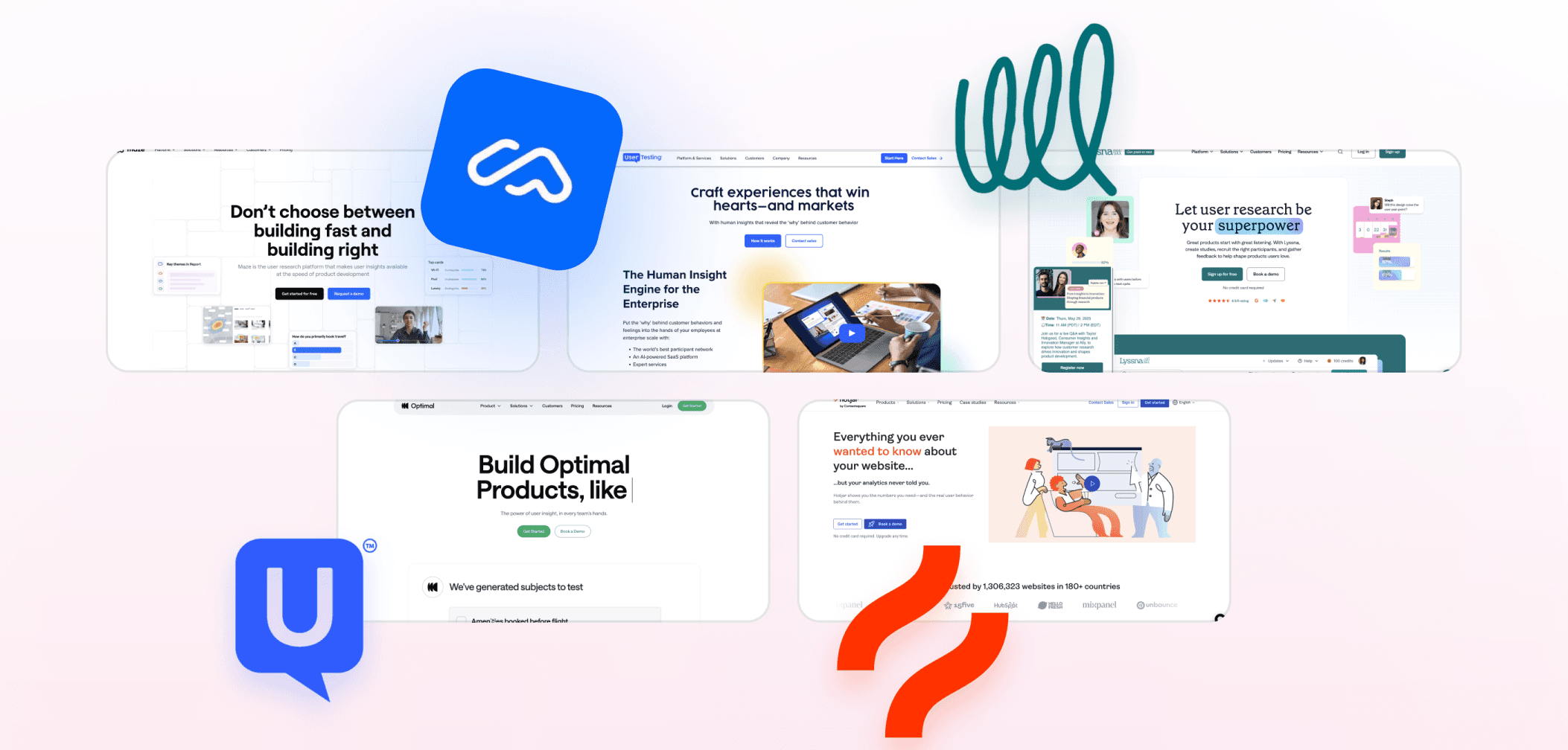
A common beginner mistake in UI design is designing entirely in isolation without testing the interface with other people. Testing designs helps reveal issues that may not be obvious during the design process itself.
Ignoring feedback
Another common beginner mistake in UI design is avoiding feedback during the design process. Skipping user testing sessions limits opportunities to see how people actually interact with the interface and where they run into difficulties.
Another issue is ignoring analytics and critique after a design is released or reviewed. Without that input, it becomes harder to identify what needs improvement.

Advice for beginner UI designers
Build your portfolio
Building a portfolio is one of the most important early steps for beginner UI designers. Waiting until you feel fully ready can slow you down for no good reason. Small projects still count, and every screen you design contributes to your development and experience over time.
You don’t need a degree
A formal degree is not the only path into UI design. What matters more is learning the discipline deeply and continuing to improve. Consistency beats credentials.
Don’t skip the fundamentals
Many beginners focus heavily on visual trends or tools while skipping the fundamentals. Typography, layout, and color directly shape how interfaces work and communicate. That's why spending time learning these areas will create a stronger foundation for your future work.
Practice daily
Daily practice also plays an important role in improvement. Not every project or screen will turn out well, especially early on, but repetition is part of the learning process. Creating will help you develop both technical ability and design judgment over time.
Share your work
Sharing work publicly can also help you improve. Posting projects, shipping work, and continuing to create exposes your work to feedback and creates opportunities to learn from the process.
Don't take feedback personally
Feedback is another important part of growth. Treating it as part of the learning process will make it easier for you to improve.
Keep a beginner’s mindset
Keeping a beginner’s mindset also matters throughout the learning process. Stay curious, ask questions, and remain open to learning. It will help you improve. And don't pretend you know it all.
We’re thrilled to invite you to join our incredible community of product designers (and enthusiasts) by following us on Instagram. We’re here to support you on your journey to falling in love with product design and advancing your career!
Keep on designing and stay hungry, stay foolish! 🥳
andrija & supercharge design team

We’re thrilled to invite you to join our incredible community of product designers (and enthusiasts) by following us on Instagram. We’re here to support you on your journey to falling in love with product design and advancing your career!
Keep on designing and stay hungry, stay foolish! 🥳
andrija & supercharge design team
Related blog posts
You might like the following



LIMITED-TIME OFFER
Get 12 premium members-only video lessons for free
Just tell us where to send them
You can unsubscribe at any time—no strings attached
LIMITED-TIME OFFER
Get 12 premium members-only video lessons for free
Just tell us where to send them
You can unsubscribe at any time—no strings attached