
Accessible Website: How to Design for Colorblind People
·
6 min read
Designing for colorblind people is crucial in creating inclusive and accessible experiences. With an estimated 300 million people worldwide affected by color vision deficiency, understanding how to accommodate their needs can significantly enhance the usability of your projects.
We’ll cover practical tips and strategies for making your designs colorblind-friendly, allowing your work to be inclusive for everyone. Whether you’re an experienced designer or just starting out, these guidelines will help you create visuals everyone can appreciate.
Table Of Contents
How to design an accessible website for colorblind people?
Colorblind people struggle to distinguish between certain colors, such as red and green or blue and yellow. At first glance, it might seem like a minor inconvenience. Still, it can significantly impact everyday activities, including browsing the internet. Imagine trying to navigate a website where you can’t differentiate colors. Poor color contrast or selection might render text or buttons invisible, which makes browsing a frustrating experience.
But is this a rare medical condition or a widespread one? According to Color Blind Awareness, almost 300 million people around the world suffer from different types of color blindness. Therefore, web designers need to learn more about color blindness and how colorblind people see. This way, they can create inclusive and user-friendly websites for everyone, including users with color impairments.
What is color blindness?
Colorblind people have a medical condition that makes it difficult for them to see colors normally. They may experience trouble differentiating between colors, such as blue and yellow or red and green.

Infographic showing how colors are perceived by individuals with different types of color blindness
Types of color blindness
In a healthy eye, three types of cones detect light:
Red-sensitive cones
Green-sensitive cones
Blue-sensitive cones
Red-sensitive cones
Green-sensitive cones
Blue-sensitive cones
These three types of cones work together to create the rich variety of colors we perceive. Each cone type reacts best to a particular range of wavelengths of light. When all three cone types function normally, the brain interprets the signals from these cones to create a full spectrum of color vision. However, if one or more cone types are not working properly, it can lead to color blindness.
Red-green color vision deficiency
This is the most popular type of color blindness. Colorblind people with this condition find it hard to differentiate between reds and greens. Protanopia means weak red cones, while deuteranopia means weak green cones. One in 200 women and one in 12 men are color blind in some capacity. Due to its X chromosomal connection, red-green color blindness is the most popular and common in men.
Blue-yellow color vision deficiency
This is a less popular deficiency compared to the previous one. People with this condition have trouble differentiating between blue and yellow hues and sometimes see them as shades of gray or beige.
Complete color vision deficiency
Colorblind people with this condition have very limited or no color vision at all. The world appears in shades of gray, and they may also experience light sensitivity and blurry vision.


A visual comparison showing a website as seen by a person with normal color vision versus a person with blue and red color blindness
Why accessibility matters for colorblind people
Website designers use visuals to convey information and guide the user’s journey through web pages. But what about people who experience the world in different colors? Websites that depend solely on color contrast or specific color combinations can confuse and frustrate colorblind people.
Imagine trying to complete a task online but being unable to understand the information or use the features because of color limitations. Here’s why in accessible websites create a barrier for colorblind people:
Low color contrast between the background and text can make the text unreadable.
Charts, graphs, and other visuals that rely solely on color coding can become meaningless.
Colorblind people might miss important cues that rely solely on color differentiation, such as error messages.
Buttons, toggles, links, and other interactive elements that depend solely on color changes for activation can become unusable.
Designing for colorblind people is important to guarantee that all users can view the content effectively. Conducting an audit for website accessibility could be the first step toward an inclusive and accessible website design.
How to design a website for people with color vision deficiency
An important component of creating an accessible website is ensuring it’s usable by people with color vision deficiencies. Here are some fundamental guidelines to help website designers accomplish this:
Pay attention to color contrast
Any visual design, including web pages and mobile app interfaces, must carefully consider color selection. The difference between two colors affects a design’s readability and clarity.
High color contrast is important for web accessibility.
Visually impaired people may struggle to read text with low contrast.
Reading becomes challenging when the text and background have little contrast.
Using color combinations with a high contrast ratio ensures text is readable against the background.
The Web Content Accessibility Guidelines (WCAG) set minimum contrast ratios for text and background colors. These are a 4.5:1 contrast ratio for normal text and 3:1 for large text.
Contrast applies to more than just text. It includes buttons, icons, and any elements that need to be clearly distinguished from the background.
Don’t use color alone to provide information
Use other visual design elements besides color to communicate ideas. People with differences in color perception, including colorblind people, have difficulty distinguishing between colors.
Rely only on color to convey information can exclude colorblind people.
Use text labels, patterns, or icons in addition to color to convey information.
Rely only on color to convey information can exclude colorblind people.
Use text labels, patterns, or icons in addition to color to convey information.

Use descriptive labels for links and buttons
Clear and informative buttons and link labels are essential for a good user experience. The label should clearly communicate the action the user will take when clicking; this helps users understand the outcome of their clicks and make informed decisions.
Vague labels like “Click Here” are not informative.
Use clear, descriptive labels for links and buttons, such as “Read More About Our Services”
Vague labels like “Click Here” are not informative.
Use clear, descriptive labels for links and buttons, such as “Read More About Our Services”
Organize page content with headings
Use headings to design well-organized and easy-to-understand web pages and documents. They guide readers through the content and make understanding the overall structure and key points easier.
Use headings to break up large text blocks, making the content visually appealing.
Readers can quickly scan headings to locate specific sections of interest.
Structure your content logically with headings, making it easier to read and navigate.
Use headings to break up large text blocks, making the content visually appealing.
Readers can quickly scan headings to locate specific sections of interest.
Structure your content logically with headings, making it easier to read and navigate.
Use descriptive text for images
Alt text is important to create inclusive web pages and documents. It provides a textual description of images, ensuring everyone can understand the content.
Images without descriptions can be confusing.
Clear alt text provides additional context and information about the visual content.
People who use screen readers need alt text for comprehending the content.
Descriptive alt text for all images ensures the content is accessible to everyone.
Images without descriptions can be confusing.
Clear alt text provides additional context and information about the visual content.
People who use screen readers need alt text for comprehending the content.
Descriptive alt text for all images ensures the content is accessible to everyone.
Avoid non-compatible color combinations
Incompatible color combinations can make the content difficult to understand and even pose challenges for colorblind people.
Avoid certain color pairings, like red/green and blue/yellow.
Use color combinations that are distinguishable for everyone.
Consider using a single base color with shade, tint, and tone variations.
Avoid certain color pairings, like red/green and blue/yellow.
Use color combinations that are distinguishable for everyone.
Consider using a single base color with shade, tint, and tone variations.
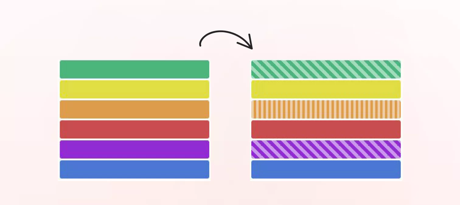
Use patterns and textures
Solely using color to differentiate sections or elements is not recommended. Textures and patterns are powerful tools for adding visual interest and functionality to design.
Break up monotony and create a more dynamic composition using textures and patterns.
Use contrast effectively with textures and patterns to improve accessibility for visually impaired people.
Break up monotony and create a more dynamic composition using textures and patterns.
Use contrast effectively with textures and patterns to improve accessibility for visually impaired people.
Choose thicker lines
Thin lines can be a challenge, especially on smaller screens or for viewers with visual limitations. Thicker lines stand out more, making it easier for viewers to see and understand the design.
Use thicker lines for borders and important elements to ensure they are easily visible.
Use thin lines to highlight borders, titles, or other key elements.
Use thin and thick lines to create a visual hierarchy and guide the viewer’s eye.
Use thicker lines for borders and important elements to ensure they are easily visible.
Use thin lines to highlight borders, titles, or other key elements.
Use thin and thick lines to create a visual hierarchy and guide the viewer’s eye.
Implement accessibility features for e-commerce websites
When designing e-commerce websites, consider colorblind people and add accessible features to ensure their successful use.
Choose the right button colors
Choosing the right colors for buttons is essential. Use colors that look attractive and convey to customers the desired activity.
Ensure sufficient contrast between text and button color for users with visual impairments.
Select button colors that stand out and provide clear labels.
Light backgrounds work well with bold colors, while dark backgrounds work well with brighter colors.
Ensure sufficient contrast between text and button color for users with visual impairments.
Select button colors that stand out and provide clear labels.
Light backgrounds work well with bold colors, while dark backgrounds work well with brighter colors.
Provide customizable themes
Not every user will find a single-color scheme appropriate. Allowing users to change the theme will enable them to customize the appearance and feel of the website to their preferences. Provide options like high-contrast themes or adjustable font sizes to help visually impaired users.
Do not rely only on color-coded alerts
Colorblind people can miss color-coded alerts without text. Effective communication requires more than just color-coded warnings to convey information. To make sure the message is understandable and available to all users, it’s critical to employ cues other than color.
Include text descriptions with color-coded alerts.
Text provides a clear and specific explanation of the alert’s meaning.
Text allows for additional emphasis through bolding or italics.
Include text descriptions with color-coded alerts.
Text provides a clear and specific explanation of the alert’s meaning.
Text allows for additional emphasis through bolding or italics.
Conclusion
When creating a website, consider accessibility for color blindness and make careful choices about color, labeling, and alt text.
Keep in mind that web accessibility benefits all users and creates a more equitable online environment.
Your efforts will improve the user experience for everyone, including colorblind people, and demonstrate a commitment to inclusivity on the web.
By incorporating the tips and strategies mentioned, you can ensure your projects are usable and enjoyable for everyone.
Remember, thoughtful design can make a significant difference.
We’d love to invite you to take a look at our Instagram page. It’s a community filled with amazing aspiring designers who are creating a more inclusive world through their incredible designs.
andrija & supercharge design team
Related blog posts
You might like the following


LIMITED-TIME OFFER
Get 12 premium members-only video lessons for free
Just tell us where to send them
You can unsubscribe at any time—no strings attached
LIMITED-TIME OFFER
Get 12 premium members-only video lessons for free
Just tell us where to send them
You can unsubscribe at any time—no strings attached