
Error Messages in UI/UX Design: How to Design Clear, Helpful, and Actionable Feedback
·
11 min read
Error messages are often treated as simple alerts, but their role goes beyond just informing users that something went wrong. They act as recovery tools that help users understand the issue and move forward.
For that to work, error messages need to be designed carefully. This includes placing them where users will notice them, using clear and straightforward language, preserving any progress the user has made, and offering a clear next step.
Their purpose is to help users recognize what went wrong, understand why it happened, and continue with as little confusion, delay, or data loss as possible.
In this article, we’ll go through the key principles behind effective error messages and how to apply them in practice.
Table Of Contents
Recovery and prevention
The best error message is the one the user never has to see. In many cases, the interface can prevent the problem before it happens.
Prevention comes down to reducing the chances of error in the first place. You can do this through:
Using constraints
Reasonable defaults
Confirmations for destructive actions
Communicating requirements early on
It’s also important to prevent users from entering states they can’t recover from, such as starting an action that can’t be completed.
Not all errors are the same, so they shouldn’t be handled in the same way.
Some errors are slips, like accidental clicks or typos. These can often be handled with more forgiving inputs, such as allowing easy corrections or supporting flexible formats.
Others are mistakes, where the user misunderstands how something works. In those cases, the interface should provide better guidance and make the expected outcome clearer.
Even with good prevention in place, errors will still happen. When they do, the worst outcome is a lack of feedback. If users don’t understand what went wrong or what to do next, they’re likely to get stuck or abandon the task completely.
Placement, timing, and visibility
Error messages should appear close to where the issue occurs. This gives users immediate context and makes it easier to understand what needs to be fixed without scanning the entire interface.
Visibility is just as important. Relying on a single visual cue is often not enough, so it’s better to combine multiple signals such as:
Clear text
Strong contrast
Borders
Icons
Highlighted sections
Clear text
Strong contrast
Borders
Icons
Highlighted sections
This helps ensure that the message is noticeable and accessible in different conditions.
For field-level issues, inline or contextual messages tend to work best. They allow users to identify and fix problems directly within the flow of the form, without interrupting the overall experience.
Timing also plays a role. Errors shouldn’t appear too early, especially during exploratory actions. For example, showing an error just because a user clicked into a field and left it empty can feel premature. It’s better to wait until there’s a clear intent to submit or complete the form.
When dealing with form submission errors, it’s useful to include a summary at the top of the page. This gives users an overview of what needs attention, especially in longer forms. Placing this summary below the action button is less effective, since it’s easy to miss.
If this is something that interests you, check out our article on Form Design Best Practices where you can learn how to design forms that are easier to complete.
Finally, placement should take real-world usage into account. On mobile devices, elements like keyboards, autofill suggestions, or zoom can obscure parts of the interface. In those cases, placing error messages above the field can be more reliable than placing them below, since they’re more likely to remain visible.

Language and specificity
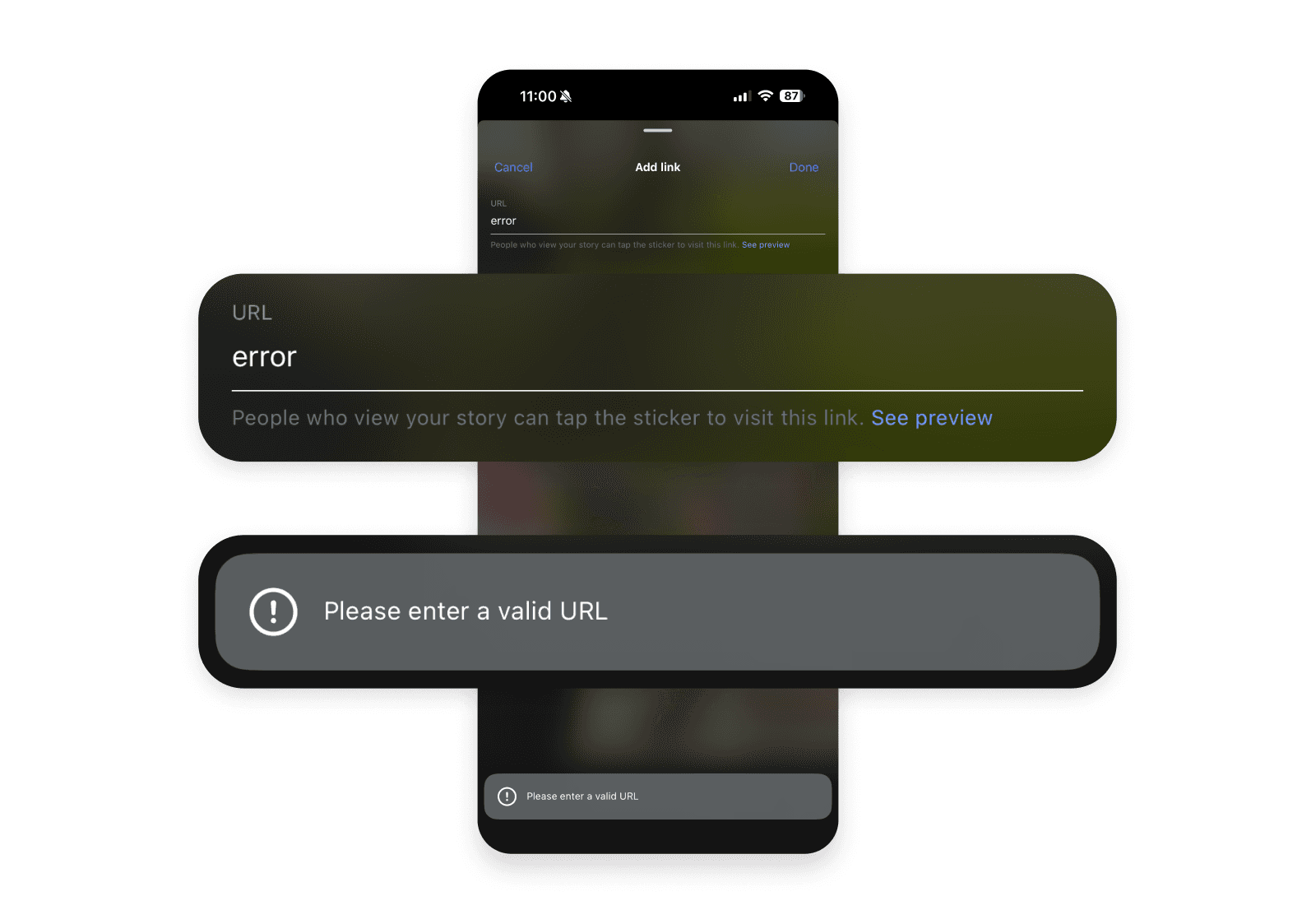
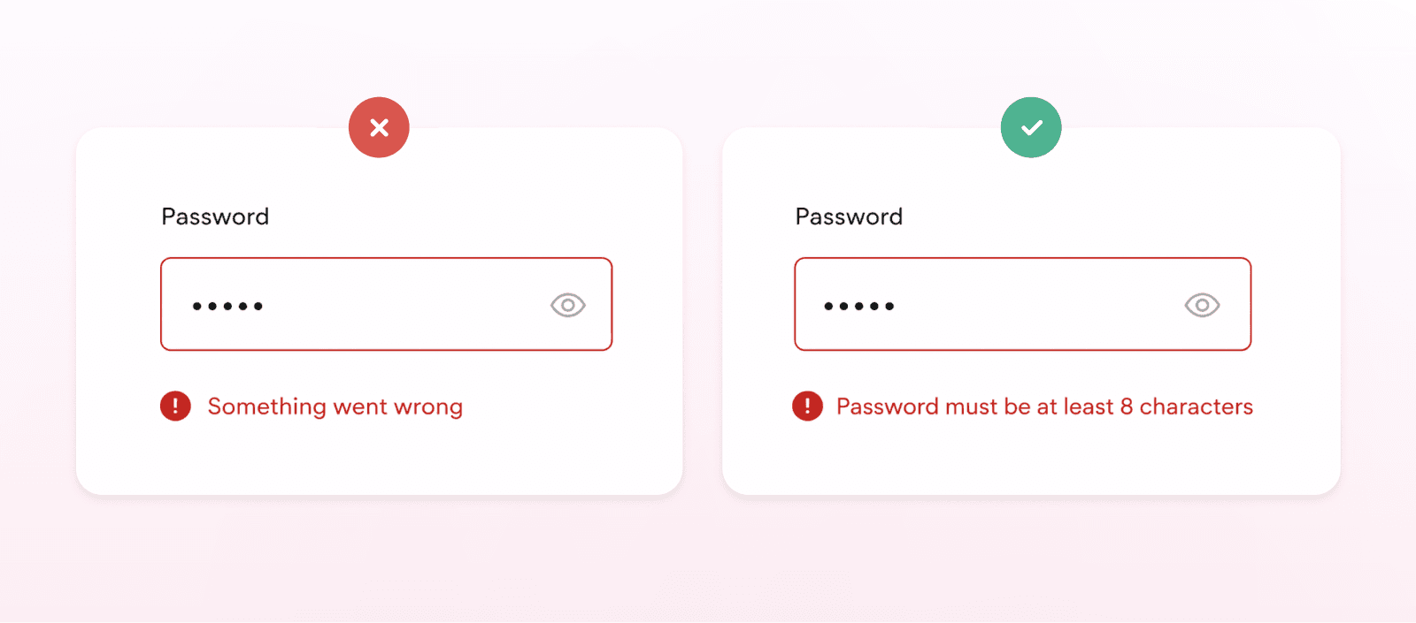
The way error messages are written has a direct impact on how quickly users can recover. Generic messages like “Something went wrong” don’t give enough information, while overly technical language can make the situation even more confusing.
Error messages should use plain, human-readable language. The goal is to:
Clearly describe what the issue is
Give just enough context about why it happened
Show the user what to do next
Clearly describe what the issue is
Give just enough context about why it happened
Show the user what to do next
Anything beyond that tends to add unnecessary noise.
Clarity improves when the message is specific. Instead of vague labels like “invalid input,” it’s more helpful to show what a correct input looks like. Concrete examples make it easier for users to fix the issue without guessing.
When messages are clear and specific, users spend less time figuring out what went wrong and more time resolving it.
Tone and emotional handling
The tone of an error message affects how users experience the situation. Even small issues can feel frustrating, especially if they interrupt progress or create uncertainty.
Error messages should use respectful and neutral language. Avoid phrasing that suggests the user did something wrong, and focus instead on what needs to be fixed. Validation isn’t just a technical step; it also has an emotional component, particularly when users are worried about losing their work or having to start over.
Providing reassurance can help in those moments. Let users know that their progress is safe where possible, and make it clear that the issue can be resolved. This reduces unnecessary stress and helps them continue with the task.
At the same time, messages should stay concise and focused. Extra words that don’t contribute to solving the problem tend to get in the way. The priority is to communicate what happened and what the user should do next.
Empathy works best when it’s practical. That means preserving user input when possible, avoiding interruptions that force users to repeat actions, and giving a clear next step so they can recover quickly.
In some edge cases, like broader system outages where users can’t take immediate action, a slightly more human or informal tone can help make the experience feel less rigid. This works best when the situation isn’t critical and expectations are set clearly.
Component choice and severity
The way an error is presented should match both its context and its impact on the user. Not every issue requires the same level of attention, so choosing the right UI pattern is important.
Inline messages are usually the best option for field-level validation, since they keep the feedback close to the input and make it easy to fix issues in place. Contextual cues can support this by providing subtle guidance or highlighting areas that need attention without interrupting the flow.
For broader issues that affect a section or an entire task, banners are often a better fit. They can communicate important information without fully blocking the user. Modals, on the other hand, should be used more carefully. They interrupt the experience and are best reserved for serious errors where users can’t continue without addressing the problem.
The format of the message should reflect how critical the issue is. Minor problems can be handled with lightweight notifications, while more serious issues may require more prominent patterns. The key is to use the least disruptive option that still keeps the message visible and actionable.
Toast messages are usually not the best choice for actionable errors. Because they disappear quickly and are often disconnected from the part of the interface where the issue occurred, they can be easy to miss and hard to act on. They can also create accessibility challenges.
In cases where the system cannot proceed at all, higher-impact patterns like full-screen error states may be necessary. For system or sync failures, it’s important to clearly explain what’s happening and what the user can do next. If there’s no meaningful action available, avoid suggesting things like “Try again,” as that can create confusion rather than helping the user move forward.
Component | Best used for | Why |
|---|---|---|
Inline messages | Field-level validation | Keep feedback close to the input and make it easy to fix issues in place |
Contextual cues | Subtle guidance, highlighting attention areas | Provide guidance without interrupting the flow |
Banners | Section-wide or task-level issues | Communicate important information without fully blocking the user |
Modals | Serious errors blocking progress | Interrupt the experience when users can’t continue without action |
Lightweight notifications | Minor problems | Low disruption while still informing the user |
Prominent patterns | More serious issues | Increase visibility when impact is higher |
Toast messages | Generally not suitable for actionable errors | Easy to miss, disconnected from context, and can create accessibility challenges |
Full-screen error states | System cannot proceed (e.g. system or sync failures) | Clearly explain what’s happening and what the user can do next |
Preserving effort and recovery design
When users encounter an error, they should be able to fix it without having to start over. Restarting a process adds unnecessary effort and is one of the more common reasons users abandon tasks.
A key part of this is preserving user input. Data that has already been entered should remain in place, so users can correct only what’s needed instead of re-entering everything. This is especially important in longer flows or forms where the effort investment is higher.
It also helps to reassure users that their progress is safe. Whether it’s saved drafts, items in a cart, or partially completed inputs, maintaining that state reduces frustration and builds trust in the system.
Validation should support this process, not make it harder. In some cases, flexibility is important. Inputs like names, addresses, or phone numbers can vary widely, so overly strict rules can create unnecessary friction.
In other cases, such as credit card numbers or IBANs, stricter validation is necessary, but it should always be paired with clear guidance so users know how to meet the requirements.
Overall, error handling should not increase the cost of completing a task. The effort required to recover should always be lower than the effort it took to get there in the first place.
Accessibility and measurement
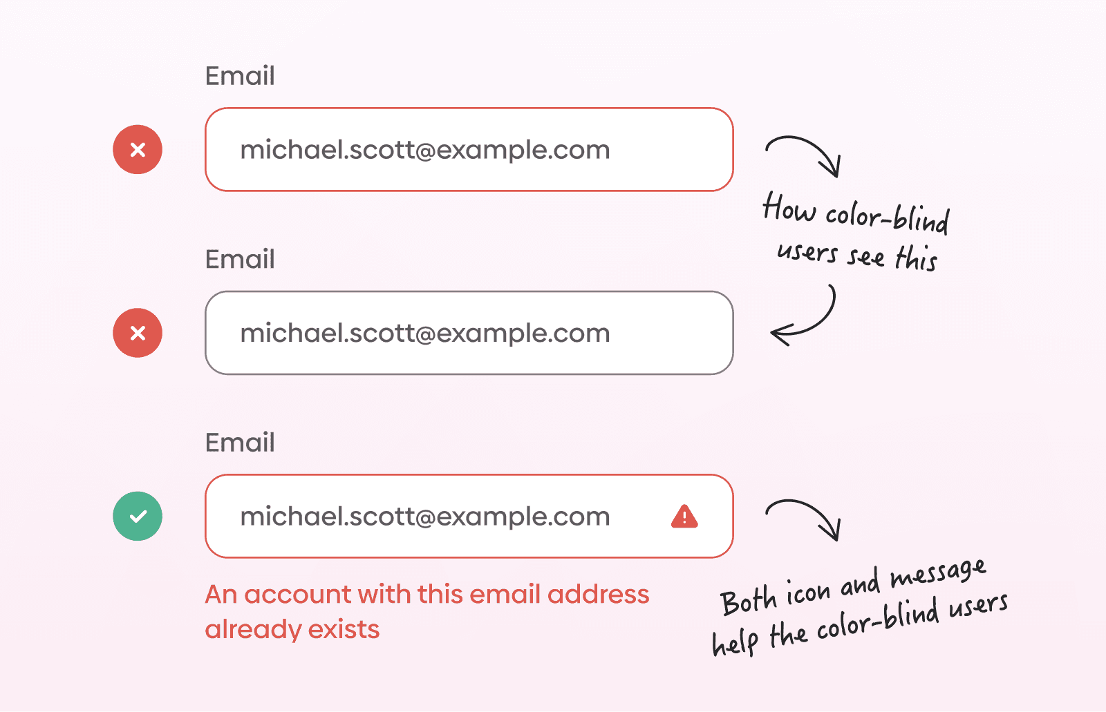
Error messages need to be accessible and easy to perceive in different conditions. Relying on color alone is not enough, since some users may not be able to distinguish colors clearly.
It’s better to combine multiple indicators such as icons, strong contrast, borders, or highlighted sections so the message is easier to notice and understand.
There are also practical usability issues to consider. On mobile devices, error messages can be obscured by virtual keyboards, autofill overlays, or screen magnification. If the message isn’t visible at the right moment, it loses its value, even if the content itself is clear.
Toast messages can create similar problems. Because they disappear after a short time, users may miss them or have no way to revisit the information. This makes them unreliable for communicating issues that require action.
In more complex interfaces, such as tables, error messages should stay close to the source of the problem. Displaying them inline at the row level is usually more effective than showing a general message elsewhere on the page.
To understand whether error handling is working well, it’s useful to measure it. Some common indicators include:
How many mistakes do users make during a task
How long it takes them to recover
Whether users complete the process
How much time the overall task takes
How many mistakes do users make during a task
How long it takes them to recover
Whether users complete the process
How much time the overall task takes
These metrics can help identify where users struggle and where improvements are needed.
Conclusion
Error messages are an inevitable part of any interface. What matters is how they’re handled.
A well-designed error message doesn’t interrupt the experience more than necessary. It fits into the flow, explains what’s needed, and allows users to continue without rethinking the entire task.
When error handling is done properly, it rarely stands out. Users simply correct the issue and move on. That’s usually the best outcome, not drawing attention to the problem, but making the recovery feel straightforward.
FAQs
Should error messages always explain why something went wrong?
Should error messages always explain why something went wrong?
Should I use icons alongside error messages?
Should I use icons alongside error messages?
Should error messages be logged or tracked?
Should error messages be logged or tracked?
How do I handle repeated or persistent errors?
How do I handle repeated or persistent errors?
What should happen after an error is resolved?
What should happen after an error is resolved?
We’re thrilled to invite you to join our incredible community of product designers (and enthusiasts) by following us on Instagram. We’re here to support you on your journey to falling in love with product design and advancing your career!
Keep on designing and stay hungry, stay foolish! 🥳
andrija & supercharge design team
Related blog posts
You might like the following


LIMITED-TIME OFFER
Get 12 premium members-only video lessons for free
Just tell us where to send them
You can unsubscribe at any time—no strings attached
LIMITED-TIME OFFER
Get 12 premium members-only video lessons for free
Just tell us where to send them
You can unsubscribe at any time—no strings attached