Everything should be made as simple as possible, but not simpler.
Often attributed to Albert Einstein

·
8 min read
Forms are one of the most common components in UX/UI design, but they’re also one of the easiest places to lose users. Whether someone is signing up, checking out, or submitting a request, the experience often comes down to how simple and clear the form feels.
In this article, we’ll go through what makes a good form, common mistakes to avoid, and form design best practices you can use to design forms that are easier to complete.
Forms are interactive components used to collect, validate, and submit user information to a server.
They’re a fundamental part of almost every digital product. You come across them when logging into a website, signing up for a newsletter, completing a purchase, or filling out a contact form.
In UX/UI design, a form is essentially an interface element that allows users to send data to a system. While that sounds straightforward, forms often play a key role in whether users can successfully complete a task or not.
Because of that, even small usability issues can have a noticeable impact. If a form is unclear or difficult to use, people are more likely to abandon it. But a well-designed form can make the interaction feel simple and predictable.
Since forms are so common and closely tied to key user actions, they’re something UX/UI designers need to approach carefully.
A good form design in UX is clear, concise, and easy to complete. It asks only for the information it actually needs, guides users through the process, and minimizes the effort required to finish it.
In practice, that means reducing friction at every step. The structure should feel logical, the labels should be easy to understand, and the inputs should behave as users expect. When the experience is intuitive, users don’t have to stop and think about what to do next.
Most form-related issues come down to a few common problems that lead to drop-offs:
Too many fields or unnecessary questions
Unclear labels or instructions
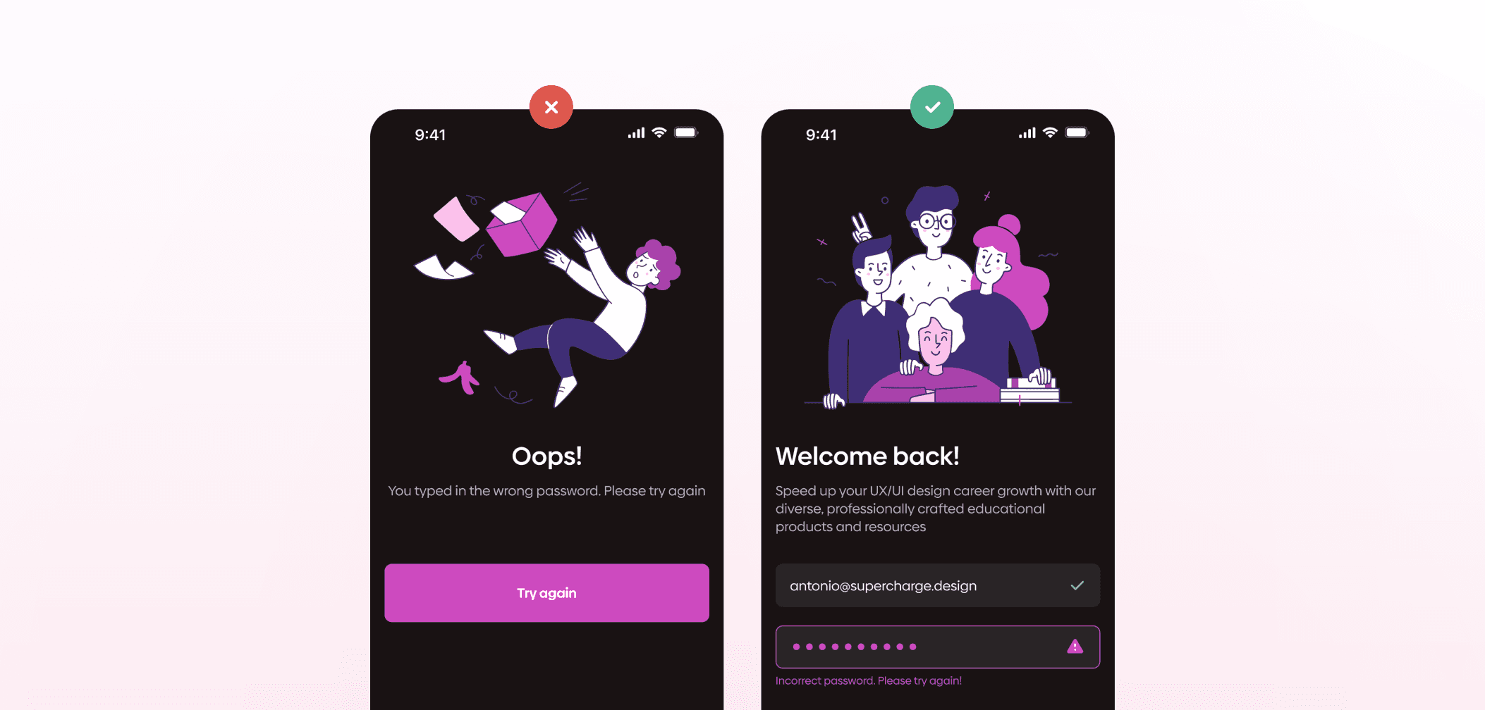
Poor error handling or confusing validation messages
Unclear or overly restrictive input requirements (e.g., strict password rules without guidance)
Lack of feedback or uncertainty about what happens next
Forms that don’t work well on mobile devices
When users encounter these types of friction, they’re more likely to abandon the process before completing it. That’s why good form design is all about removing obstacles.
The goal of any form is simple: users should be able to complete it without confusion or unnecessary effort. Most best practices come down to reducing friction and making the process as straightforward as possible.
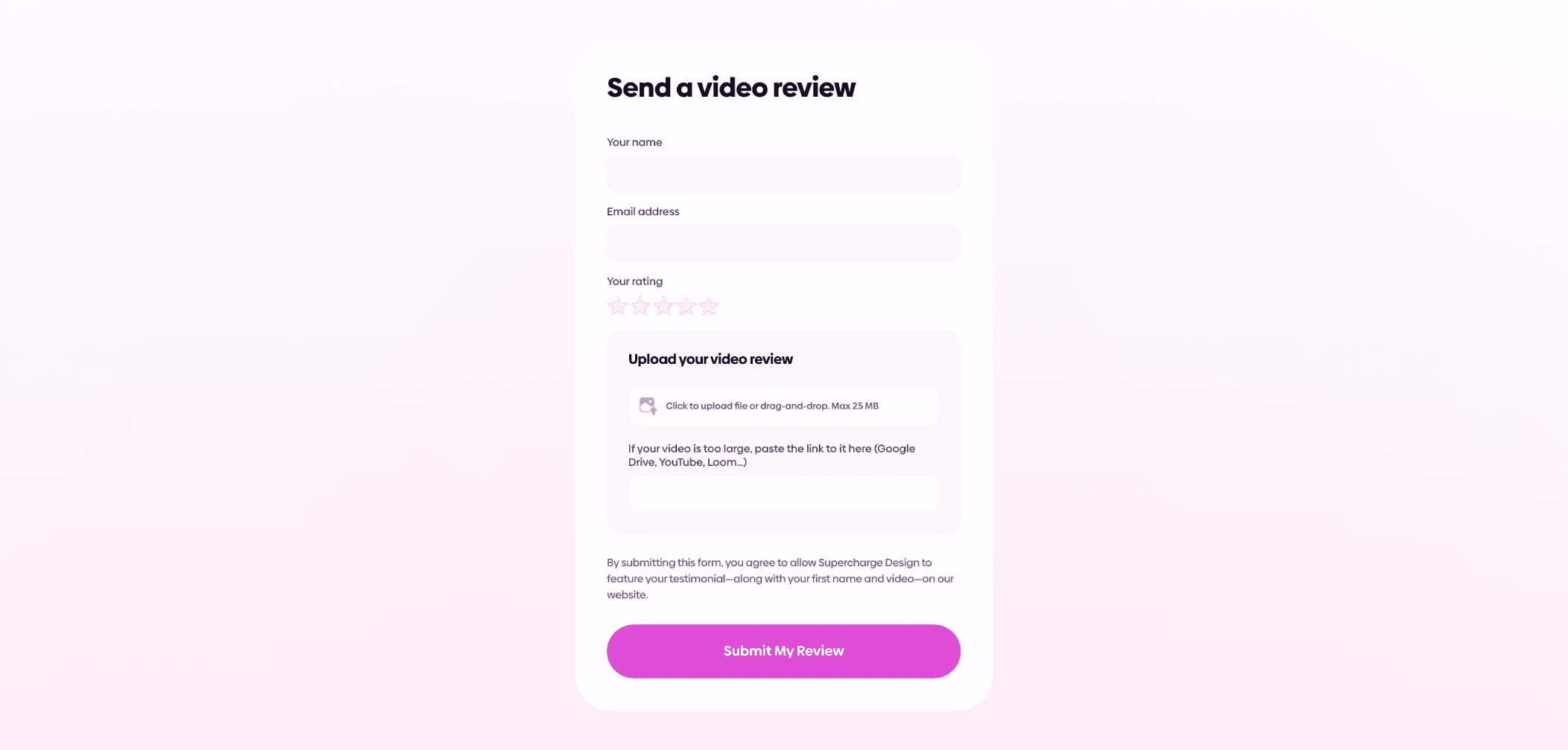
One of the first UX form best practices to consider is the number of fields. Only ask for information you actually need. Extra fields increase effort and can quickly discourage users. If some inputs are optional, make that clear so users know what they can skip.
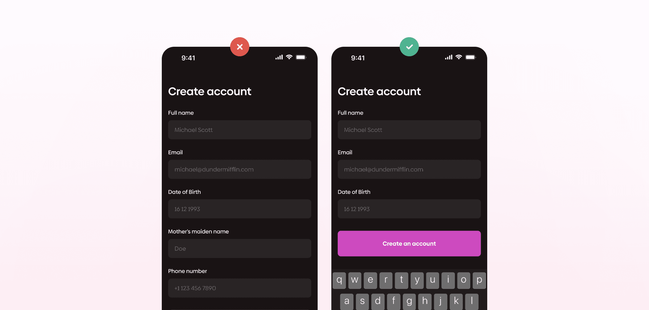
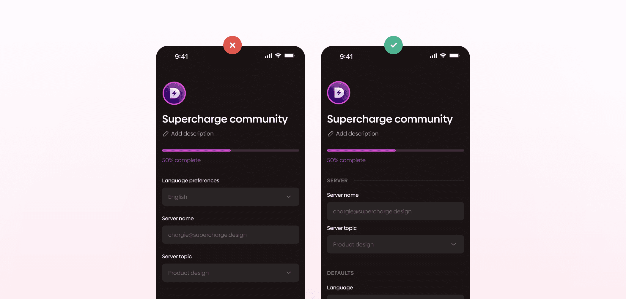
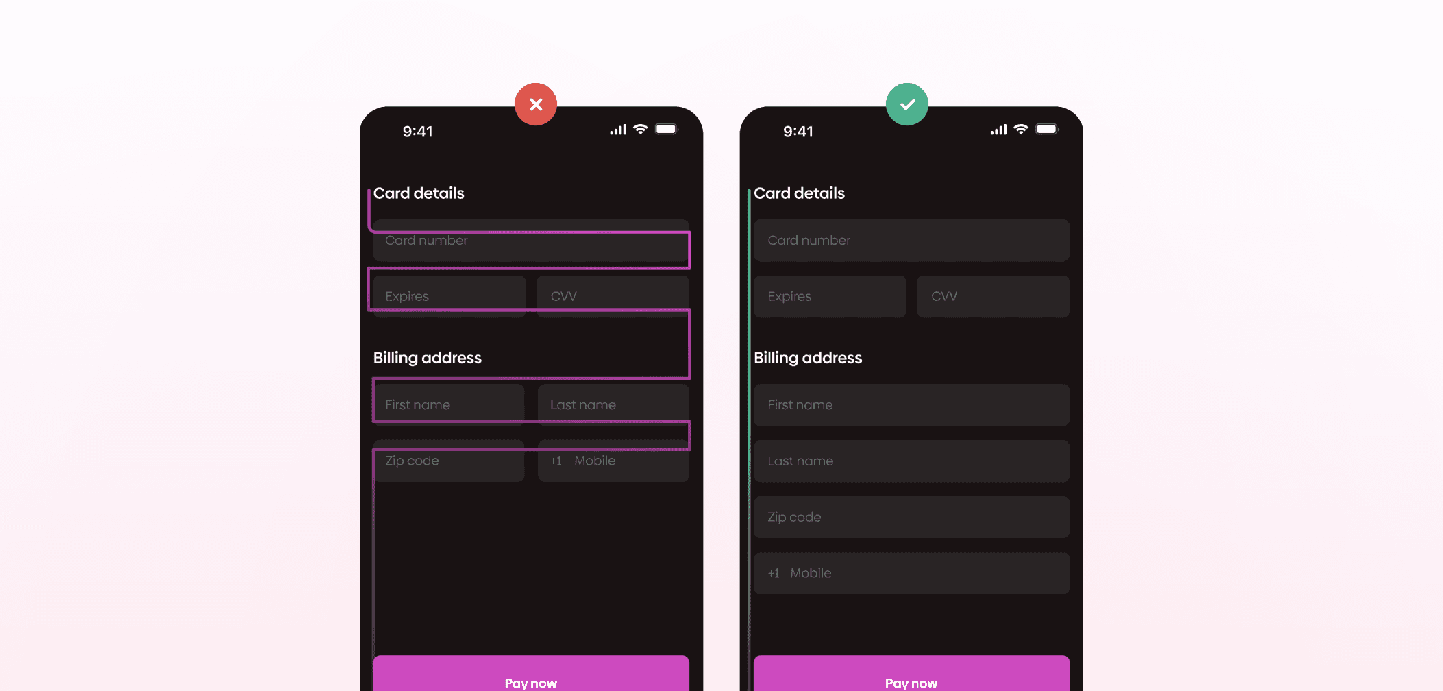
It’s also important to organize fields in a way that makes sense. Shifting from the keyboard input to dropdown selection, then back to the keyboard is not ideal. Group-related fields to reduce friction. Visual grouping supports this further. Spacing, section headings, or labels can make the structure easier to scan and follow.
Layout plays a big role as well. In most cases, a single-column layout works better than multiple columns. It creates a clear flow, reduces the chance of mistakes, and generally makes the form easier to complete. The same applies to label placement. Labels placed above input fields are easier to follow because they support a simple vertical reading pattern, instead of forcing users to scan back and forth.
Left-align the text as well. This complements the natural reading pattern and enables a shorter completion time.
The language you use should be clear and direct. Avoid technical terms or internal wording, and focus on what users will immediately understand. Products like Slack are a good reference for this kind of straightforward communication.
Real-time (inline) validation helps users correct errors immediately instead of after submission, reducing frustration and improving completion rates.
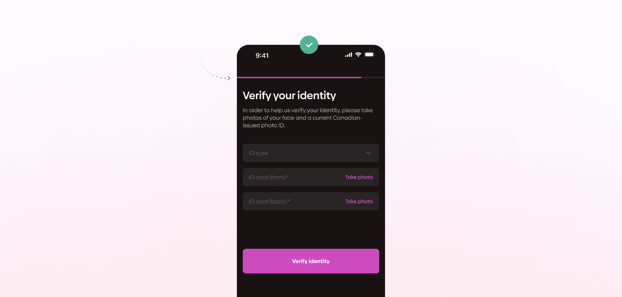
For longer or more complex forms, showing progress helps users. A progress bar or step indicator gives users a sense of how much is left, which can make the process feel more manageable. Similarly, letting users know what happens next, whether it’s a confirmation, review step, or next page, reduces uncertainty and helps them move forward with confidence.
On mobile devices, it’s best to rely on native OS features whenever possible. Both iOS and Android provide built-in input methods like date pickers or numeric keyboards. Users are already familiar with these patterns, and they tend to be more reliable than custom solutions.
In general, form design doesn’t need to be reinvented. The focus should stay on clarity, usability, and making the process as easy as possible for users to complete their task.
Forms are interactive components used to collect, validate, and submit user information to a server.
They’re a fundamental part of almost every digital product. You come across them when logging into a website, signing up for a newsletter, completing a purchase, or filling out a contact form.
In UX/UI design, a form is essentially an interface element that allows users to send data to a system. While that sounds straightforward, forms often play a key role in whether users can successfully complete a task or not.
Because of that, even small usability issues can have a noticeable impact. If a form is unclear or difficult to use, people are more likely to abandon it. But a well-designed form can make the interaction feel simple and predictable.
Since forms are so common and closely tied to key user actions, they’re something UX/UI designers need to approach carefully.
A good form design in UX is clear, concise, and easy to complete. It asks only for the information it actually needs, guides users through the process, and minimizes the effort required to finish it.
In practice, that means reducing friction at every step. The structure should feel logical, the labels should be easy to understand, and the inputs should behave as users expect. When the experience is intuitive, users don’t have to stop and think about what to do next.
Most form-related issues come down to a few common problems that lead to drop-offs:
Too many fields or unnecessary questions
Unclear labels or instructions
Poor error handling or confusing validation messages
Unclear or overly restrictive input requirements (e.g., strict password rules without guidance)
Lack of feedback or uncertainty about what happens next
Forms that don’t work well on mobile devices
When users encounter these types of friction, they’re more likely to abandon the process before completing it. That’s why good form design is all about removing obstacles.
The goal of any form is simple: users should be able to complete it without confusion or unnecessary effort. Most best practices come down to reducing friction and making the process as straightforward as possible.
One of the first UX form best practices to consider is the number of fields. Only ask for information you actually need. Extra fields increase effort and can quickly discourage users. If some inputs are optional, make that clear so users know what they can skip.
It’s also important to organize fields in a way that makes sense. Shifting from the keyboard input to dropdown selection, then back to the keyboard is not ideal. Group-related fields to reduce friction. Visual grouping supports this further. Spacing, section headings, or labels can make the structure easier to scan and follow.
Layout plays a big role as well. In most cases, a single-column layout works better than multiple columns. It creates a clear flow, reduces the chance of mistakes, and generally makes the form easier to complete. The same applies to label placement. Labels placed above input fields are easier to follow because they support a simple vertical reading pattern, instead of forcing users to scan back and forth.
Left-align the text as well. This complements the natural reading pattern and enables a shorter completion time.
The language you use should be clear and direct. Avoid technical terms or internal wording, and focus on what users will immediately understand. Products like Slack are a good reference for this kind of straightforward communication.
Real-time (inline) validation helps users correct errors immediately instead of after submission, reducing frustration and improving completion rates.
For longer or more complex forms, showing progress helps users. A progress bar or step indicator gives users a sense of how much is left, which can make the process feel more manageable. Similarly, letting users know what happens next, whether it’s a confirmation, review step, or next page, reduces uncertainty and helps them move forward with confidence.
On mobile devices, it’s best to rely on native OS features whenever possible. Both iOS and Android provide built-in input methods like date pickers or numeric keyboards. Users are already familiar with these patterns, and they tend to be more reliable than custom solutions.
In general, form design doesn’t need to be reinvented. The focus should stay on clarity, usability, and making the process as easy as possible for users to complete their task.
How you write form copy has a direct impact on whether users complete it or not. Clear, well-structured copy can make the process feel simple, while vague or confusing wording can slow users down or lead to drop-offs. If the importance of microcopy in UI design is something that interests you, check out our article on How to Write Microcopy in UI.
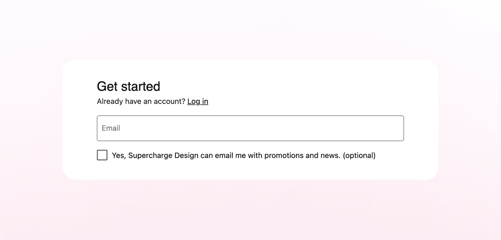
Field labels should be clear and concise. The goal is to communicate what’s needed using as few words as possible, without sacrificing clarity. Tone also matters here. It should feel natural and consistent with the rest of the product.
In cases where there’s any chance of confusion, it helps to provide extra guidance. This can be done through short helper text, examples, or brief instructions placed near the input. The idea is to answer potential questions before users have to stop and think.
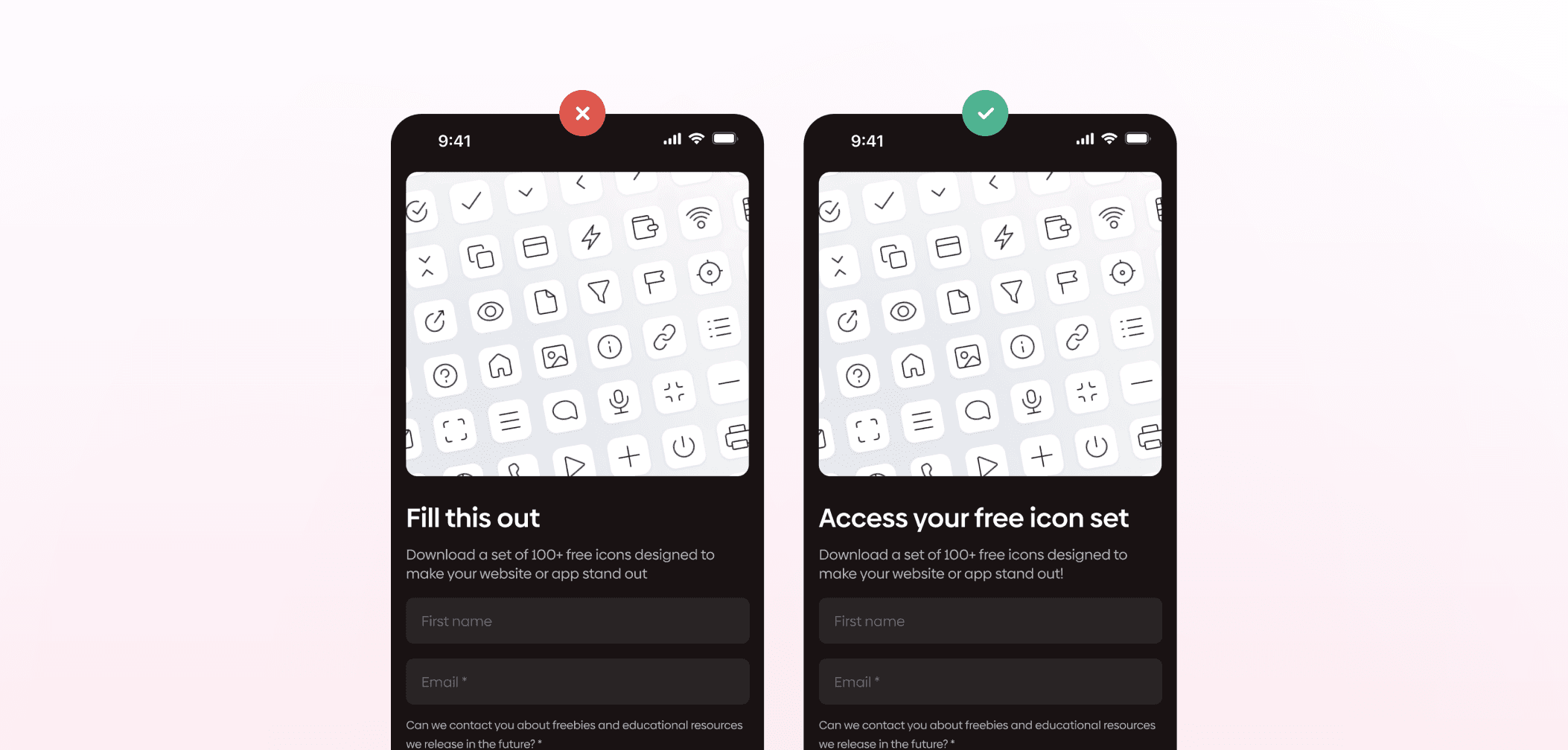
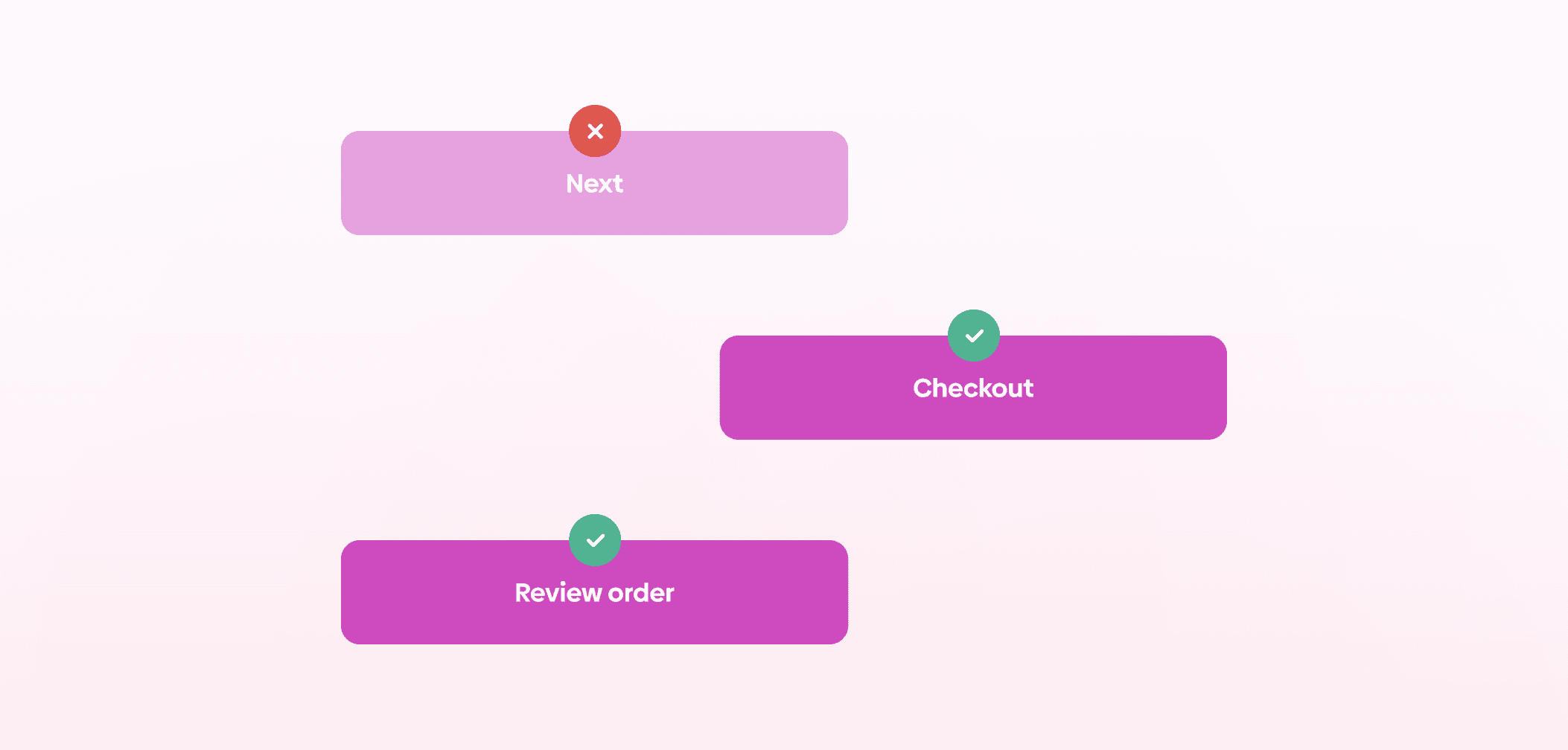
Button labels are another important part of form copy. Instead of using generic labels, it’s better to describe the action clearly. Phrases like “Sign up” or “Create account” set clearer expectations than something vague like “Submit”.
Placeholder text should not replace labels. Since it disappears once users start typing, it can create unnecessary friction if they forget what the field was for. A better approach is to use labels for clarity and placeholders to support formatting, such as showing an example input.
It’s also important to make any required input format clear from the start. Whether it’s a password requirement, date format, or specific input structure, providing that information upfront reduces guesswork and helps users complete the form more efficiently.
As with the rest of form design, the goal is to keep things as simple as possible while still collecting the information you actually need. Being concise helps, but only if it doesn’t come at the cost of clarity or usefulness.
Everything should be made as simple as possible, but not simpler.
Often attributed to Albert Einstein
Everything should be made as simple as possible, but not simpler.
Often attributed to Albert Einstein
Forms appear in different contexts depending on the product and the goal of the interaction. While their structure may vary, most fall into a few common categories.
Registration and sign-up forms are used to create new user accounts. They typically collect basic information such as name, email, and password, and are often the first interaction users have with a product.
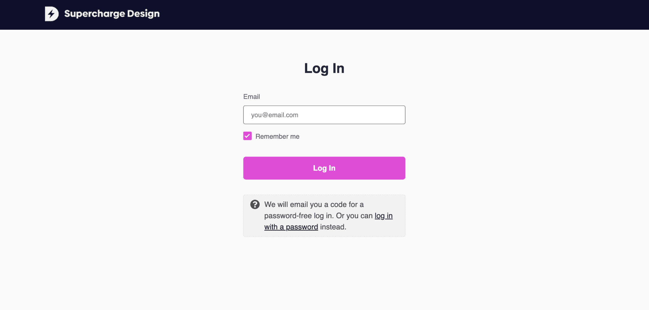
Log-in forms are simpler and focus on giving returning users access to their accounts. Because they’re used frequently, clarity and speed are especially important here.
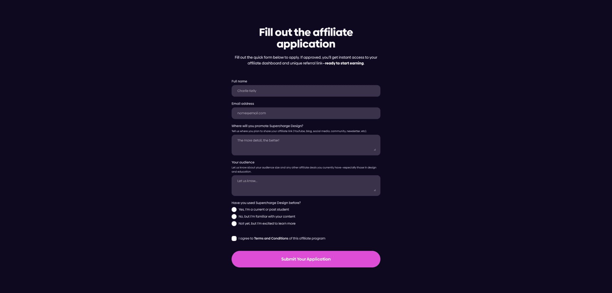
Application forms are more detailed than registration or log-in forms. They are used when users need to provide more structured or extensive information. This could include job applications, onboarding flows, or service requests.
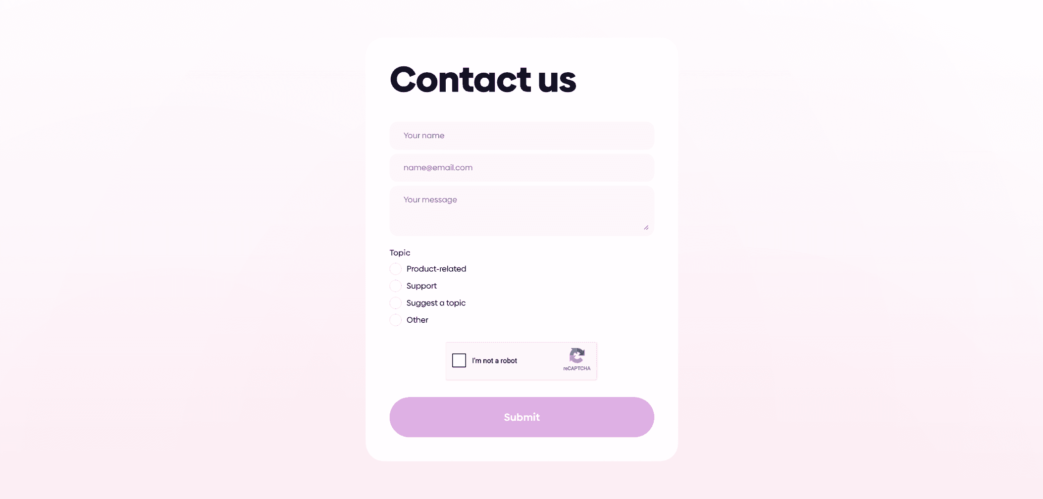
Contact forms allow users to get in touch with a company or support team. These forms are typically short and focused on collecting just enough information to respond effectively.
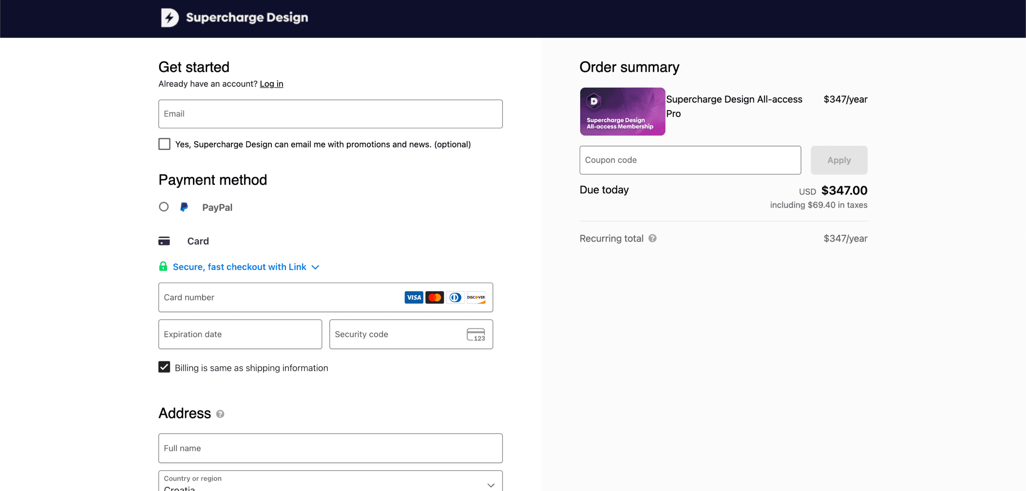
Checkout forms are a key part of e-commerce experiences. They guide users as they provide shipping, billing, and payment details, and are directly tied to conversion, which makes their usability especially important.
Lead generation forms are designed to collect user information for marketing or sales purposes. They are often used in exchange for something, such as a downloadable resource or access to content.

Surveys and questionnaires are used to gather feedback or insights from users. These forms can vary in length and complexity, depending on the type of data being collected.
If you wish to learn everything about high-quality UX surveying in one sitting, our User Researcher's Guide to Surveys is just what you need. And the best thing? It's completely free!
Before launching a form, it’s important to test it thoroughly. Even small issues can affect completion rates, so catching them early can make a noticeable difference.
Start by checking the core functionality. This includes things like input fields, validation states, and any conditional logic. Make sure error messages appear when they should, and that they’re clear enough for users to understand how to fix the issue.
It’s also important to test across different browsers. Begin with the most commonly used ones and ensure the form behaves consistently in each of them.
Mobile testing is another key step. Forms often behave differently on smaller screens, so you should check layout, input methods, and overall usability on both iOS and Android devices.
If time and resources allow, running a user testing session can provide useful insights. Watching how people interact with the form can reveal issues that aren’t always obvious during internal testing.
Finally, evaluate performance. Analyze how long it takes for the form to load, how quickly it responds to user input, and completion time. These factors all contribute to the overall experience and can influence whether users finish the process.
UX/UI design forms are a core part of most digital products, and in many cases, they’re directly tied to key user actions like signing up, making a purchase, or getting in touch.
Because forms are so critical, small design decisions can have a noticeable impact. The number of fields, the way information is grouped, the clarity of labels, and the overall flow all influence how easy the form is to complete.
The same applies to copy and testing. Clear, straightforward language helps users move through the form with less effort, while proper testing ensures everything works as expected across different devices and scenarios.
In the end, good form design is about making the process feel simple and predictable. When users understand what’s expected and don’t run into unnecessary friction, they’re much more likely to complete the task.
We’re thrilled to invite you to join our incredible community of product designers (and enthusiasts) by following us on Instagram. We’re here to support you on your journey to falling in love with product design and advancing your career!
Keep on designing and stay hungry, stay foolish! 🥳
andrija & supercharge design team
LIMITED-TIME OFFER
Just tell us where to send them
You can unsubscribe at any time—no strings attached
LIMITED-TIME OFFER
Just tell us where to send them
You can unsubscribe at any time—no strings attached