
What Is a UX Audit? A Complete Guide
·
12 min read
A UX audit is a close look at your website or app to identify usability issues that might be hurting performance. It examines how your digital product supports, or gets in the way of, your users, and turns those findings into practical improvements.
In this guide, you’ll learn what a UX audit is, the key benefits and limitations of running an audit, and how to prioritize what to fix first.
To make things easier, we added a UX audit checklist that covers key areas like usability, UX and UI design, accessibility, and best practices. This helps you evaluate your experience in a more organized way, with a clear start and finish point.
Table Of Contents
What is a UX audit?
A UX audit is a structured evaluation of your website or app, designed to uncover usability issues that may be quietly hurting performance. You might also hear it referred to as a UX review, but the goal is the same: to take a close look at how your digital product supports (or blocks) your users.
Unlike surface-level feedback or quick visual critiques, a UX audit is grounded in established UX research and best practices. It uses proven methods to review navigation, how clear the content is, how users interact with it, how accessible it is, and the overall flow of the user experience. The aim is to identify what feels "off" and to clearly pinpoint where users are struggling and why.
From there, the audit provides clear and actionable recommendations to resolve those issues. Instead of vague suggestions, you receive specific guidance that your design and development teams can carry out. The result is often a smoother, more intuitive experience that leads to stronger engagement, higher user satisfaction, and improved conversion rates.
Many UX audits include benchmarking. This means evaluating your product’s user experience against industry standards, recognized best practices, and competitor experiences. Benchmarking gives you context. It shows not only what needs improvement, but how your experience compares in the broader market. It also provides measurable indicators you can track over time.
It’s important to distinguish a UX audit from usability testing. Usability testing involves observing real users as they interact with a live interface. It can reveal how people behave, where they hesitate, and what confuses them. If you want to learn more about usability testing, check out our blog on that topic.
A UX audit, on the other hand, takes a systematic, expert-driven approach based on established research. It analyzes the interface to explain why issues are occurring and how they can be resolved.
The two methods work especially well together. Testing uncovers behavioral patterns; auditing interprets them and translates findings into systematic improvements.
The final output of a UX audit is a prioritized set of prioritized recommendations that can guide your design and development work. Alongside these recommendations, you receive benchmarks that allow you to measure progress and continuously improve your user experience over time.

UX audit benefits
A UX audit provides clear, tailored recommendations to improve the usability and overall performance of your website or app. Instead of relying on assumptions or scattered feedback, you get insights that highlight what’s working, what’s not, and exactly where to focus your efforts.
It’s one of the most effective ways to uncover hidden friction in the user journey. Small usability issues such as confusing navigation, unclear CTAs, and unnecessary steps often go unnoticed on the inside but have a big impact on real users. An audit brings these friction points to the surface and helps guide smarter, more confident decisions.
By making your site easier and more intuitive to use, a UX audit can improve customer satisfaction. When users can achieve their goals quickly and without confusion, they’re far more likely to stay engaged. At the same time, reducing frustration and eliminating drop-off points means fewer abandoned carts, fewer incomplete sign-ups, and fewer support tickets.
A UX audit also enables data-driven decision-making. Instead of investing time and budget into changes based on guesswork, you can focus on improvements that lower acquisition and support costs while delivering measurable impact. This focused approach cuts unnecessary development work and ensures your team spends time where it matters most.
Perhaps most importantly, a UX audit often reveals what your users actually need, not just what you assume they need. These insights help you build experiences that resonate, increasing customer retention and boosting lifetime value.
And the result is often higher conversion rates and a user experience that supports sustainable revenue growth.


UX audit limitations
While a UX audit can deliver significant value, it’s important to understand its limitations. One of the main considerations is cost. A thorough audit requires time, expertise, and careful analysis, which means it may not be the right fit for every company, especially those with very limited budgets or early-stage products still in rapid experimentation mode.
Another challenge is the volume of insights you receive. A good auditor will help you prioritize recommendations and focus on high-impact improvements first. Still, the amount of data and identified issues can initially feel overwhelming. Seeing everything that needs improvement at once can be tough, particularly for teams that have invested heavily in the current version of their product.
Finally, a comprehensive UX audit takes time. Properly evaluating user flows, interface patterns, usability barriers, and performance issues cannot be rushed without sacrificing depth and quality. If you’re looking for instant fixes, an audit may feel slower than expected. But that upfront investment in time is often what makes the recommendations meaningful and actionable in the long run.
How to do a UX audit
When you do a UX audit, the goal is to figure out the usability issues real users run into. Here's how to get started:
Set up for success
A successful UX audit starts with clarity. The first step is defining your goals. What are you trying to improve? Conversions, retention, onboarding, and task completion time? When you have a clear goal, you know where to begin and which data truly matter. Without that focus, it’s easy to get lost in surface-level issues instead of solving meaningful problems.
Next, start gathering user data. If you’re auditing an existing product, you need to understand what users are actually doing inside your app or website. An analytics tool is essential, whether that’s Google Analytics or another platform that tracks behavior, flows, and drop-offs. Real data grounds your audit in reality and prevents decisions based on assumptions.
It’s also important to involve the right people. For larger audits, bringing together design, development, product, and marketing teams can create alignment early on. When everyone understands the goals and contributes their perspectives, recommendations are easier to implement and far more effective.
Because a UX audit could theoretically continue forever, setting a clear endpoint is crucial. Set a realistic timeline for the analysis phase. A thorough audit usually takes two to four weeks, but this can vary depending on the scope. Outlining milestones and deadlines helps you stay focused and keep momentum going.
Creating user personas for each key audience is another foundational step. Personas clarify who you’re designing for and keep discussions centered around real user needs rather than internal preferences.
Finally, map out your customer journeys. Seeing how different personas move through your app and what they’re trying to achieve at each stage gives you a clear, structured overview of the experience. It highlights friction points, missed opportunities, and areas where the journey can be simplified or strengthened.
When these elements are in place, your UX audit becomes focused, collaborative, and far more likely to drive meaningful results.
Uncover behavioral patterns and the "why" behind them
A strong UX audit goes beyond surface-level metrics. It looks for hidden trends in user behavior and works to understand the reasons behind them. Data tells you what is happening; your job is to uncover why.
Start by analyzing your conversion data. Where are users completing key actions, and where are they dropping off? Identify patterns in conversion performance and compare results across different segments.
Break down metrics relevant to your goals by user personas, traffic sources, devices, or specific products. Different audience groups often behave in very different ways. What works for one segment might create friction for another.
Examine both web and app data closely. Look at how performance differs across pages and audience segments. Inconsistencies can be especially revealing. A page with an unusually high bounce rate or a sudden drop in engagement often signals a deeper usability issue.
Quantitative data is powerful, but pairing it with qualitative insights creates a fuller picture. Conduct usability tests to observe real users interacting with your product. Usability testing is a practical UX research method that helps uncover issues before they become expensive to fix.
After testing, consider running user interviews. Conversations provide context, clarify frustrations, and help you understand user expectations. Often, what seems like a small issue from a metrics perspective feels significant to users.
Finally, watch recordings of key user journeys. Seeing where users hesitate, get confused, or abandon tasks can quickly highlight friction points that analytics alone might miss. To do this, you can use various tools such as Hotjar, Microsoft Clarity, or Mouseflow, which allow you to observe real user behavior, analyze click and scroll patterns, and identify usability challenges with far more context.
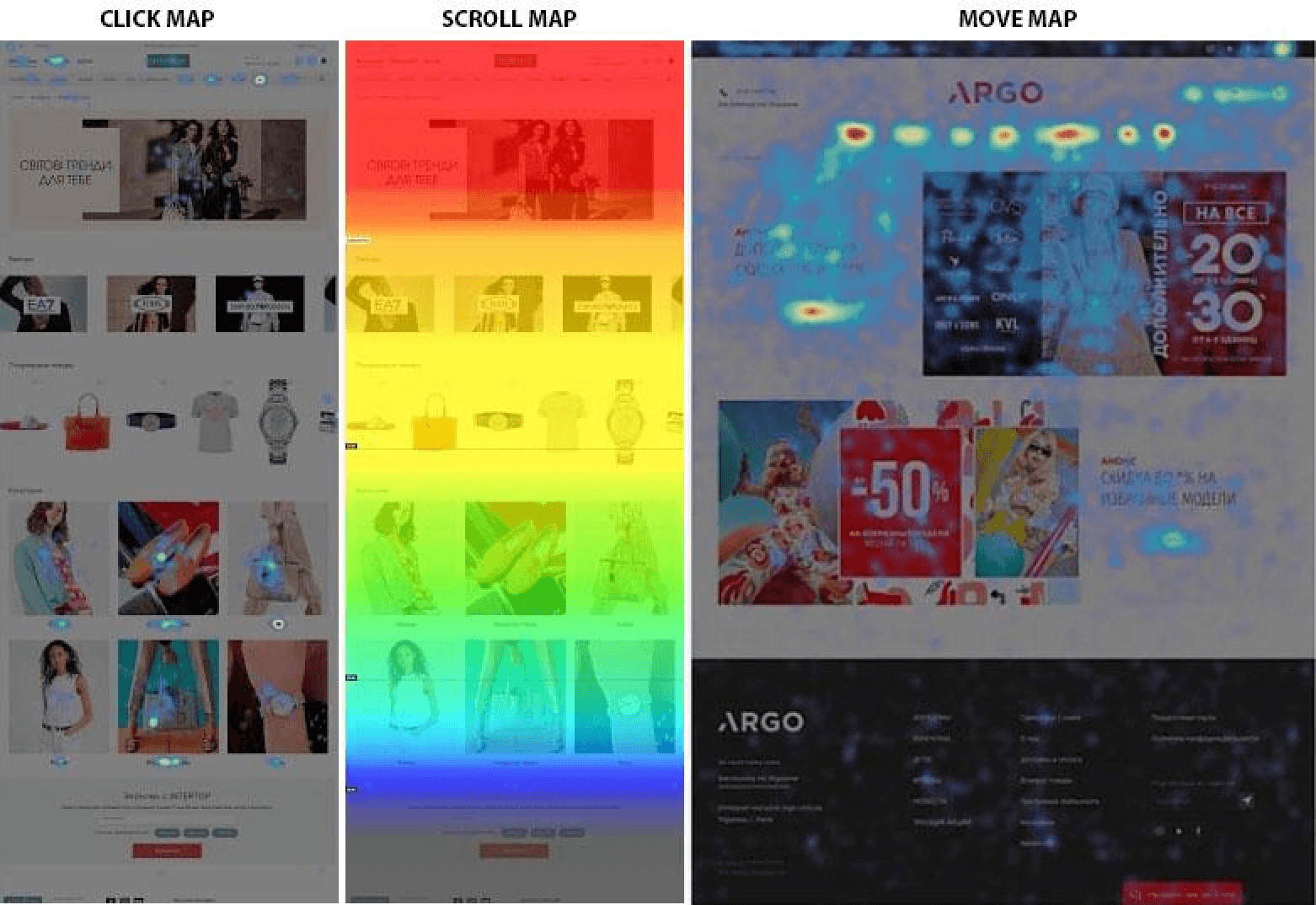
Source: Hotjar
Analyze, prioritize, and define improvements
Once the data is collected, the next step is a systematic evaluation.
Begin by analyzing all findings thoroughly. Look for patterns across data sources such as analytics, usability tests, interviews, and recordings. The goal is to connect insights rather than to treat each issue in isolation.
Next, clearly identify the key problems. Separate minor usability irritations from critical blockers that impact conversions, retention, or customer satisfaction.
Then, rank the issues by urgency and impact. Prioritization is a must. Focus first on high-impact problems that affect core user journeys or revenue-driving actions.
Finally, define actionable UX improvements. Recommendations should be specific, practical, and aligned with business goals. Not vague suggestions, but clear next steps that your team can execute.
Share findings and align the team
A UX audit only delivers value if its insights are shared clearly and effectively.
Create a comprehensive UX audit report that outlines your findings, priorities, and recommended actions. Structure it in a way that is easy to scan and understand.
Where possible, include links to key data sources such as analytics dashboards, session recordings, and usability test summaries so that colleagues can explore the evidence themselves. Transparency builds trust and makes it easier to secure buy-in.
When insights are clearly communicated and backed by data, teams can move forward confidently, aligned around meaningful improvements that enhance both user experience and business performance.
UX audit checklist
Here's a UX audit checklist you can use as a starting point when evaluating your website or app.
Usability heuristics
The system provides clear and timely feedback about what is happening.
The interface uses familiar language and follows real-world conventions.
Users can easily undo, cancel, or exit unwanted actions.
The design is consistent and follows platform and industry standards.
Errors are prevented where possible through smart design and confirmation.
Important information and actions are visible, minimizing the need to remember things.
The interface supports both beginners and advanced users with flexible shortcuts.
The design is clean and focused, without unnecessary information.
Error messages are clear, specific, and provide helpful solutions.
Help or documentation is available when needed, without overwhelming the user.
UX design
UX writing is clear, helpful, and supports users in understanding, navigating, and taking action.
Navigation and interaction patterns allow users to move through the product easily and complete tasks efficiently.
Search and filtering tools help users quickly find and refine information.
Forms and registration processes are short, well-structured, and minimize errors.
Design decisions apply principles of human behavior and cognitive psychology.
User research methods inform design decisions and reflect real user needs.
Ideas are validated early through testing to uncover usability issues before development.
UI design
Layout and spacing create a clean, organized, and easy-to-scan interface.
Shadows and visual depth are used purposefully to establish hierarchy and interactivity.
Colors are applied meaningfully, with proper contrast and accessibility in mind.
Typography is clear, readable, and visually consistent with a strong hierarchy.
Icons and imagery are high quality, consistent, and support understanding.
Buttons and interactive elements are visually distinct, intuitive, and provide feedback.
UI components (forms, dropdowns, tables, modals, etc.) are consistent and well-structured.
Visual hierarchy effectively guides attention and prioritizes important content.
Accessibility
Animations are subtle, non-disruptive, and can be reduced or disabled if needed.
Visual appearance supports readability with sufficient contrast and a clear structure.
Color is not the only way information is communicated, and it meets accessibility contrast standards.
Content is structured clearly with proper headings, labels, and meaningful text.
Media (images, video, audio) includes appropriate alternatives like alt text, captions, or transcripts.
The interface is fully usable with a keyboard and supports a logical focus order.
Interactive elements are clearly identifiable, accessible, and provide proper feedback.
Forms are accessible, properly labeled, and provide clear validation and error messaging.
The mobile experience is responsive, readable, and usable across devices and assistive technologies.
Best practices
Collaboration and handoff processes are clear, documented, and aligned across teams.
The product aligns with business goals, strategy, and defined success metrics.
User flows are simple, logical, and free of unnecessary friction.
The design minimizes cognitive load and avoids overwhelming users.
The product builds trust through transparency, clarity, and ethical design choices.
Emotional design supports a positive, engaging user experience.
Patterns and components are used consistently across the product.
The interface reinforces value clearly and communicates benefits effectively.
Privacy and data practices are transparent, responsible, and user-centered.
Conclusion
A UX audit is about creating clarity. When you evaluate your product through structured analysis, real user data, and established best practices, patterns start to appear. Friction becomes visible. Assumptions are replaced with evidence. And instead of random fixes, you get a clear direction on what to improve first.
Not every product needs an audit at every stage. But when usability issues start affecting engagement, conversions, or retention, a systematic review can uncover what’s holding users back.
We’re thrilled to invite you to join our incredible community of product designers (and enthusiasts) by following us on Instagram. We’re here to support you on your journey to falling in love with product design and advancing your career!
Keep on designing and stay hungry, stay foolish! 🥳
andrija & supercharge design team
Related blog posts
You might like the following


LIMITED-TIME OFFER
Get 12 premium members-only video lessons for free
Just tell us where to send them
You can unsubscribe at any time—no strings attached
LIMITED-TIME OFFER
Get 12 premium members-only video lessons for free
Just tell us where to send them
You can unsubscribe at any time—no strings attached