
Iconography in UI Design: How to Create Clear, Consistent, Accessible Icons
·
11 min read
Icons are one of the most common elements in UI design. They help users recognize actions, navigate through a product, understand content, and complete tasks faster.
But iconography is not just about choosing symbols that look good. Icons need to be clear, consistent, accessible, and appropriate for the context in which they appear. If users have to stop and guess what an icon means, it is not supporting the interface well.
In this article, we’ll go through what iconography means inside and outside UI design, how to approach icons as part of a system, and what to keep in mind when choosing, designing, or testing them.
Table Of Contents
Iconography outside of UI design
Iconography existed long before digital interfaces. Throughout history, people have been using images, signs, and symbols to communicate.
You can see this across many contexts. Road signs, maps, airports, public spaces, branding, art, religion, and culture all rely on visual elements to communicate meaning. Oftentimes, visual communication makes information easier to process, especially when text would be too slow, too long, or language-dependent.
It’s also useful to know the difference between icons, symbols, and pictograms:
Icons usually resemble what they represent, which makes them easier to recognize.
Symbols depend more on learned or cultural meaning, so they require some prior understanding.
Pictograms are simplified images commonly used in public systems where clarity and speed are important.
Even though visual elements are often treated as universal, their meaning can vary. Interpretation changes across cultures, generations, industries, and contexts. The same shape or sign can communicate different things depending on where it appears and how it’s used.
Context plays a key role here. Without it, even a familiar symbol can become unclear or misleading.
Another important difference is that, outside of UI design, most icons are not interactive. They are used to inform, guide, identify, warn, or influence behavior, rather than trigger actions.
Studying iconography outside UI design helps us as designers see icons as part of a broader visual communication system, and not just as an interface decoration.

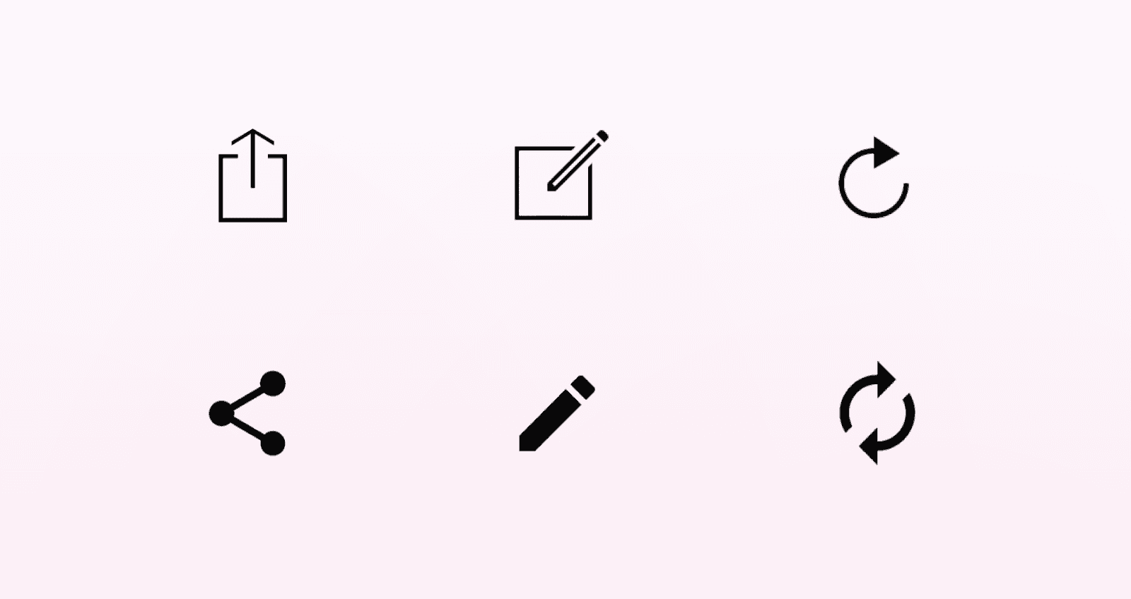
Example of an icon set in 2 weights
Iconography in UI design
In UI design, iconography works as a visual language. Icons help communicate actions, content, or intent quickly, often before users read any supporting text.
Because of that, icons shouldn’t be treated as separate visual elements. They work best as part of a consistent system, with shared rules for size, stroke, style, spacing, and usage. When icons are designed one by one without clear guidelines, the interface can quickly start to feel inconsistent.
For UI icons, SVG is usually the preferred format. It scales well across different screen sizes, keeps its quality, can be styled with CSS, and often keeps file sizes fairly small. This makes it a practical choice for most interface icons.
It’s also important to separate semantic icons from decorative ones.
Semantic icons communicate information or support an action, so they need a clear label or accessible name.
Decorative icons are there to support the visual style, so they should usually be hidden from assistive technologies to avoid adding unnecessary noise.
This distinction helps keep icons useful, consistent, and accessible instead of treating them as decoration alone.
How to achieve good iconography
Good iconography can make an interface easier to understand and navigate. When icons are clear and used consistently, they help users recognize actions faster and move through the product with less effort.
Icons are also useful because they save space. This is especially important in navigation, toolbars, mobile interfaces, and other areas where there isn’t much room for long labels. A well-chosen icon can communicate meaning quickly without taking over the layout.
They also support visual hierarchy. Icons can draw attention to important actions, separate different types of content, or make dense interfaces easier to scan.
Another advantage is that icons can reduce friction across languages. Since they rely on visual communication, they can make some interactions easier to understand without depending entirely on text. However, this only works when the icon is familiar enough and supported by the right context.
If you wish to learn more about core pillars of visual communication for UI designers and explore why they are essential for a successful UI design career, check out our Visual Communication for UI Designers article.
Good iconography can also improve accessibility when it is implemented properly. Semantic icons should have accessible names, while decorative ones should stay out of the accessibility tree. This helps users who rely on assistive technologies understand the interface without extra noise.
Finally, icons can contribute to brand identity. Their style, shape, level of detail, and visual personality can make a product feel more recognizable and consistent, as long as usability remains the priority.
Comprehension
The main test of a good icon is whether users can understand it quickly. It should be clear, readable, recognizable, and as simple as possible.
If users have to stop and decode what an icon means, it is not doing its job well. Icons are meant to reduce effort, not add another layer of interpretation.
Consistency
Consistency is one of the core principles of good icon design. Icons rarely appear alone, so they need to feel like they belong to the same system.
A consistent icon set should follow the same rules for:
Size
Visual style
Color scheme
Roundness
Stroke weight
Overall visual weight
Size
Visual style
Color scheme
Roundness
Stroke weight
Overall visual weight
Icon grids provide a shared framework for designing an icon set, helping maintain consistent proportions and layout across every icon.
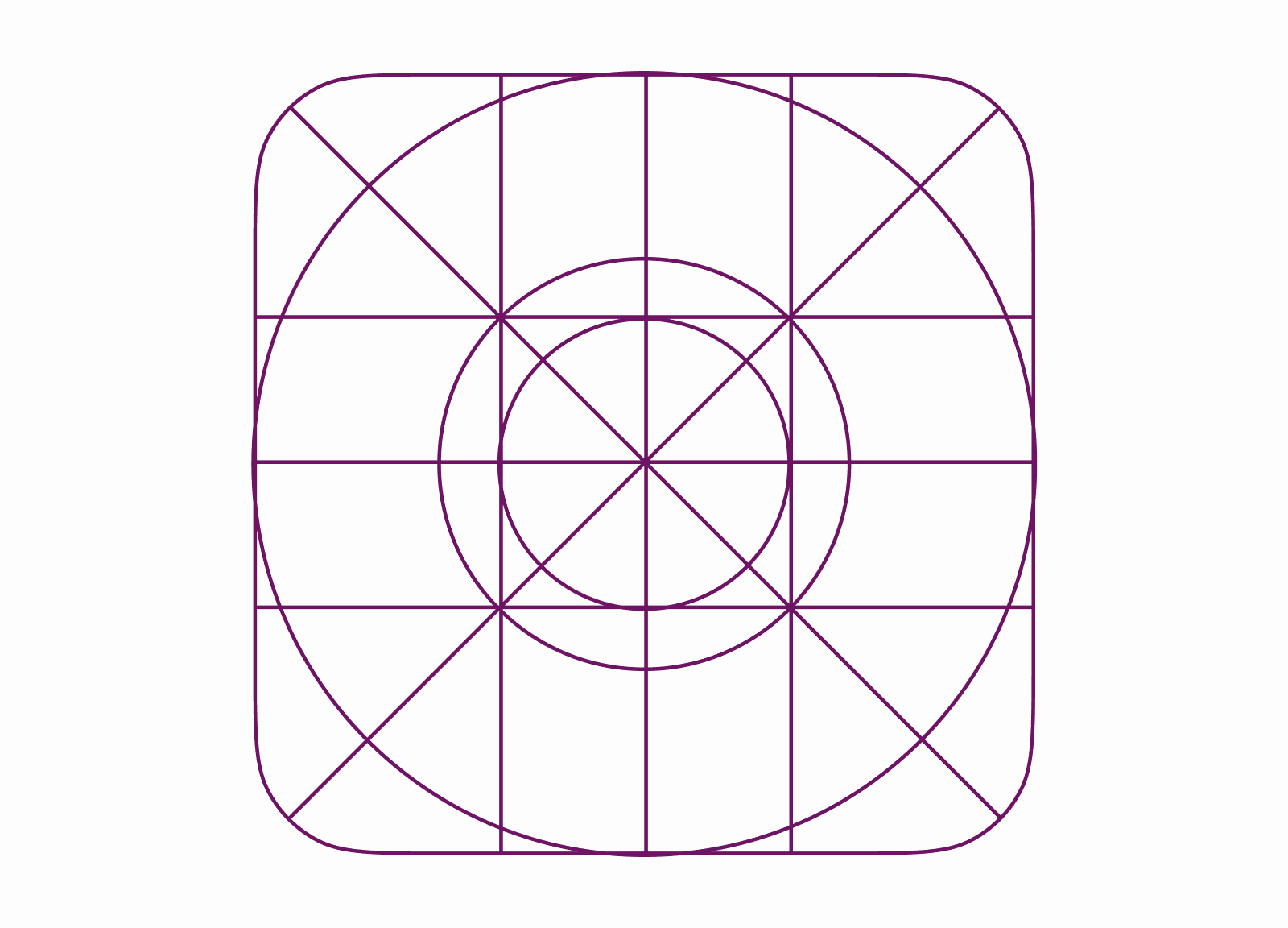
Icon grid example
When these details are aligned, the interface feels more polished and easier to scan.
If every icon looks like it came from a different source, users may still understand the individual icons, but the product can start to feel visually messy and less reliable.
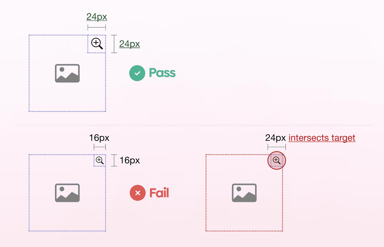
Size and tapability
Size and tapability are important because icons often need to be both visible and easy to interact with.
A common base size for UI icons is 24×24 px/dp or 32×32 px/dp, depending on the system and interface. However, the visual size of the icon is not always the same as the touch target.
On touch interfaces, icons should have enough clickable or tappable area around them. A target size of around 44–48 px usually makes them easier to hit and less frustrating to use on mobile devices.
Color
Color should support clarity, state, hierarchy, and brand, but it should not be the only thing carrying meaning.
A good approach is to design the core icon system in one color first. This makes it easier to check whether the icons are clear, consistent, and readable without relying on color to make them work.
Once the system works in a single color, color can be applied more intentionally. For example, it can help communicate active, inactive, disabled, or priority states, as long as there are other cues supporting the same meaning.
Grids, keylines, live areas, and padding
Grids, keylines, live areas, and padding help keep icons structured and consistent across the interface.
They define:
How each icon sits inside its container
How much space it should use
How it aligns with other icons in the set
How each icon sits inside its container
How much space it should use
How it aligns with other icons in the set
This helps icons feel optically balanced, even when their shapes are different.
The full container ensures consistent alignment, while the live area gives enough room for the icon itself to stay clear and readable.
Labels, tooltips, and text alternatives
Labels, tooltips, and text alternatives are an important part of icon usability.
Some icons are familiar enough to stand on their own, especially when they appear in a clear context. But when the meaning is not instantly obvious, it’s better to add a short label or tooltip instead of making users guess.
Text alternatives are especially important for accessibility. If an icon communicates information or triggers an action, users who rely on assistive technologies need to understand what it does as well.
Accessibility
Accessibility should be considered throughout the icon design process, not added at the end.
Icons need enough size, contrast, and spacing to be easy to see and interact with. Their shapes should also be distinct enough, especially when several icons appear close to each other or represent similar actions.
Interactive icons should always have a text alternative, such as a visible label or an ARIA label. This helps users who rely on assistive technologies understand what the icon does.
It’s also important not to rely on color alone. Color can support meaning, but there should always be another cue, such as a label, icon shape, state change, or supporting text.
Context matters
The best icons use familiar metaphors that match user expectations, brand personality, and cultural context.
This is important because icons don’t exist in isolation. Their meaning depends on where they appear, what users are trying to do, and what they already understand from similar products or real-world references.
That’s why user research and testing are useful before shipping anything unclear or overly abstract. If the icon relies too much on interpretation, there’s a good chance different users will read it in different ways.
Know the difference between product icons and marketing icons
Product icons and marketing icons usually have different roles, so they should not always be designed in the same way.
Product icons need to be simple, clear, and easy to recognize at smaller sizes. Their main job is to support usability, so they should remain functional and restrained.
Marketing icons have more room for visual expression. Since they are often used in larger sizes, they can include more detail, color, depth, or even perspective if that fits the brand.
The important thing is to keep the purpose in mind. A detailed icon might work well on a landing page, but it can become blurry or hard to read inside a navigation bar or toolbar.
Visual hierarchy
Iconography works best when it supports the broader visual hierarchy of the interface.
Icons should help guide attention toward important actions, not compete with the main content. Their size, contrast, placement, grouping, and surrounding whitespace all influence how noticeable they feel.
Typography also plays a role here. When icons are paired with labels, both elements should feel balanced and work together as one unit. If the icon is too dominant, it can distract from the text. If it is too subtle, users may miss the action altogether.

Choosing between paid and free icon sets
Choosing between a paid and free icon set depends on:
Specific project needs
Budget available
Time available
Other factors and constraints
Specific project needs
Budget available
Time available
Other factors and constraints
So the question is: Are you able to draw a custom icon set for a project and is it worth it?
Free icon sets can work well for smaller projects, early concepts, or products that don’t need a highly specific visual style. They are usually easy to access and fast to implement, which makes them useful when time or budget is limited.
Paid icon sets often offer more variety, better consistency, and broader coverage across categories, states, and formats. This can be helpful for more complex products where the icon system needs to scale over time.
In some cases, a custom icon set may be worth considering. This is especially true if the product needs stronger brand alignment, a more distinctive visual language, or tighter consistency across different touch points.
It’s also important to consider platform conventions.
iOS and Android icons can differ in style, behavior, and user expectations, so one icon approach may not work equally well everywhere. We as designers should be aware of these differences instead of assuming that one style fits every platform.
You can see the difference between the two in the example below.
Difference between Android and iOS icons
Steps for a practical process
A practical icon design process starts with defining the system. Before designing individual icons, it’s useful to decide on the core rules:
Size
Stroke weight
Grid
Corner radius
Level of detail
Color usage
How icons should behave in different states
Size
Stroke weight
Grid
Corner radius
Level of detail
Color usage
How icons should behave in different states
Once the system is defined, document the usage rules. This helps keep the icon set consistent as it grows and makes it easier for other designers, developers, or future team members to use it correctly.
The next step is to list the icons you actually need. This prevents the set from becoming too broad too early and keeps the work tied to real product use cases.
It usually makes sense to start with simple and common icons first. These are easier to test across the interface and can help establish the visual direction before moving on to more specific or complex icons.
The icon system should also align with the broader design system and engineering constraints. This includes naming conventions, file formats, component structure, accessibility requirements, and how icons will be implemented in the product.
After that, test and iterate. Icons should be checked in context, at the actual sizes they will be used, and with real users whenever possible. If an icon is unclear, inconsistent, or difficult to interact with, it should be adjusted before it becomes part of the final system.
Common mistakes
Even small issues in icon design can affect how clear and usable the interface feels. Most mistakes happen when icons are treated as decoration instead of functional parts of the UI.
Ambiguity
One of the most common problems is ambiguity. If an icon can be interpreted in multiple ways, users may hesitate or choose the wrong action. This usually happens when the metaphor is too abstract, too specific to the team, or not supported by enough context.
Common examples are the heart and the star, which often need labels to clarify what they do in a given situation. They can mean different things, like favorite or bookmark for the heart, and rate or save for the star.
Mixing styles
Another common issue is mixing styles. Using filled icons next to outlined ones, or combining icons with different stroke weights, corner styles, or levels of detail, can make the interface feel inconsistent. It also makes the icon set harder to scan as a system.
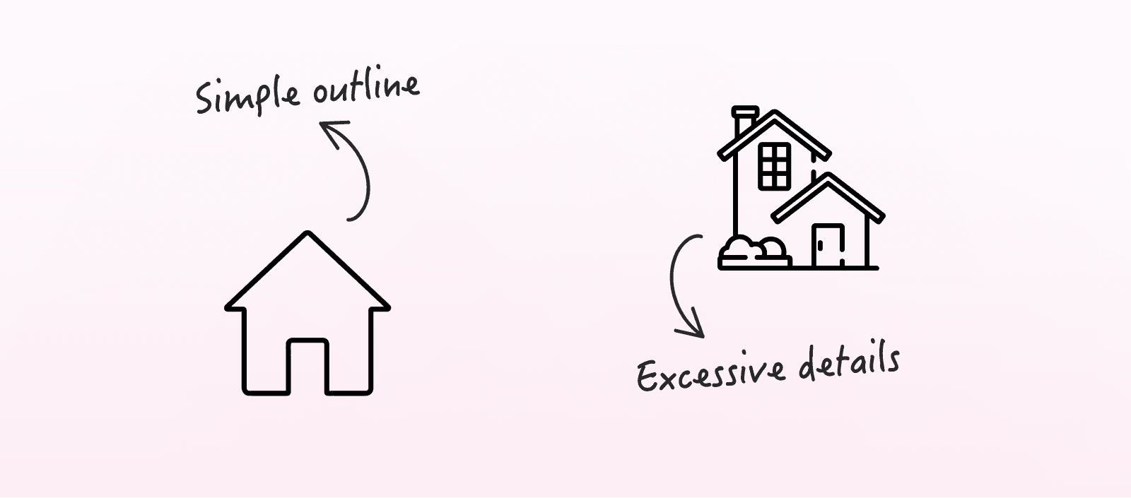
Excessive detail
Excessive detail can also create problems. Small UI icons need to stay simple enough to remain recognizable at smaller sizes. Details that work in a large illustration or marketing asset can become visual noise inside an interface.
Poor scalability
Scalability is another thing to watch. Icons should remain clear across different screen sizes, densities, and contexts. If an icon only works at one size, it may not be suitable for a product system.
Tiny touch targets
Touch targets are often overlooked as well. An icon may look visually balanced, but if the clickable area is too small, it becomes frustrating to use, especially on mobile devices.
Visual clutter
Visual clutter is another frequent mistake. Too many icons, or icons used without a clear purpose, can make an interface harder to read instead of easier.
Decorative techniques that hurt recognition
Decorative techniques should also be used carefully. Effects like unnecessary perspective, gradients, or combining multiple styles side by side can hurt recognition, especially when icons are small. In UI design, clarity usually matters more than visual complexity.
Conclusion
Good iconography is about making icons clear, scalable, consistent, and usable across a whole interface.
When icons are easy to understand, they reduce effort. When they are consistent, they make the interface easier to scan. When they are scalable and accessible, they continue to work across different devices, screen sizes, and user needs.
In the end, iconography should make the product easier to use, not just make the interface look more complete.
FAQs
How many icons should a product actually use?
How many icons should a product actually use?
When should an icon be used without a label?
When should an icon be used without a label?
Are universal icons really universal?
Are universal icons really universal?
How do you know if an icon is too abstract?
How do you know if an icon is too abstract?
Should every icon in a set have the same exact dimensions?
Should every icon in a set have the same exact dimensions?
We’re thrilled to invite you to join our incredible community of product designers (and enthusiasts) by following us on Instagram. We’re here to support you on your journey to falling in love with product design and advancing your career!
Keep on designing and stay hungry, stay foolish! 🥳
andrija & supercharge design team
Related blog posts
You might like the following


LIMITED-TIME OFFER
Get 12 premium members-only video lessons for free
Just tell us where to send them
You can unsubscribe at any time—no strings attached
LIMITED-TIME OFFER
Get 12 premium members-only video lessons for free
Just tell us where to send them
You can unsubscribe at any time—no strings attached