
How to Set the Right Design Direction for Your UX/UI Project
Jul 20, 2026
·
3 min read
You might be wondering how to bring consistency to your designs and how to make sure every button, color, image, icon, and headline feels like it belongs to the same visual family.
The answer starts with one very important thing which is setting the right design direction.
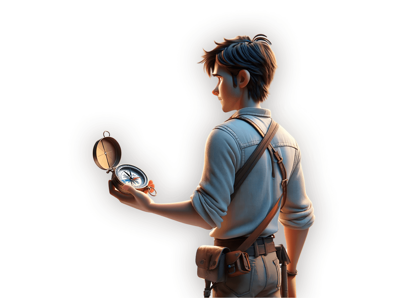
Think of it as your project’s North Star. It helps guide every design decision you make, so your final product feels consistent, coherent, and easy to understand.
In this article, we'll go through the steps that will help you learn how to define your design direction and turn it into a visual language that works like a charm.
What is design direction
Design direction is the foundation of your design identity. It defines the overall mood, feel, and visual personality of your project before you start designing individual screens or UI elements. Without it, your design can quickly feel scattered.
One button might feel playful, another section might feel serious, and your colors might look like they came from three different products.
That’s why design direction matters. It helps every element speak the same visual language.
The importance of design direction
Setting a design direction helps you create consistency and coherence across your designs. This ensures that your colors, typography, images, icons, layouts, and UI elements all feel connected.
Instead of making random design choices, having a clear guide will help you decide:
What the product should feel like
What kind of personality should the product express
What visual choices support the users’ needs
What elements match the brand identity
In other words, a design direction keeps you from designing in the dark and gives your project a clear compass.
Start with your users
As always in UX/UI design, we start with the users. Before choosing colors, fonts, or image styles, you need to understand who you’re designing for.
Ask yourself:
Who are the users?
What do they like?
What don’t they like?
What problems are they facing?
What solutions might they be looking for?
These answers help you create a design direction that actually fits the people who will use the product. Because beautiful design is great, but useful, relevant, user-centered design is even better.
Understanding the brand or product
Your users are highly important, but they’re not the only piece of the puzzle. You also need to understand the brand or product you’re designing for.
Ask yourself:
What is the brand’s vision?
What values does it hold dear?
How do those values connect with users?
What is the brand’s personality like?
Is it youthful and energetic?
Is it mature and sophisticated?
Is it friendly, earthy, and approachable?
Your design direction should reflect this personality. The goal is to create a strong connection between the user and the brand, because that’s where the magic happens.
Turn insights into a mood board
So, you have your user insights. You understand the brand. Now what? Our go-to next step would be creating a mood board or style board.
A mood board is a visual collage that captures the mood, feel, and direction of your design.
A mood board can include:
Images
Colors
Typography
Textures
UI references
Icon styles
Words or phrases
Anything that communicates the desired feeling
Think of it as a visual snapshot of your design identity. It doesn’t have to be perfect, it just needs to clearly show the direction you want the design to follow.
Define your visual language
Once your mood board is ready, you can start defining your visual language. Visual language is the set of design elements that make your product feel consistent.
A visual language usually includes:
Color palette
Typography
Iconography style
Image style
UI elements
Overall visual mood
Each of these elements should connect back to your mood board. If your mood board feels calm, earthy, and approachable, your visual language should echo that.
If your mood board feels energetic, youthful, and bold, your colors, type, and UI elements should support that feeling too. Easy breezy, right?
Design direction is not a rigid rulebook
Here’s something important to remember. Your design direction is not a strict rulebook that kills creativity. It’s more like a flexible guide.
It gives you enough structure to keep things consistent, but still leaves room for experimentation.
That balance is key. You want your design to feel coherent, but not boring; consistent, but not robotic; guided, but not trapped.
Conclusion
Setting the right design direction is one of the most important steps in creating a consistent UX/UI design.
It helps you define the mood, personality, and visual identity of your project before you jump into the details.
What is design direction
Design direction is the foundation of your design identity. It defines the overall mood, feel, and visual personality of your project before you start designing individual screens or UI elements. Without it, your design can quickly feel scattered.
One button might feel playful, another section might feel serious, and your colors might look like they came from three different products.
That’s why design direction matters. It helps every element speak the same visual language.
The importance of design direction
Setting a design direction helps you create consistency and coherence across your designs. This ensures that your colors, typography, images, icons, layouts, and UI elements all feel connected.
Instead of making random design choices, having a clear guide will help you decide:
What the product should feel like
What kind of personality should the product express
What visual choices support the users’ needs
What elements match the brand identity
In other words, a design direction keeps you from designing in the dark and gives your project a clear compass.
Start with your users
As always in UX/UI design, we start with the users. Before choosing colors, fonts, or image styles, you need to understand who you’re designing for.
Ask yourself:
Who are the users?
What do they like?
What don’t they like?
What problems are they facing?
What solutions might they be looking for?
These answers help you create a design direction that actually fits the people who will use the product. Because beautiful design is great, but useful, relevant, user-centered design is even better.
Understanding the brand or product
Your users are highly important, but they’re not the only piece of the puzzle. You also need to understand the brand or product you’re designing for.
Ask yourself:
What is the brand’s vision?
What values does it hold dear?
How do those values connect with users?
What is the brand’s personality like?
Is it youthful and energetic?
Is it mature and sophisticated?
Is it friendly, earthy, and approachable?
Your design direction should reflect this personality. The goal is to create a strong connection between the user and the brand, because that’s where the magic happens.
Turn insights into a mood board
So, you have your user insights. You understand the brand. Now what? Our go-to next step would be creating a mood board or style board.
A mood board is a visual collage that captures the mood, feel, and direction of your design.
A mood board can include:
Images
Colors
Typography
Textures
UI references
Icon styles
Words or phrases
Anything that communicates the desired feeling
Think of it as a visual snapshot of your design identity. It doesn’t have to be perfect, it just needs to clearly show the direction you want the design to follow.
Define your visual language
Once your mood board is ready, you can start defining your visual language. Visual language is the set of design elements that make your product feel consistent.
A visual language usually includes:
Color palette
Typography
Iconography style
Image style
UI elements
Overall visual mood
Each of these elements should connect back to your mood board. If your mood board feels calm, earthy, and approachable, your visual language should echo that.
If your mood board feels energetic, youthful, and bold, your colors, type, and UI elements should support that feeling too. Easy breezy, right?
Design direction is not a rigid rulebook
Here’s something important to remember. Your design direction is not a strict rulebook that kills creativity. It’s more like a flexible guide.
It gives you enough structure to keep things consistent, but still leaves room for experimentation.
That balance is key. You want your design to feel coherent, but not boring; consistent, but not robotic; guided, but not trapped.
Conclusion
Setting the right design direction is one of the most important steps in creating a consistent UX/UI design.
It helps you define the mood, personality, and visual identity of your project before you jump into the details.
If you aren't following us on Instagram already, you're seriously missing out! Become a part of our ever-growing community and learn something new from the field of product design every. single. day.
Happy designing! 🥳
andrija & supercharge design team

If you aren't following us on Instagram already, you're seriously missing out! Become a part of our ever-growing community and learn something new from the field of product design every. single. day.
Happy designing! 🥳
andrija & supercharge design team
Related blog posts
You might like the following
You might like the following


LIMITED-TIME OFFER
Get 12 premium members-only video lessons for free
Just tell us where to send them
You can unsubscribe at any time—no strings attached
LIMITED-TIME OFFER
Get 12 premium members-only video lessons for free
Just tell us where to send them
You can unsubscribe at any time—no strings attached