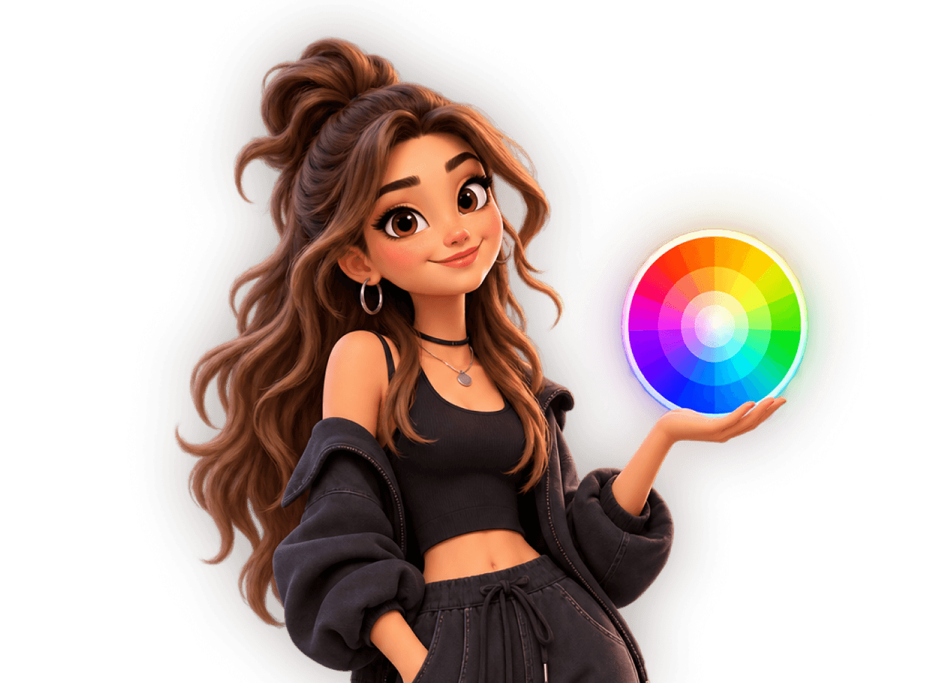
Understanding the RGB Color Wheel for UI Design
Aug 11, 2026
·
3 min read
When it comes to UI design, it is important to use the right color wheel. Because digital interfaces are displayed on screens, the relevant model is the RGB color wheel rather than the RYB color wheel commonly taught in school. Let's dive into this topic a bit more.
How screens display color
Digital screens use the RGB color model, which stands for red, green, and blue. These are the primary colors used to create a wide range of colors displayed on a screen.
The RGB model works by combining different intensities of red, green, and blue. Screens produce these colors by emitting light. Each pixel consists of three subpixels that emit red, green, and blue light at different intensities. Changing and combining those intensities produces the range of colors we see on the screen.
This is an important distinction for UI designers because the way screens produce color affects how colors are presented and perceived in digital interfaces.
Color gamuts
Another factor to consider is color gamut, which refers to the range of colors a screen can display.
Different screens have different color gamuts. Some can display a wider range of colors, allowing them to present more vivid and accurate colors, while others have a more limited range. This is one reason colors may not look exactly the same on a computer screen and a smartphone.
Screen calibration is important when trying to ensure that colors are displayed accurately. For us designers, these differences matter because they affect how the colors used in an interface may appear across screens.
Why UI design uses the RGB color wheel
Since UI designs are created for RGB screens, the RGB color wheel is more appropriate than the red, yellow, and blue model. It also corresponds with the way hue can be divided into three 120-degree ranges around the color wheel.
Looking at a hue color wheel, red sits at 0 and 360 degrees, green at 120 degrees, and blue at 240 degrees. These three points form the basis for the primary colors in the RGB model.
Primary and secondary colors
Red, green, and blue are the three primary colors. Combining two primary colors creates a secondary color.
For UI purposes, the secondary colors are cyan, magenta, and yellow:
Blue and green create cyan
Red and blue create magenta
Green and red create yellow
Their positions on the hue color wheel fall between the primary colors. Yellow is at 60 degrees, halfway between red and green. Cyan is at 180 degrees, between green and blue, while magenta is at 300 degrees, between blue and red.
Together, the primary and secondary colors occupy positions at 60-degree intervals around the wheel.
Tertiary colors
Tertiary colors occupy the 30-degree positions between the primary and secondary colors.
At 30 degrees is orange, which can be thought of as a combination of the primary color red and the secondary color yellow.
At 90 degrees is chartreuse, also commonly called yellow-green or greenish-yellow. It comes from combining the primary color green with the secondary color yellow.
At 150 degrees is spring green, sometimes called emerald. It is a bright blue-green created by mixing primary green with secondary cyan.
At 210 degrees is azure, a color mixed from primary blue and a secondary color.
At 270 degrees is violet-purple, created by mixing primary blue with secondary magenta.
Finally, at 330 degrees is rose-pink, which results from mixing secondary magenta with primary red.
That makes the six tertiary colors:
Orange
Chartreuse
Spring green
Azure
Violet
Rose-pink
Categorizing colors by warmth
Primary, secondary, and tertiary colors are not the only way to organize colors. They can also be grouped into warm and cool colors.
For designers, this distinction relates to how colors can affect the way users perceive and interact with a digital interface.
Warm colors
Warm colors are associated with warmth, energy, and excitement. This category includes shades, tints, and tones of red, orange, and yellow, which are associated with the sun and fire.
In UI design, warm colors can be used to create a sense of energy and vibrancy. A warm color used for a call-to-action button, for example, can create a sense of urgency and excitement. Tints of warm colors used in backgrounds can instead create a sense of comfort.
Cool colors
Cool colors are associated with coolness, calmness, and relaxation. They include shades, tints, and tones of blue, green, and purple, which are associated with water and nature.
Within a digital interface, cool colors can be used to create a sense of calmness and serenity. A meditation app, for example, can use cool colors to create a feeling of relaxation and tranquility. In a financial app, using a cool color for a call-to-action button can create a sense of trust and security.
Final words
Understanding these different ways of organizing color gives UI designers a framework for working with color on screens. The RGB color wheel describes the relationships between primary, secondary, and tertiary colors, while warm and cool categories provide another way to group those colors according to the qualities associated with them.
How screens display color
Digital screens use the RGB color model, which stands for red, green, and blue. These are the primary colors used to create a wide range of colors displayed on a screen.
The RGB model works by combining different intensities of red, green, and blue. Screens produce these colors by emitting light. Each pixel consists of three subpixels that emit red, green, and blue light at different intensities. Changing and combining those intensities produces the range of colors we see on the screen.
This is an important distinction for UI designers because the way screens produce color affects how colors are presented and perceived in digital interfaces.
Color gamuts
Another factor to consider is color gamut, which refers to the range of colors a screen can display.
Different screens have different color gamuts. Some can display a wider range of colors, allowing them to present more vivid and accurate colors, while others have a more limited range. This is one reason colors may not look exactly the same on a computer screen and a smartphone.
Screen calibration is important when trying to ensure that colors are displayed accurately. For us designers, these differences matter because they affect how the colors used in an interface may appear across screens.
Why UI design uses the RGB color wheel
Since UI designs are created for RGB screens, the RGB color wheel is more appropriate than the red, yellow, and blue model. It also corresponds with the way hue can be divided into three 120-degree ranges around the color wheel.
Looking at a hue color wheel, red sits at 0 and 360 degrees, green at 120 degrees, and blue at 240 degrees. These three points form the basis for the primary colors in the RGB model.
Primary and secondary colors
Red, green, and blue are the three primary colors. Combining two primary colors creates a secondary color.
For UI purposes, the secondary colors are cyan, magenta, and yellow:
Blue and green create cyan
Red and blue create magenta
Green and red create yellow
Their positions on the hue color wheel fall between the primary colors. Yellow is at 60 degrees, halfway between red and green. Cyan is at 180 degrees, between green and blue, while magenta is at 300 degrees, between blue and red.
Together, the primary and secondary colors occupy positions at 60-degree intervals around the wheel.
Tertiary colors
Tertiary colors occupy the 30-degree positions between the primary and secondary colors.
At 30 degrees is orange, which can be thought of as a combination of the primary color red and the secondary color yellow.
At 90 degrees is chartreuse, also commonly called yellow-green or greenish-yellow. It comes from combining the primary color green with the secondary color yellow.
At 150 degrees is spring green, sometimes called emerald. It is a bright blue-green created by mixing primary green with secondary cyan.
At 210 degrees is azure, a color mixed from primary blue and a secondary color.
At 270 degrees is violet-purple, created by mixing primary blue with secondary magenta.
Finally, at 330 degrees is rose-pink, which results from mixing secondary magenta with primary red.
That makes the six tertiary colors:
Orange
Chartreuse
Spring green
Azure
Violet
Rose-pink
Categorizing colors by warmth
Primary, secondary, and tertiary colors are not the only way to organize colors. They can also be grouped into warm and cool colors.
For designers, this distinction relates to how colors can affect the way users perceive and interact with a digital interface.
Warm colors
Warm colors are associated with warmth, energy, and excitement. This category includes shades, tints, and tones of red, orange, and yellow, which are associated with the sun and fire.
In UI design, warm colors can be used to create a sense of energy and vibrancy. A warm color used for a call-to-action button, for example, can create a sense of urgency and excitement. Tints of warm colors used in backgrounds can instead create a sense of comfort.
Cool colors
Cool colors are associated with coolness, calmness, and relaxation. They include shades, tints, and tones of blue, green, and purple, which are associated with water and nature.
Within a digital interface, cool colors can be used to create a sense of calmness and serenity. A meditation app, for example, can use cool colors to create a feeling of relaxation and tranquility. In a financial app, using a cool color for a call-to-action button can create a sense of trust and security.
Final words
Understanding these different ways of organizing color gives UI designers a framework for working with color on screens. The RGB color wheel describes the relationships between primary, secondary, and tertiary colors, while warm and cool categories provide another way to group those colors according to the qualities associated with them.
If you aren't following us on Instagram already, you're seriously missing out! Become a part of our ever-growing community and learn something new from the field of product design every. single. day.
Happy designing! 🥳
andrija & supercharge design team

If you aren't following us on Instagram already, you're seriously missing out! Become a part of our ever-growing community and learn something new from the field of product design every. single. day.
Happy designing! 🥳
andrija & supercharge design team
Related blog posts
You might like the following
You might like the following


LIMITED-TIME OFFER
Get 12 premium members-only video lessons for free
Just tell us where to send them
You can unsubscribe at any time—no strings attached
LIMITED-TIME OFFER
Get 12 premium members-only video lessons for free
Just tell us where to send them
You can unsubscribe at any time—no strings attached