
Color Psychology in UX Design
·
0 min read
Understanding color psychology in UX design is crucial for creating a high-quality digital product. As a designer, you'll use colors for UI elements, such as navigation elements, button design, and CTAs. Moreover, colors are essential for establishing a desired feeling of the digital product and representing its branding.
In this article, we'll break down the hidden meaning of colors and add a couple of hefty tricks and examples to help you master the art of using colors in UX design.
Table Of Contents
Red
Every UX designer must be familiar with the color psychology in UX. Using the right colors to provoke emotions in users and impact their decision-making processes is a skill, and you mustn't take it lightly. So, let's see how and where you can use red color in UX design.
The initial thought regarding the red color can be that it's a bold, powerful, intense color. It represents heat and conveys strong emotions.
In Western cultures, red symbolizes love but also danger and action. Far Eastern cultures use red to express good fortune, vitality, and possessions. On the contrary, the Middle east connects red to evil forces and danger.
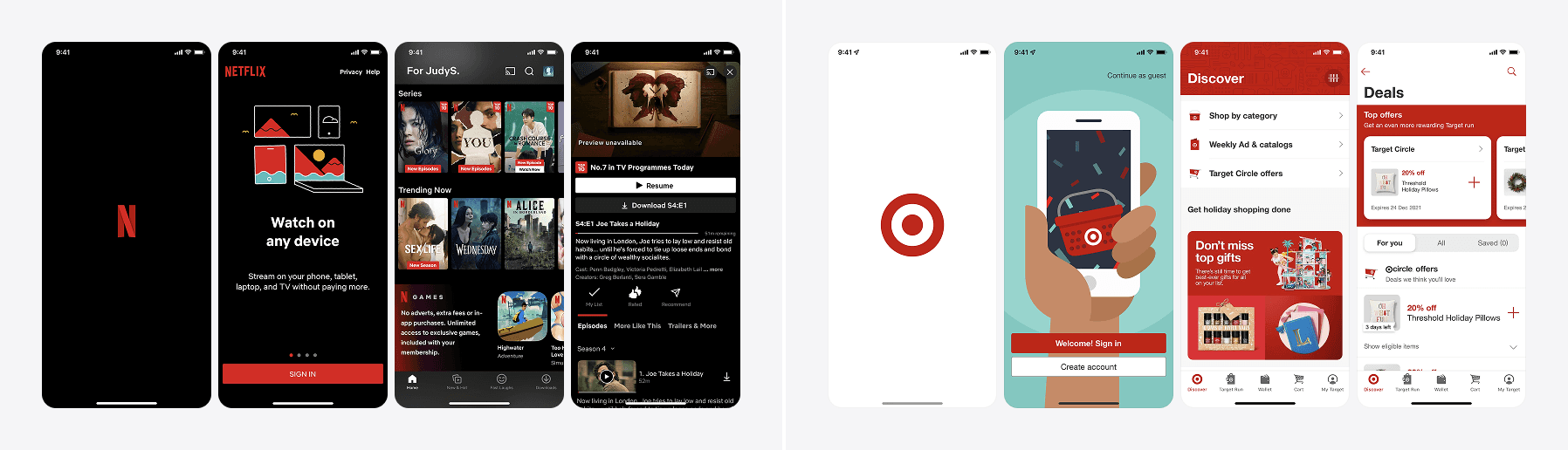
So, to know when to use such a rich color, you must master the color psychology in UX and know when to use it to maximize its impact and avoid adverse feelings. You'll usually see red color in situations where users' attention is a must - such as sales and other promotional campaigns. Moreover, designers use red for CTAs or error messages.
Using red in branding is also a powerful statement - it sparks emotions of urgency, energy, and passion.
Some brands that use red color for their branding are CNN, Puma, Time, Netflix, Canon, and Target.
Orange
Our next step in understanding color psychology in UX is familiarizing ourselves with the orange color. Orange is an exciting color associated with adventure, adolescence, warmth, and success.
Humans also usually connect orange with citrus, which evokes feelings of freshness. Sometimes, designers use orange to portray a retro feel because of the color's popularity in the 70s.
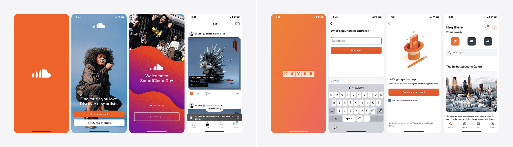
Orange indeed draws attention, which explains traffic signs and cones in orange. Moreover, sometimes it's a safer option for CTAs than red. Customers respond to the color orange in many ways: they can perceive it as playful and friendly and associate it with affordable products.
But, color psychology in UX is sometimes complex and not applicable to all. For example, Hindu cultures consider orange the holiest color, whereas people in Zambia don't even perceive it as a particular color.
That's why it's crucial to know your target audience and learn their color preferences.
Some brands that use orange for their logos and branding are Timberland, Glaxo-Smith-Kline, Nickelodeon, and Soundcloud.

Yellow
Learning the meaning of yellow is another step closer to fully grasping color psychology in UX. Yellow is a happy color. It conveys optimism, cheerfulness, joy, and in some cultures, prosperity, and royalty. Children mostly prefer yellow, but such preference starts to decline as they age.
That's why designers usually use yellow for products targeted at children. However, yellow has its use in products for adults, too. Pastel yellow hues are baby-neutral, and darker shades turn into gold, whose meaning we'll discuss later in the article.
Yellow is another attention-grabbing color; you can find it in traffic signs, bold advertisements, or toys. For other design-related purposes, yellow is a popular accent color, rather than the primary color, because it's striking and tires the eye. Learning more about color psychology in UX tells us there are always (at least) two sides to a color. That's why people sometimes perceive yellow as aggressive or even confrontational.
Yellow is also one of the most complex colors to work with in UI design because you can easily move into other hues (green and orange), or it might look unappealing when you lower the brightness.
Some brands that use yellow for their logos and branding are National Geographic, Snapchat, Mcdonald's, Hertz, and Mailchimp.

Green
Color psychology in UX associates green with nature, grass, trees, and earth, which evokes peace, tranquility, and a feeling connected to nature and ecology. Different cultures attach different meanings to green.
Western cultures consider green to symbolize luck, spring, wealth, inexperience, and jealousy (thus, the term green from envy.) In the US, green can sometimes embody feelings of greed and sickness. Mexico considers green as a national color, which means independence. In contrast, Indonesia has banned the use of green color. Many South American cultures use green to represent death.
If you further think about color psychology in UX, you'll conclude that green usually serves to confirm actions, such as answering the call, clicking purchase, or indicating success.
But, using green in UX design isn't always the best option, especially if you use it in terms of the traffic light or the R/Y/G pattern. When designers overuse the R/Y/G pattern or use it where it isn't necessary, it can confuse and distract users from achieving their objectives.
Brands that use green for their branding and logos include Starbucks, Spotify, John Deere, and Android.
Blue
Let's see the use of blue color in color psychology in UX design.
Blue is a natural color - it represents the sky and daylight. Blue light wavelengths help us wake up in the morning. It's also the color of the water. Such connections make us connect the blue color with calmness, serenity, and security.
Additionally, blue signifies reliability and stability, so it's no wonder that many brands use it in their branding and advertising. Studies suggest that using blue in offices can induce productivity and creativity. But the term "feeling blue" exists for a reason, too. Blue also creates feelings of sadness and gloom.
Color psychology in UX teaches us that blue color also bears diverse cultural meanings. Learning cultural differences and connotations is crucial for using specific colors in your UX designs. In North America, blue represents a trustworthy person or business. The UK recognizes the blue color for dignity and decorum. In Latin America, blue is connected to mourning but also trust.
It is one of the safest and most popular choices for UI design due to its popularity and general association with reliability and stability.
Brands that use blue color for their branding are PayPal, Facebook, Salesforce, Ford, Samsung, IBM, and Oral-B.

Purple
Another step towards mastering color psychology in UX is learning more about the use of purple color. People associate purple with many meanings: royalty, creativity, power, luxury, wisdom, magic, wealth, and extravagance. Associations of purple with royalty originate from the fact that the purple dye used in ancient times was uncommon, exceptional, and, therefore, particularly expensive.
Purple color also illustrates spirituality. Its rare occurrence seems connected to the unknown or divine interference.
Diverse shades of purple have various spiritual meanings. For instance, light purples are associated with romantic energies, while darker shades can represent sadness. In some parts of Europe, purple symbolizes death and mourning. Purple represents nobility in the majority of Asian cultures. Yet, it symbolizes mourning in Thailand.
Color psychology in UX indicates that designers use purple in products connected to beauty, wellness, and spa. Another reason you must consider your target audience before opting for a specific color is that men generally don't love purple color, whereas women adore it.
Brands that use purple for their logos and branding: Yahoo, Twitch, Cadbury, Urban Decay, and Hallmark.
Pink
Let's see the meaning of pink in color psychology in UX design.
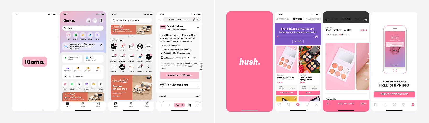
All around the world, pink symbolizes love and romance. Moreover, this color sometimes evokes calm feelings. Pink also represents creativity, power, and euphoria. If we consider the cultural meaning of pink, in Western cultures, it's a feminine color that marks a daughter's birth. It also illustrates fun and childhood. In Latin America, people associate pink with architecture and use it as a building color. Middle Eastern cultures don't pay any specific meaning to pink, and other countries and cultures recognize it as a calming and serene color. That's why Switzerland uses it for jail cell walls.
Another famous example of using the pink color is Breast Cancer Awareness month, during which people use the pink ribbon to honor people who underwent such a malignant disease.
Pinkwashing is a negative term used nowadays to describe the efforts of corporations or politicians who resort to breast cancer awareness or LGBTQ rights to soft-pedal their adverse actions or solely for advertising. That's why it's crucial to understand color psychology in UX design and make sure using pink will evoke the right feelings.
Brands that use pink for their branding include Barbie, Lyft, and T-Mobile.
White
From a cultural standpoint, many cultures associate white with innocence, purity, and cleanliness. On the contrary, white can also seem bland and dull, so it's crucial to understand color psychology in UX and use white properly. White (flag) symbolizes peace, but in some cultures, such as China and Korea, white represents death, mourning, and bad luck. While others wear white at weddings, these countries wear white to funerals.
Brands today like to use white for their logos and brand identities because it signifies minimalism and clean aesthetics. Designers accentuate such feelings by using white with other shades of white, such as gray or beige. Still, people find white color sterile, which can bring memories of a hospital, representing tough and sad memories for many.
Understanding color psychology in UX before selecting a primary color for your digital product will save you time and other precious resources. White is one of the colors that allows other hues to stand out and is, therefore, heavily used in UI design.
Brands that use white for their branding color: Apple, MAC, Adidas, and Nike.
Grey
This neutral color can bear many different meanings. Some consider it boring; others call it elegant. Grey exists as a middle color between black and white. It is a neutral or achromatic color, which literally means that it is a color "without color." Grey is the color of a cloudy sky, ash, and lead.
Color psychology in UX determines grey as a sleek, refined, and classy color. Gray (or silver shades) resemble a polished look and add a whiff of professionalism. Designers rarely use grey as a primary color for a website; they use it as an accent color that highlights black and white colors.
Moreover, it's a fantastic option to increase readability and use grey as a background color when the contrast between white and black is too strong. Designers familiar with color psychology in UX use grey and silver colors with brands that want to look expensive, such as vehicles and jewelry brands.
When you think about it, greys make most of the interfaces we design, some entirely neutral grey and others containing a bit of hue. Since it is such a neutral color that doesn’t grab attention, it allows other colors to call attention to themselves.
Some brands that use grey for their branding are Mercedes Benz, Swarovski, Wikipedia, Toyota, Forbes, and Wii.
Black
Many people consider black a premium color that exudes sophistication and boldness. Others connect it with death, sadness, bad luck, mystery, and illness. In the Middle East, black color represents both rebirth and mourning. In Africa, black signifies masculinity, maturity, and age.
Knowing more about color psychology in UX will help you determine when to use black and when to avoid it. For example, using black as a background might seem a great idea - after all, it does represent boldness, authority, and specific power. But, using a completely black background will diminish all light emitting from the screen and make users' eyes work harder to read white letters.
That will eventually lead to a low-quality experience. If you want to achieve maximum readability and accessibility for your digital product, using black background simply will not do.
Since black color bears many negative connotations (think about some of the widespread expressions such as black magic, black sheep, blackmail, black market, or blackout,) you'll have to become an expert in color psychology in UX to ensure using black in your projects will bring only positive outcomes.
Brands that use black color are The New York Times, Burberry, Chanel, Schwarzkopf, Playboy, and Vans.

Gold
Gold is a color that doesn't need broad explanations. Most of the time, gold represents money, wealth, luxury, and power. Gold is the most precious metal of all time, so it's also associated with divinity, royalty, and perfection in many cultural and religious settings. But there are also some negative connotations, such as decadence and overindulgence,
Using gold in your digital products website will suggest high-quality and might unconsciously help build customer trust. Color psychology in UX determines gold as a color that sparks interest, but you should never use it as the dominant color of your product. Gold will work best for borders or as a highlight around crucial features. That way, it can draw the users' attention without looking chaotic and disrupting their attention.
Using too many gold shades might get considered trashy and represent a lack of taste and good measure, so keep that in mind.
Brands that use gold color are Metro-Goldwyn-Meyer, Lindt, Guinness, Versace, Guess, and Dove.

Brown
Color psychology in UX usually defines brown color as elegant, natural, rustic, and sophisticated, which is why many luxury and organic brands opt for it in their branding. The reliable feeling of the brown color might also entail why many shipping companies choose it for their branding.
But, some might consider brown dirty and dingy. Eastern and Asian cultures associate brown with mourning. Conversely, brown brings lower sales in Colombia, and the people of Nicaragua find brown disapproving.
Before selecting brown for your digital product's color palette, you must research your audience and their cultural backgrounds. Brown is one of the least popular colors, so if you’re using it on your project – be careful!
Brands that use brown color for their branding and logos include UPS, M&M's, Hershey's, Nespresso, UGG, and Hollister.
Summary
Congratulations - you've covered the most important parts of color psychology in UX! We hope learning about the different meanings, connotations, and cultural backgrounds of specific colors will bring you peace of mind and confidence when selecting a color palette for your future designs.
If you need to further deepen your knowledge about colors, enroll in our Ultimate UI Colors Masterclass and boost this significant designer skill. Our Masterclass is not another boring, theoretical course where we do the talking, and you do the half-listening while mindlessly scrolling the web. Au contraire - it's an efficient course that will make you roll your sleeves and help you master everything: from color basics to creating suitable color schemes, tints, and shades for stunning user interfaces!

If you aren't following us on Instagram already, you're seriously missing out! Become a part of our ever-growing community and learn something new from the field of product design every. single. day.
Happy designing! 🥳
andrija & supercharge design team
If you aren't following us on Instagram already, you're seriously missing out! Become a part of our ever-growing community and learn something new from the field of product design every. single. day.
Happy designing! 🥳
andrija & supercharge design team
Related blog posts
You might like the following


LIMITED-TIME OFFER
Get 12 premium members-only video lessons for free
Just tell us where to send them
You can unsubscribe at any time—no strings attached
LIMITED-TIME OFFER
Get 12 premium members-only video lessons for free
Just tell us where to send them
You can unsubscribe at any time—no strings attached