
Ultimate UI Spacing Cheat Sheet
Jan 7, 2026
·
2 min read
Spacing is one of the most underestimated tools in UI design. It directly affects readability, hierarchy, and how polished a product feels. This cheat sheet breaks down the core spacing rules every UX/UI designer should know and apply consistently.
Reality check: Spacing matters
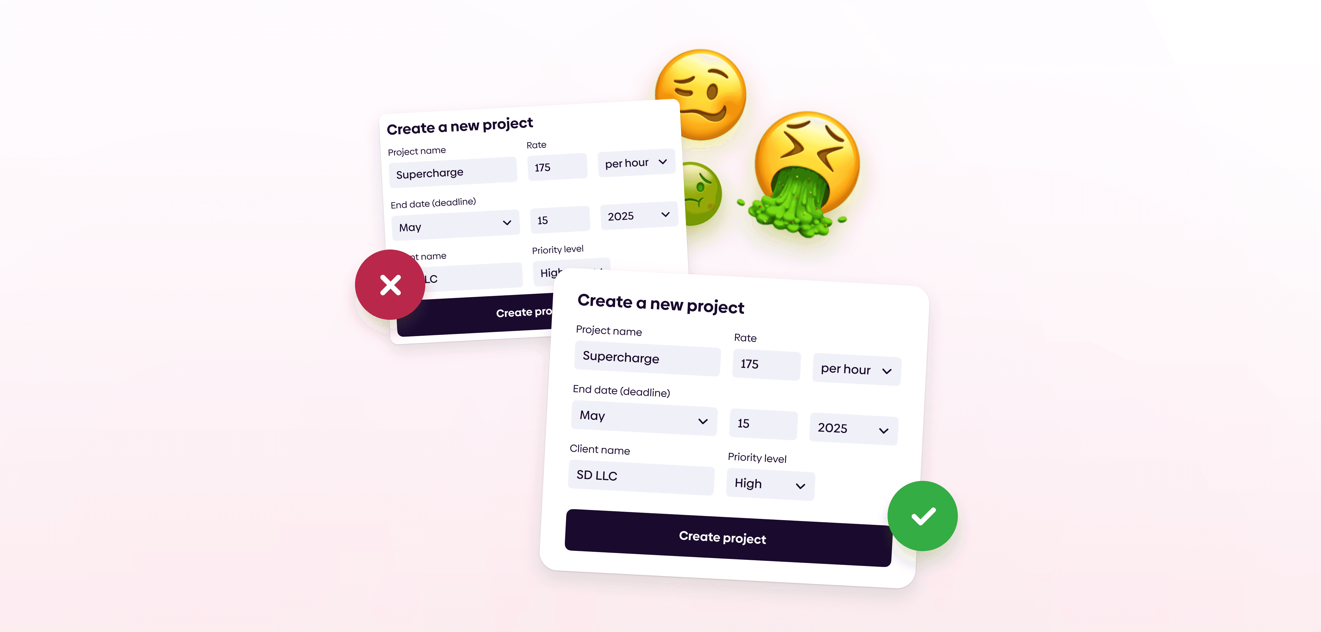
Good spacing is invisible. Bad spacing is immediately noticeable. When spacing is inconsistent or cramped, interfaces feel messy and harder to use, even if colors, typography, and components are well designed.
Spacing isn’t decoration. It’s structure.
Spatial consistency
Build spacing in clear, predictable increments. A 4- or 8-point spacing system helps maintain rhythm and visual balance across the entire interface.
Small spacing: inner padding, tiny elements
Medium spacing: Large elements, related components
Large spacing: sections
Type spacing
Don't ignore text line height settings. Most of the design is text, aim to always make it legible.
Body line height: 1.3-1.6 x font size
Headline line height: 0.9-1.2 x font size
Tiny text line height: 1.4-1.7 x font size
Paragraph spacing: 0.3-0.7 x line height
Body letter spacing: 0% for most typefaces
Headline letter spacing: -2% for most typefaces
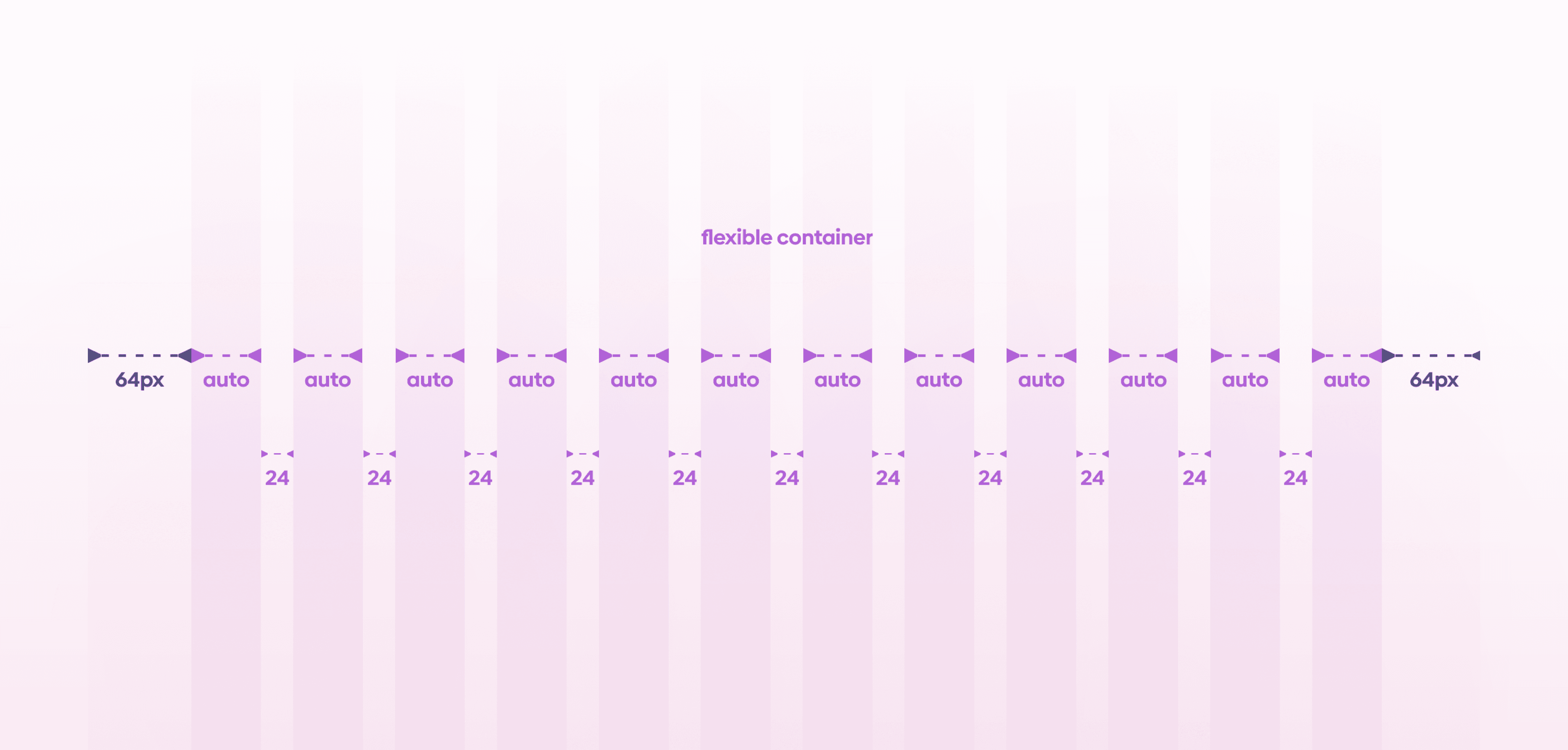
Use grids
Grids ensure visual alignment and consistency across screens. They act as a structural guide for placing UI elements in a clear, logical way.
Grid is a visual tool used to align UI elements, based on a sequence of columns and/or rows.
Spacing terms you need to know
Padding is the inner spacing and the space between elements within a component
Margins are spaces outside the content, defining boundaries
Columns are vertical guidelines in a grid allocated to content
Gutters are spaces between columns serving as separators
Understanding these terms helps teams communicate spacing decisions clearly.
Our tip
Give your UI room to breathe. Whitespace is a designer’s secret weapon. It improves clarity, focus, and perceived quality without adding complexity.
If you aren't following us on Instagram already, you're seriously missing out! Become a part of our ever-growing community and learn something new from the field of product design every. single. day.
Happy designing! 🥳
andrija & supercharge design team
If you aren't following us on Instagram already, you're seriously missing out! Become a part of our ever-growing community and learn something new from the field of product design every. single. day.
Happy designing! 🥳
andrija & supercharge design team
Related blog posts
You might like the following
You might like the following


LIMITED-TIME OFFER
Get 12 premium members-only video lessons for free
Just tell us where to send them
You can unsubscribe at any time—no strings attached
LIMITED-TIME OFFER
Get 12 premium members-only video lessons for free
Just tell us where to send them
You can unsubscribe at any time—no strings attached