
How to Present Your Work as a UI/UX Designer
Nov 20, 2025
·
2 min read
If you've ever wondered how to present your work as a UI/UX designer, this guide is made for you. Let's dive in!
Animate: make it dynamic
Motion instantly raises perceived quality. Add light transitions, micro-interactions, or a short flow to show how screens behave—not just how they look. Keep clips tight and task-focused so the story is clear at a glance.
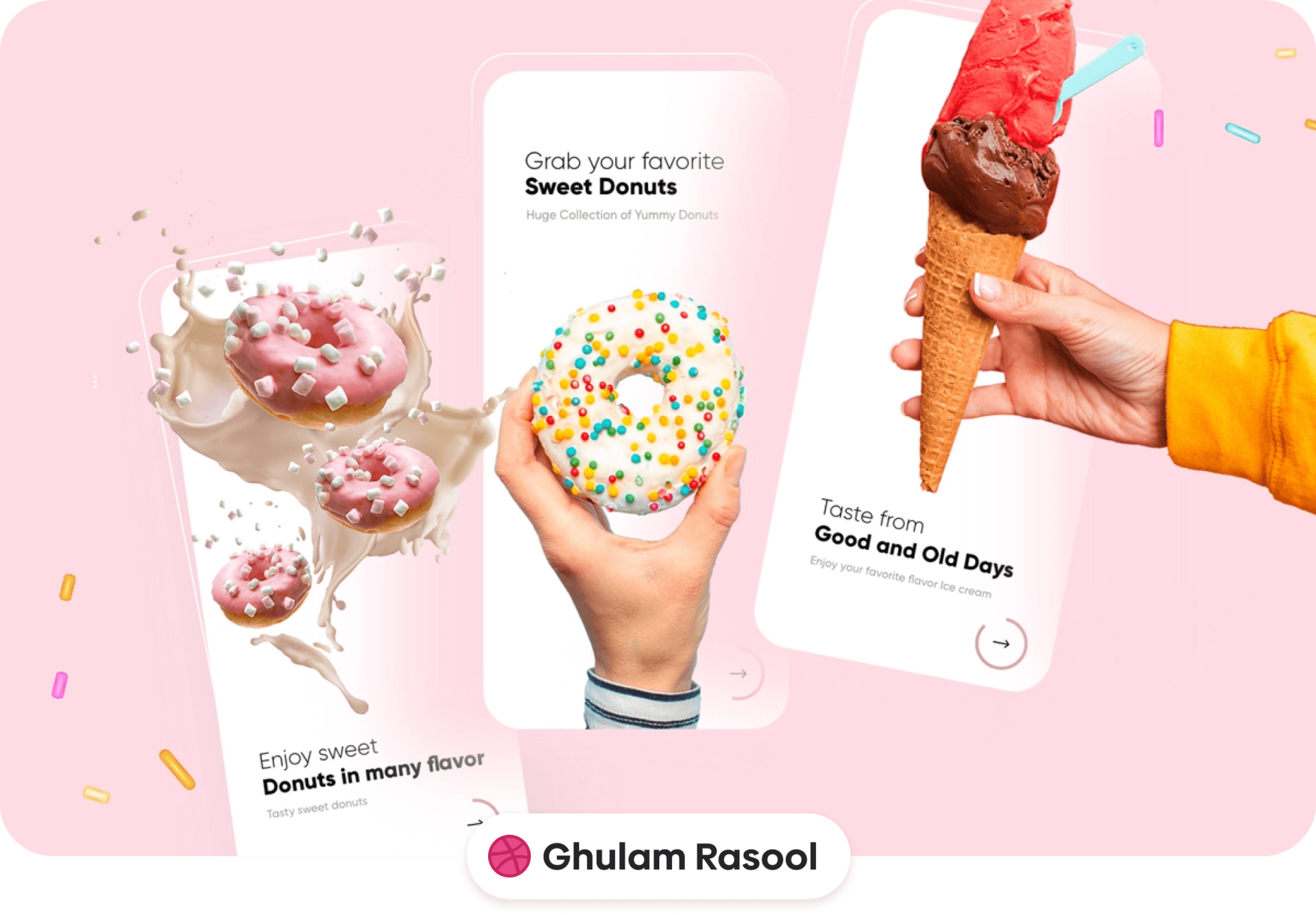
Make it pop: use backgrounds
Don’t leave work floating on white. Use simple, brand-aligned backgrounds to frame your screens and guide the eye. Vignettes, soft gradients, or on-theme shapes add contrast so the UI reads quickly without stealing the show.
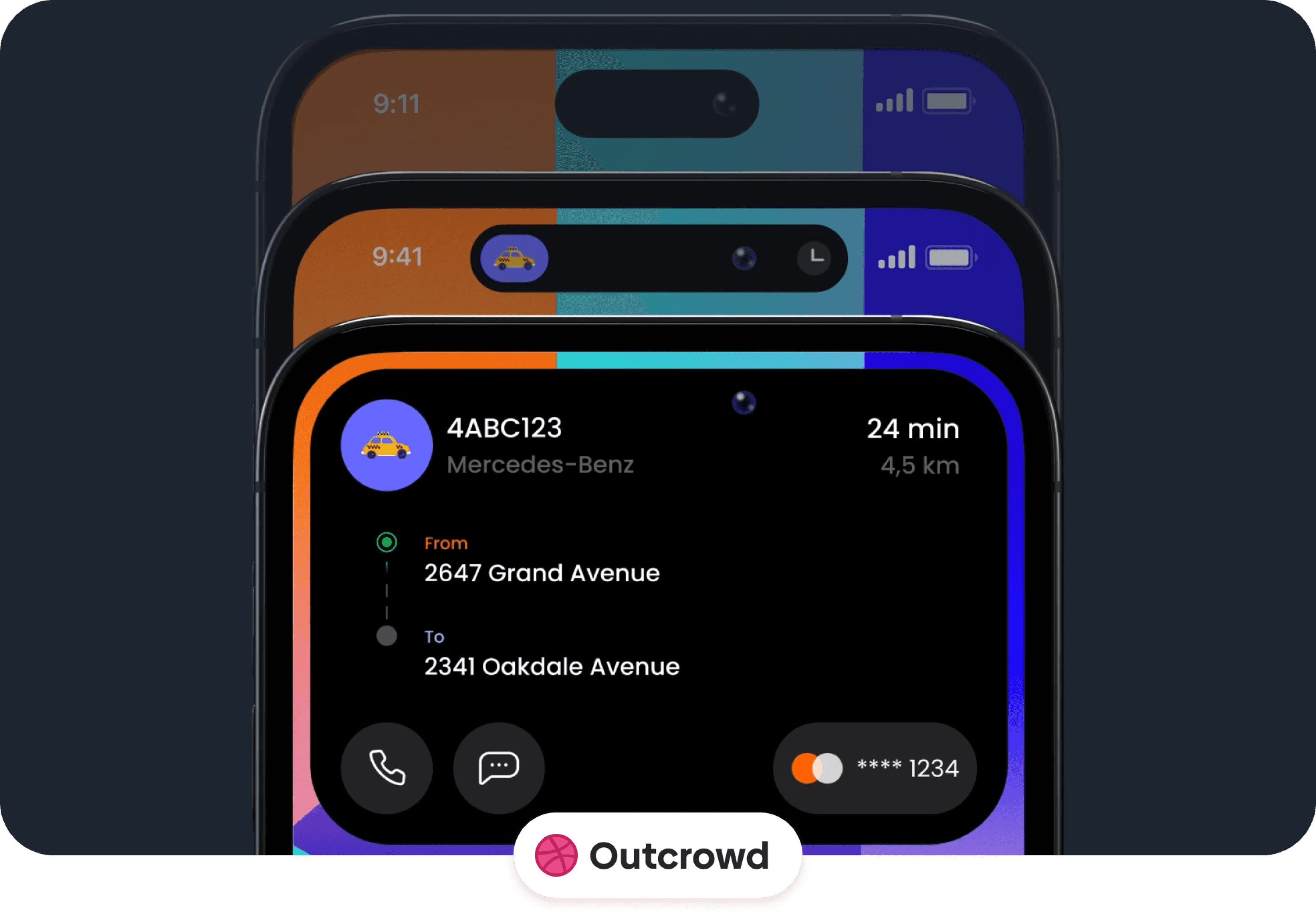
Add dimension: overlap screens
Create depth by stacking or overlapping key frames. Lead with the hero screen and let supporting screens peek from behind. It suggests system thinking, adds movement to static layouts, and helps viewers grasp the product at once.
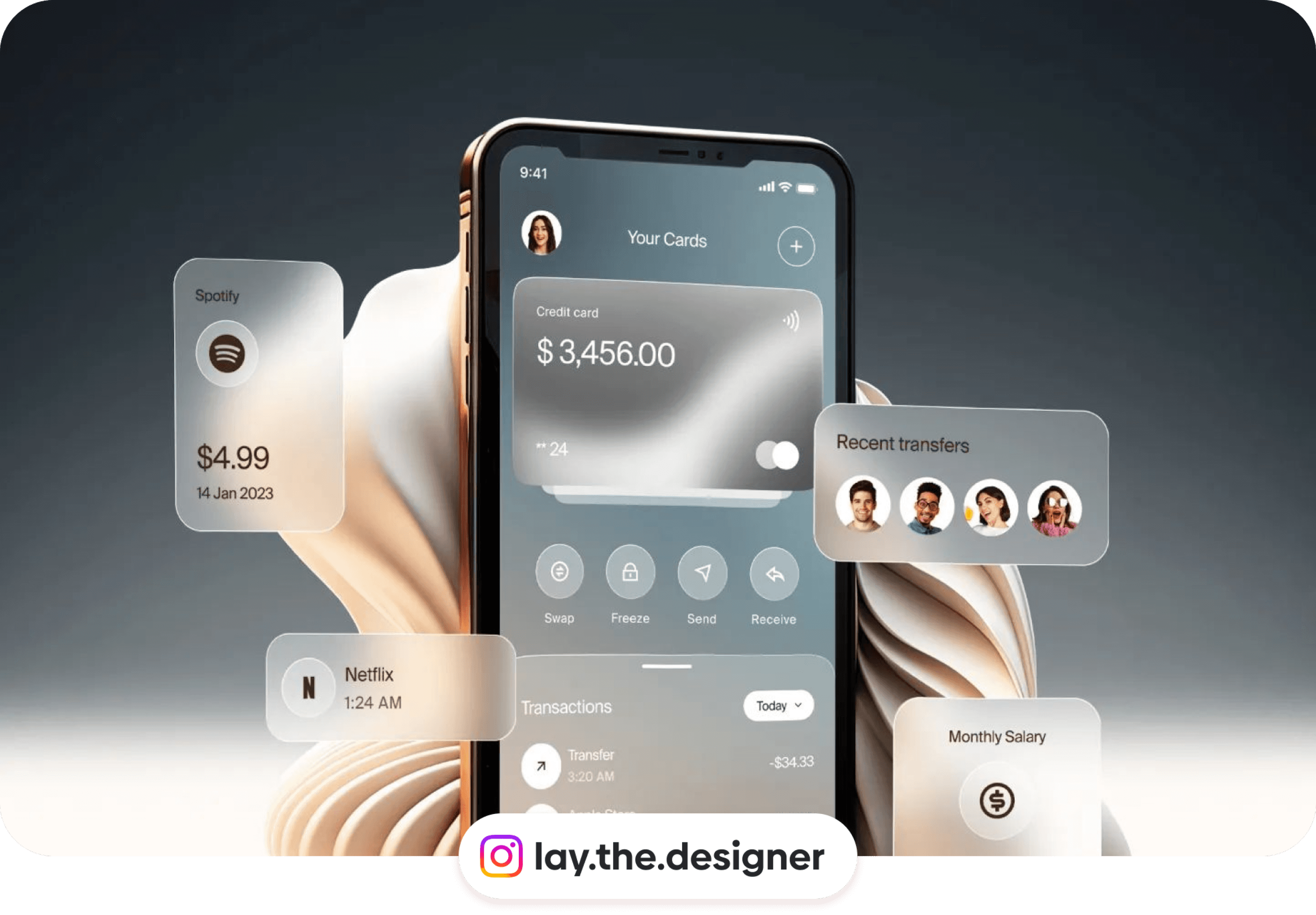
Highlight: use UI elements
Pull out the most important components—cards, totals, avatars, actions—and showcase them as floating callouts. This spotlights decisions and tells reviewers: “This is what matters.” Keep labels short and use consistent scaling.
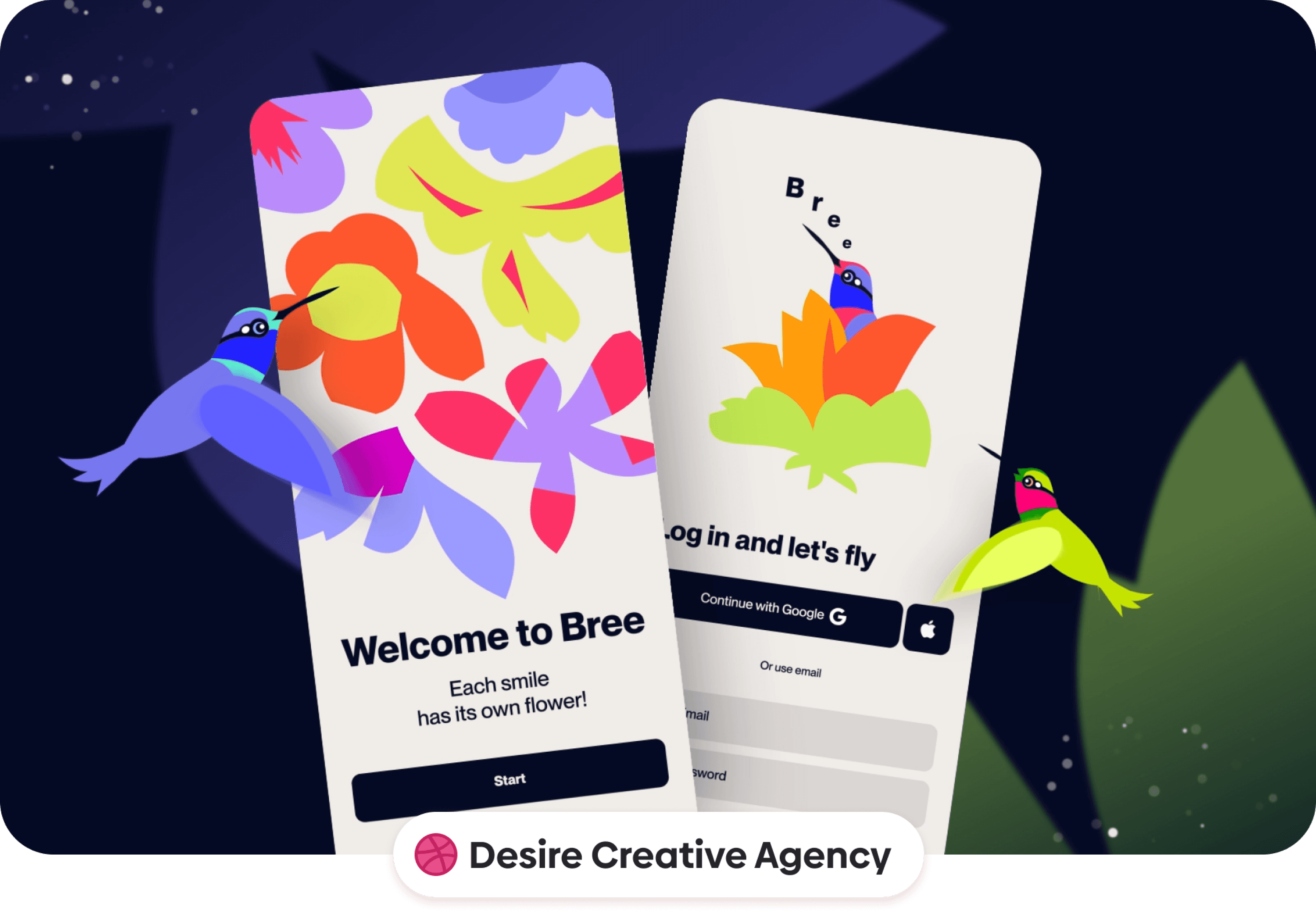
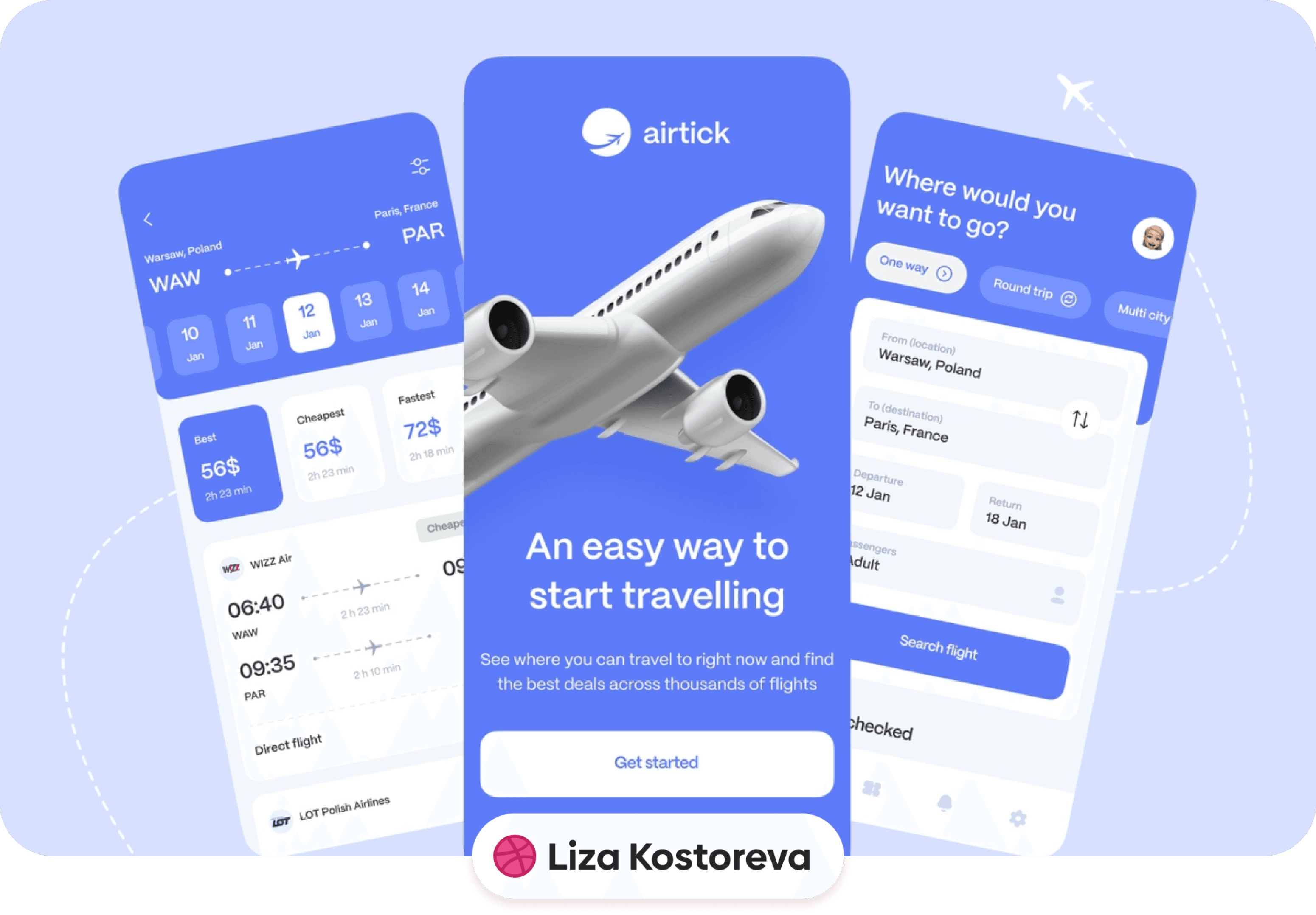
Immerse: use 3D decorations
Tasteful 3D accents can make your story feel tactile. Use them to set mood or point to an interaction, not to distract. Keep color, lighting, and shadows consistent with your UI so everything feels part of one scene.
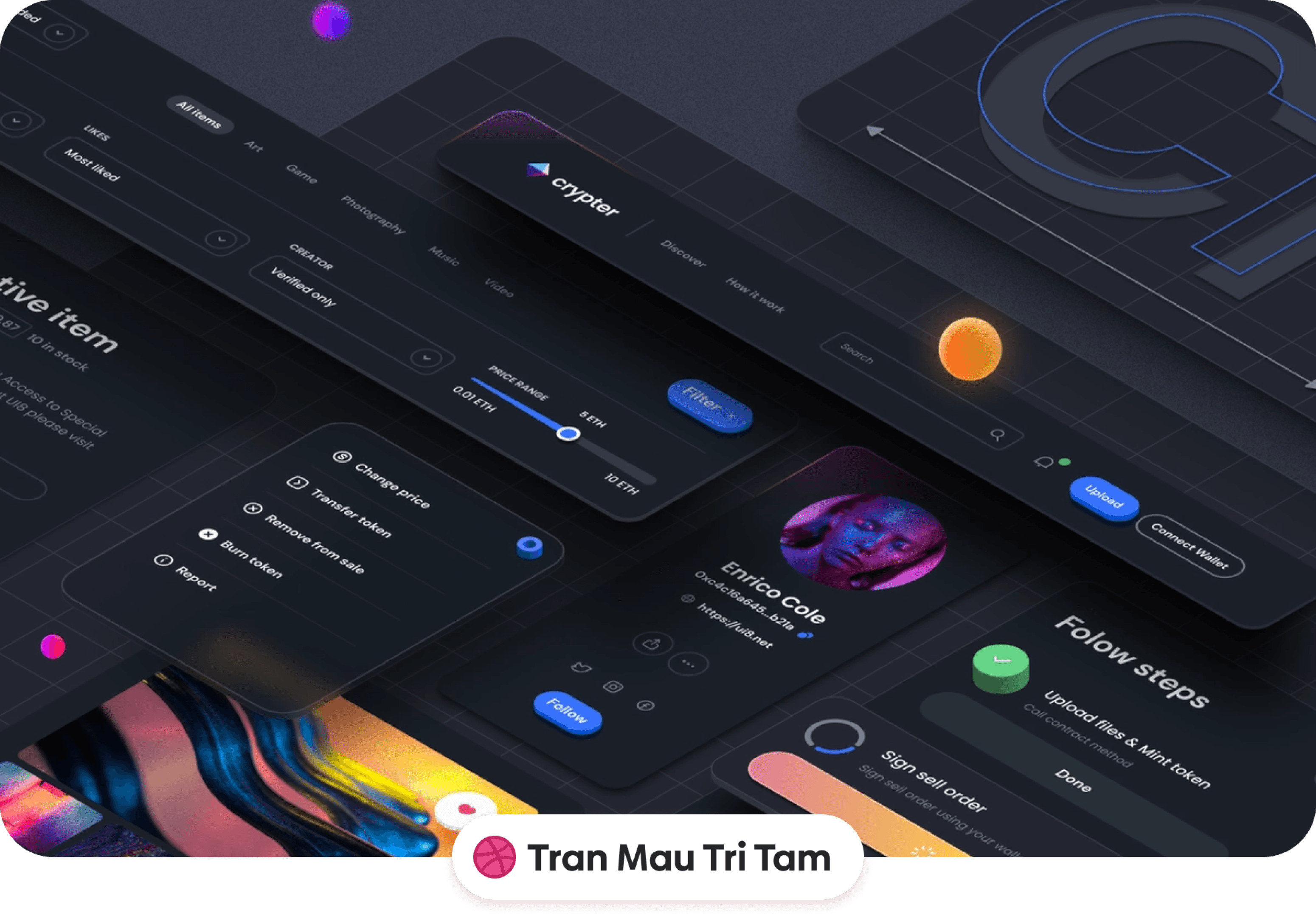
Add interest: make it isometric
Isometric compositions add structure and a polished “system view.” They’re great for dashboards, flows, or multi-screen moments. Use grid-clean angles, even spacing, and limited depth cues so the layout stays readable.
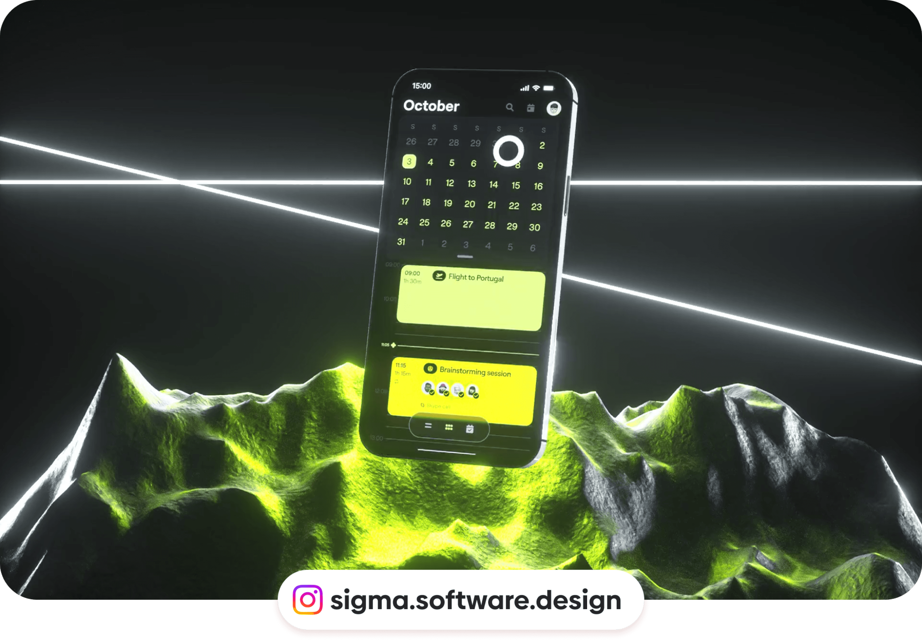
Add realism: use mockups
Place your screens in high-quality device frames or contextual scenes. Mockups give scale, explain use cases, and help non-designers visualize the product in the real world. Keep reflections and perspective subtle so the UI remains the hero.
Final thoughts
Presentations don’t need heavy polish—just a few intentional choices. Animate a moment, frame your work with backgrounds, add depth with overlaps, highlight the right UI, and finish with an isometric or mockup shot. That’s a simple workflow you can repeat for every case study or client review.
If you aren't following us on Instagram already, you're seriously missing out! Become a part of our ever-growing community and learn something new from the field of product design every. single. day.
Happy designing! 🥳
andrija & supercharge design team
If you aren't following us on Instagram already, you're seriously missing out! Become a part of our ever-growing community and learn something new from the field of product design every. single. day.
Happy designing! 🥳
andrija & supercharge design team
Related blog posts
You might like the following
You might like the following


LIMITED-TIME OFFER
Get 12 premium members-only video lessons for free
Just tell us where to send them
You can unsubscribe at any time—no strings attached
LIMITED-TIME OFFER
Get 12 premium members-only video lessons for free
Just tell us where to send them
You can unsubscribe at any time—no strings attached