
Button States Explained: Default, Hover, Active, Disabled, Loading
Jan 12, 2026
·
2 min read
Button states in UI design are how a button communicates what is happening before, during, and after interaction. When states are clear, users don’t have to guess whether something is clickable, pressed, or still processing.
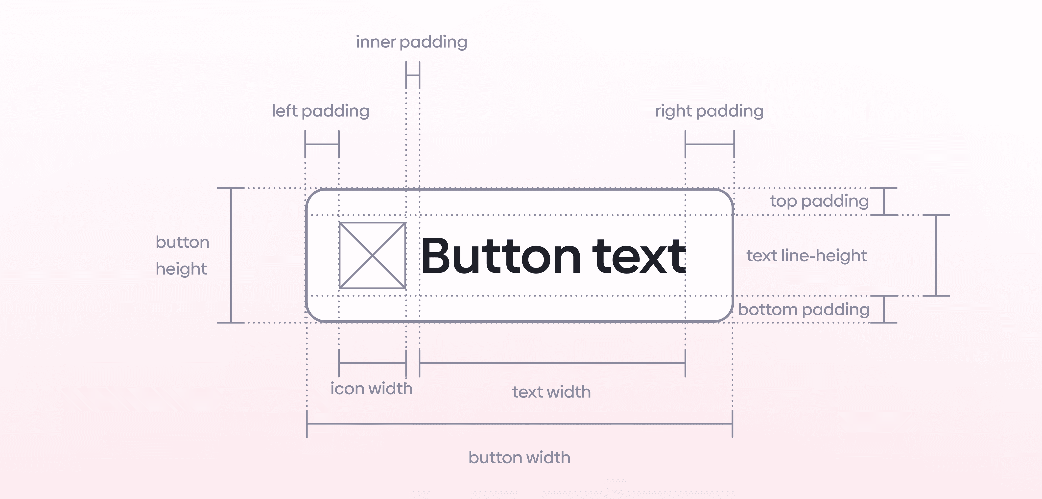
Button
Button is a prominent and visually distinct element encouraging users to take a specific action. It is commonly used to represent the most important or desired action on a screen or within a particular interface.
Buttons are used for:
Call-to-action (CTA)
Confirmation and acceptance
Submitting forms & next steps
Let's go through the must-know button states in UI design.
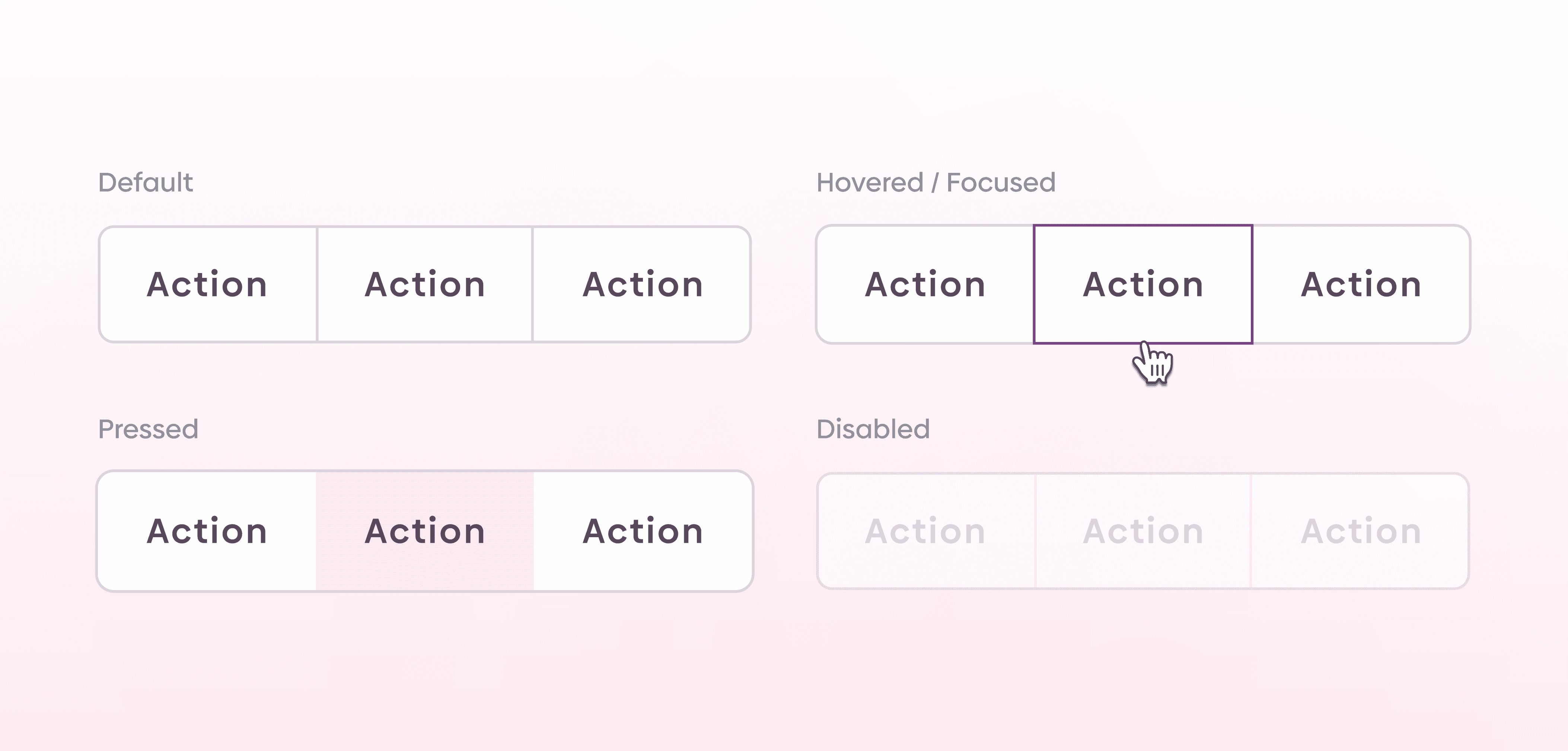
Default
The default state is the button at rest. It should look like a button without explanation: clear, familiar, and visually distinct so users immediately recognize it as interactive.
Hover
Hover is the desktop feedback moment. When the pointer moves over the button, the UI should respond with a visible change so users know they can click it. The hover state should stay consistent with the default style, just clearer.
Active
Active (pressed) is what users see while clicking or tapping. It confirms the interaction is happening and the UI is responding. Even though it’s brief, it’s important feedback.
Disabled
Disabled is a common state, but the guidance here is to avoid it when possible. Instead of blocking interaction, keep the button pressable and use validation and error messages to explain what needs to change.
Loading
When an action doesn’t instantly complete, the UI should show that something is happening. Add a loader or another visual indicator so users know the system is processing in the background.
Quick recap
Default: button at rest
Hover: feedback on pointer hover
Active: feedback while pressing
Disabled: avoid when possible; prefer validation/error messaging
Loading: show a loader or visual indicator when the action takes time
If you aren't following us on Instagram already, you're seriously missing out! Become a part of our ever-growing community and learn something new from the field of product design every. single. day.
Happy designing! 🥳
andrija & supercharge design team
If you aren't following us on Instagram already, you're seriously missing out! Become a part of our ever-growing community and learn something new from the field of product design every. single. day.
Happy designing! 🥳
andrija & supercharge design team
Related blog posts
You might like the following
You might like the following


LIMITED-TIME OFFER
Get 12 premium members-only video lessons for free
Just tell us where to send them
You can unsubscribe at any time—no strings attached
LIMITED-TIME OFFER
Get 12 premium members-only video lessons for free
Just tell us where to send them
You can unsubscribe at any time—no strings attached