
Apple Liquid Glass: The UX Evolution of Adaptive Interfaces
·
9 min read
In this article, we'll explore how Apple’s Liquid Glass, a next-generation design system introduced in OS 26 across all major platforms, transforms user experience (UX) and accessibility.
In each section you can find both strategic insights and practical considerations, helping you leverage Liquid Glass to create clear, elegant, and responsive digital experiences. Whether you’re prototyping UI components or optimizing for accessibility, this guide will equip you with a deep understanding of what it means to design in the Liquid era.
Table Of Contents
Introduction
During WWDC 2025, Apple launched Liquid Glass—a fully integrated, cross-platform design language now embedded into iOS 26, macOS 26, iPadOS 26, watchOS 26, and tvOS 26.
Unlike traditional visual updates, Liquid Glass update represents a paradigm shift in how interfaces behave and respond to user interaction. By blending real-time light manipulation, spatial depth, and motion-driven feedback, Apple has established a new blueprint for building intuitive and aesthetically rich user interfaces.
The system adapts to touch, device orientation, content, and accessibility preferences—all while maintaining visual harmony and usability. For today’s UX and UI designers, Liquid Glass presents a highly flexible yet demanding material that rewards thoughtful, user-centric execution.
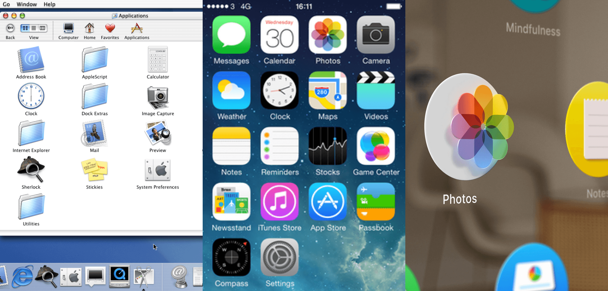
Apple's design systems: Aqua, iOS 7, visionOS
What is Liquid Glass?
Liquid Glass is Apple’s first truly dynamic UI material, combining visual style and behavior into a unified system. Unlike static gradients or flat blurs, it is fully responsive. It's bending light in real time to create fluid layers, nuanced depth, and environmental adaptation.
The material uses lensing, a technique that bends and concentrates light to help users intuitively understand what belongs where in the interface. Rather than mimicking physical glass, it simulates its properties in a digitally native way—producing lightweight, interactive layers that adjust continuously in form and behavior.
Core UX principles behind Liquid Glass
At its core, Liquid Glass communicates visually through light, shadow, and motion. Navigation bars flex, shift, and subtly animate; buttons glow upon touch, and elements organically lift into view or recede into rest states.
Each layer behaves with contextual awareness, ensuring the user always knows where to focus. Transparency allows interface elements to float above content while preserving legibility through contrast and shadow play. These visual dynamics are paired with strong accessibility support—allowing system toggles to gracefully override animations or transparency without disrupting the design intent.
Introduction
During WWDC 2025, Apple launched Liquid Glass—a fully integrated, cross-platform design language now embedded into iOS 26, macOS 26, iPadOS 26, watchOS 26, and tvOS 26.
Unlike traditional visual updates, Liquid Glass update represents a paradigm shift in how interfaces behave and respond to user interaction. By blending real-time light manipulation, spatial depth, and motion-driven feedback, Apple has established a new blueprint for building intuitive and aesthetically rich user interfaces.
The system adapts to touch, device orientation, content, and accessibility preferences—all while maintaining visual harmony and usability. For today’s UX and UI designers, Liquid Glass presents a highly flexible yet demanding material that rewards thoughtful, user-centric execution.
Apple's design systems: Aqua, iOS 7, visionOS
What is Liquid Glass?
Liquid Glass is Apple’s first truly dynamic UI material, combining visual style and behavior into a unified system. Unlike static gradients or flat blurs, it is fully responsive. It's bending light in real time to create fluid layers, nuanced depth, and environmental adaptation.
The material uses lensing, a technique that bends and concentrates light to help users intuitively understand what belongs where in the interface. Rather than mimicking physical glass, it simulates its properties in a digitally native way—producing lightweight, interactive layers that adjust continuously in form and behavior.
Core UX principles behind Liquid Glass
At its core, Liquid Glass communicates visually through light, shadow, and motion. Navigation bars flex, shift, and subtly animate; buttons glow upon touch, and elements organically lift into view or recede into rest states.
Each layer behaves with contextual awareness, ensuring the user always knows where to focus. Transparency allows interface elements to float above content while preserving legibility through contrast and shadow play. These visual dynamics are paired with strong accessibility support—allowing system toggles to gracefully override animations or transparency without disrupting the design intent.
Platform highlights: Liquid Glass in action
Apple’s Liquid Glass design adapts to each platform while maintaining a unified visual and behavioral system. Each device presents unique interaction patterns and display contexts, and Liquid Glass adjusts accordingly—ensuring both consistency and contextual optimization.
iOS 26
The tab bar dynamically shrinks during scroll and expands when interaction resumes, maintaining user focus.
Lock Screen numerals wrap behind user photos using intelligent lensing for seamless integration.
Icons and widgets use layered glass effects that react to wallpaper and tint.
The tab bar dynamically shrinks during scroll and expands when interaction resumes, maintaining user focus.
Lock Screen numerals wrap behind user photos using intelligent lensing for seamless integration.
Icons and widgets use layered glass effects that react to wallpaper and tint.
iPadOS 26
Navigation evolves into floating sidebars, replacing bottom tab bars on larger screens.
Sidebars dynamically reflect surrounding color and content, enhancing spatial awareness.
Visual consistency with macOS strengthens multi-device fluency.
Navigation evolves into floating sidebars, replacing bottom tab bars on larger screens.
Sidebars dynamically reflect surrounding color and content, enhancing spatial awareness.
Visual consistency with macOS strengthens multi-device fluency.
macOS 26
A transparent menu bar blends into the wallpaper, creating more open visual space.
Active windows appear crisp and bright, while inactive windows subtly fade via opacity.
Toolbars and sidebars behave as floating layers with refined shadow and depth.
A transparent menu bar blends into the wallpaper, creating more open visual space.
Active windows appear crisp and bright, while inactive windows subtly fade via opacity.
Toolbars and sidebars behave as floating layers with refined shadow and depth.
watchOS 26
Notifications and overlays use high-contrast Liquid Glass panels for clarity.
Buttons glow subtly when tapped, enhancing responsiveness with minimal animation.
Visual consistency with iOS improves usability across devices.
Notifications and overlays use high-contrast Liquid Glass panels for clarity.
Buttons glow subtly when tapped, enhancing responsiveness with minimal animation.
Visual consistency with iOS improves usability across devices.
tvOS 26
Menus and overlays use soft blur and refraction to sit comfortably over content.
Focused items glow internally, removing the need for hard outlines.
Menus and overlays use soft blur and refraction to sit comfortably over content.
Focused items glow internally, removing the need for hard outlines.

Accessibility enhancements across platforms
Accessibility is a foundational element of Liquid Glass. The material responds automatically to user preferences—simplifying transitions under Reduce Motion, adding opacity when Reduce Transparency is enabled, and increasing separation when Increase Contrast is on.
It adjusts shadow opacity, blur density, and brightness dynamically depending on the underlying content. Additionally, users can select appearance styles that best suit their visual needs. However, real-world usage scenarios still require thoughtful testing, especially when overlapping layered content and dynamic backgrounds.
Design considerations and best practices
Use Liquid Glass for navigation and UI framing—not content layers.
Avoid stacking multiple glass layers, which can reduce clarity.
Use tinting to emphasize actions—but only sparingly.
Use Liquid Glass for navigation and UI framing—not content layers.
Avoid stacking multiple glass layers, which can reduce clarity.
Use tinting to emphasize actions—but only sparingly.
Designing with Liquid Glass is a strategic exercise. You should apply the material where it reinforces structure—navigation bars, tab bars, sidebars—not on scrollable content areas. Layering multiple glass components leads to clutter and weakens visual hierarchy.
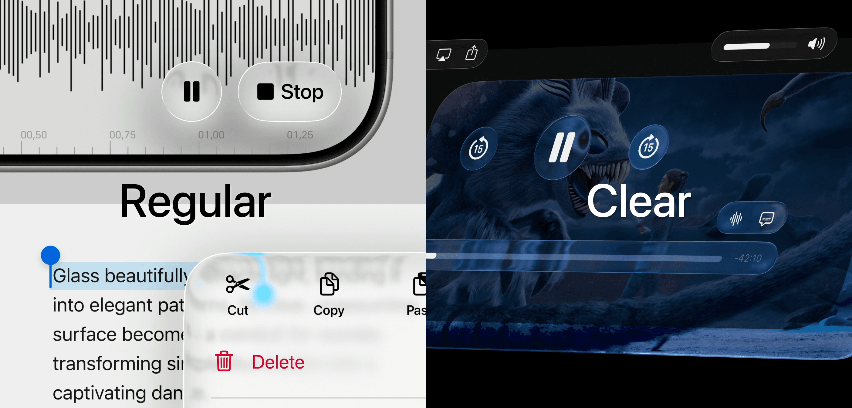
The Regular variant is adaptable and works in almost all contexts, while Clear is better suited for surfaces sitting over media-rich content, provided you add enough contrast.
Tinting can enhance visibility or branding but must be used selectively to avoid disrupting balance. Overall, design choices should support clarity, reinforce hierarchy, and respect individual user settings.
Liquid Glass UI Kit for Sketch
Sketch has already released its official UI library for macOS 26. which is great news for teams getting an early start. They also announced that more updates are on the way, especially for designers currently working on app redesigns. We should expect a lot of beta updates over the summer!
Final thoughts: Our point of view
Liquid Glass is expressive, modern, and motion-rich. It brings a sense of depth and tactility that makes digital interfaces feel more alive—more responsive to light, motion, and touch. Its cross-platform consistency is a clear win for design teams working across the Apple ecosystem.
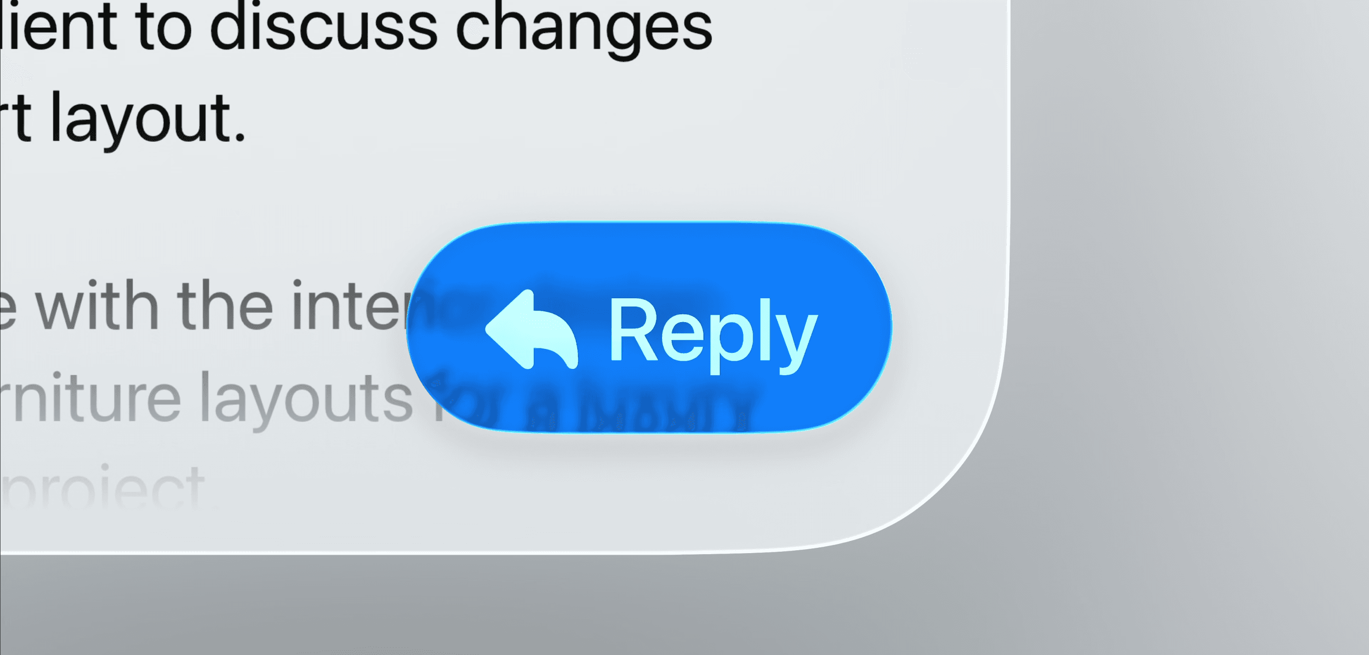
But expressive doesn’t always mean accessible. Right now, it feels like there’s too much transparency with not enough contrast. In environments with busy backgrounds or low contrast, content clarity takes a hit—especially for users with visual impairments.
With better contrast handling and more thoughtful transparency defaults, Liquid Glass has the potential to be both beautiful and truly inclusive.
We’re thrilled to invite you to join our incredible community of product designers (and enthusiasts) by following us on Instagram. We’re here to support you on your journey to falling in love with product design and advancing your career!
Keep on designing and stay hungry, stay foolish! 🥳
andrija & supercharge design team
Related blog posts
You might like the following


LIMITED-TIME OFFER
Get 12 premium members-only video lessons for free
Just tell us where to send them
You can unsubscribe at any time—no strings attached
LIMITED-TIME OFFER
Get 12 premium members-only video lessons for free
Just tell us where to send them
You can unsubscribe at any time—no strings attached