Cognitive Load in UI Design: 5 Ways to Reduce It
Feb 23, 2026
·
3 min read
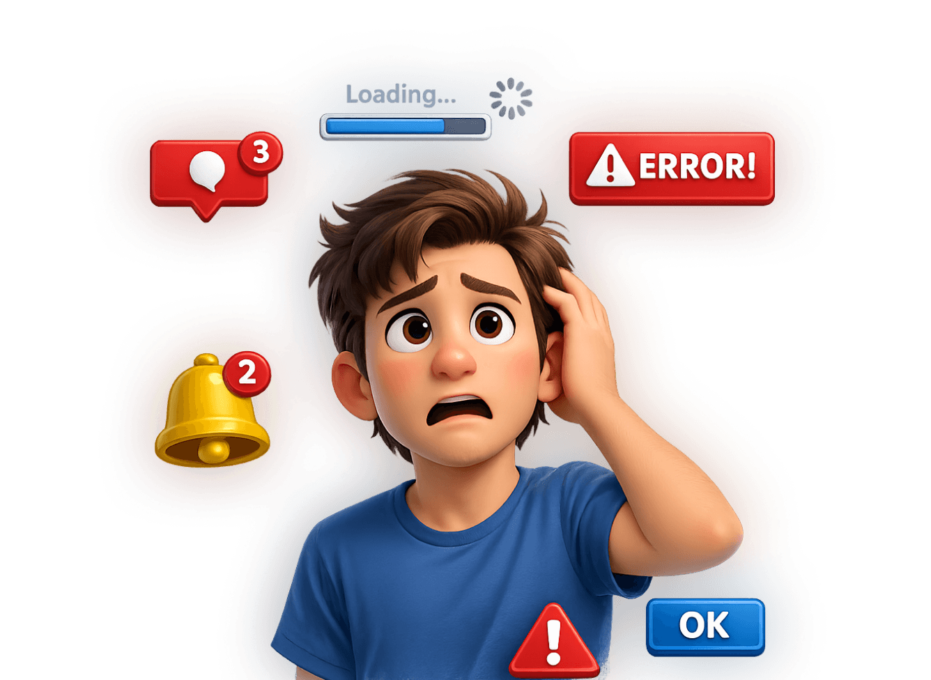
When users open your app or website, their brains get to work immediately. They scan, compare, decide, and predict what happens next. But here’s the problem: the human brain has limited processing power. If your interface demands too much mental effort, users feel confused, slow, or overwhelmed, even if your product is powerful.
The goal isn’t to “simplify everything” or make your design childish. The goal is to reduce cognitive load in UI design while keeping depth, functionality, and intelligence intact.
Let’s explore five practical ways to do exactly that.
1. Prioritize visual hierarchy (so users don’t have to guess)
When everything looks important, nothing is important. A clear visual hierarchy helps users instantly understand:
What’s primary
What’s secondary
What action to take
You can reduce cognitive load in UI design by guiding attention through:
Size differences
Contrast
Spacing
Typography weight
Color emphasis
Users should never need to “search” for the main action. Their eyes should naturally land on it. That's why you should focus on organizing features so the brain doesn’t waste energy figuring out the structure.
2. Chunk information into digestible pieces
The human brain handles information better in small groups. This is why phone numbers are split into chunks instead of one long string.
In UI, you can apply chunking by:
Grouping related settings
Using cards or sections
Breaking long forms into steps
Adding clear subheadings
For example, instead of showing 20 form fields at once, divide them into logical steps. The total information remains the same, but the mental effort drops.
To make UI design easier on the brain, you don't have to get rid of all the complex stuff. Just organize it in a way that makes sense.
3. Make choices easier (but not limited)
Too many options create decision fatigue. Too few options create frustration.
Here’s how to achieve the right balance:
Pre-select the most common option
Highlight recommended plans
Use progressive disclosure (show advanced options only when needed)
Use filters instead of long dropdown lists
That way you’re not taking control away from users; you’re reducing the mental strain of constant micro-decisions. And remember, a good UI feels intelligent, not restrictive.
4. Reduce unnecessary visual noise
Design trends sometimes encourage us to add more. More gradients. More animations. More floating elements. More decoration. But every extra visual element competes for attention.
That's why next time it's important to ask yourself:
Does this element help users complete their goals? Or is it just decoration?
Whitespace is powerful. It gives the brain breathing room. It separates concepts, and it improves readability.
To reduce cognitive load in UI design, remove anything that forces users to process information that doesn’t support their goals. Clarity is not boring; it’s professional.
5. Make interactions predictable
The brain loves patterns. When users can predict what happens next, they feel confident.
Cognitive load increases when:
Buttons behave inconsistently
Navigation changes between pages
Icons mean different things in different contexts
Layout shifts unexpectedly
Consistency reduces mental effort because users don’t need to re-learn the system on every screen.
The real goal
Reducing cognitive load doesn’t mean:
Removing advanced features
Dumbing down content
Limiting functionality
It means designing in a way that respects human psychology. When you reduce cognitive load in UI design, users:
Make faster decisions
Feel more confident
Complete tasks more easily
Trust your product more
Even complex tools can be easy to use if the complexity is organized in a smart way.
In short: You can reduce cognitive load in UI design by improving hierarchy, chunking information, guiding decisions, minimizing noise, and ensuring consistency, without removing depth or functionality.
Great UI design isn’t about making things smaller or fewer. It’s about making things clearer.
If you aren't following us on Instagram already, you're seriously missing out! Become a part of our ever-growing community and learn something new from the field of product design every. single. day.
Happy designing! 🥳
andrija & supercharge design team
If you aren't following us on Instagram already, you're seriously missing out! Become a part of our ever-growing community and learn something new from the field of product design every. single. day.
Happy designing! 🥳
andrija & supercharge design team
Related blog posts
You might like the following
You might like the following


LIMITED-TIME OFFER
Get 12 premium members-only video lessons for free
Just tell us where to send them
You can unsubscribe at any time—no strings attached
LIMITED-TIME OFFER
Get 12 premium members-only video lessons for free
Just tell us where to send them
You can unsubscribe at any time—no strings attached